Maria Almenara Bakery branding

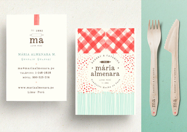
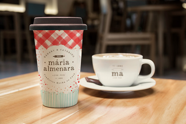
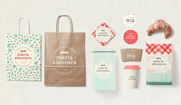
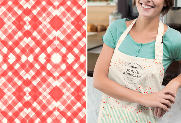
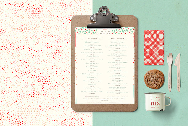
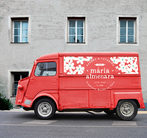
Excellent use of traditional patterns come into play for the brand identity of this bakery in Peru. The look of a cliche picnic blanket is rethought by using watercolor textures while other traditional patterns are hand drawn to bring in a feel of homemade craft. The colors are pastel and soft which makes this feel very approachable and home-like. The team at Wallnut explains their concept further:

Conceptually, we went back to the origin of the recipes, where it all started, the owner’s grandmothers cooking books and her nostalgic child memories of learning some of the most classic preparations typical of the american cuisine. Julia Child, tons of old and dusty recipe books and traditional prints found in tablecloths, aprons and textiles that surrounded the kitchen in the late 50s and 60s shaped our visual development.

Well done by Wallnut Studio

26b73964d7bf54af8f9dd60ae70454e7

1ddab2b39b0c136a549ecedae1448977

2af07af76ebc14a0ae5435b50c3b1be1

1d00b19d3b5a8eb79cf842cc13c1b55a

a7bb99a681bc28f93c4394f65bf84ddc

3707de0afd4176c1f6d1e4298e9b5fce

edeef3aa89524ffc2f3ee36baa988eed

Discuss this Project

Leave a Reply

This site uses Akismet to reduce spam. Learn how your comment data is processed.

The Forktales Podcast™: Interviews with restaurant industry leaders and visionaries

Restaurant and advertising industry headlines and thinking

Reviews of restaurant experiences from around the globe 

Reviews of our favorite design, business, & restaurant books

Our favorite typography and fonts

Inspiration in your inbox

Get the latest inspiration in your inbox every Monday morning, for FREE!

"*" indicates required fields

This field is for validation purposes and should be left unchanged.

Delicious Bits in your Inbox!

Get the latest and greatest content delivered to your inbox for free!

"*" indicates required fields

This field is for validation purposes and should be left unchanged.