Little King restaurant branding

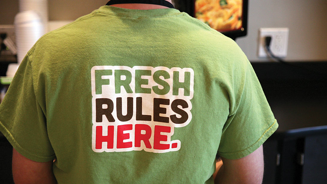
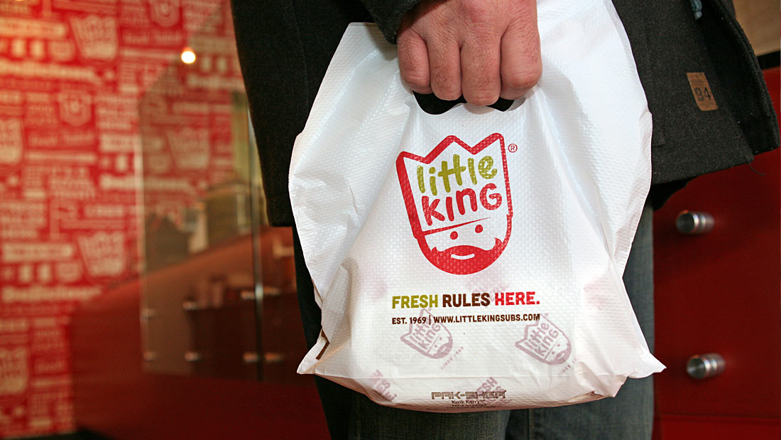
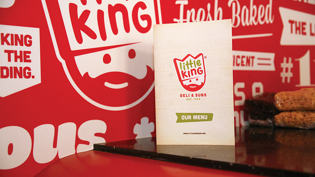
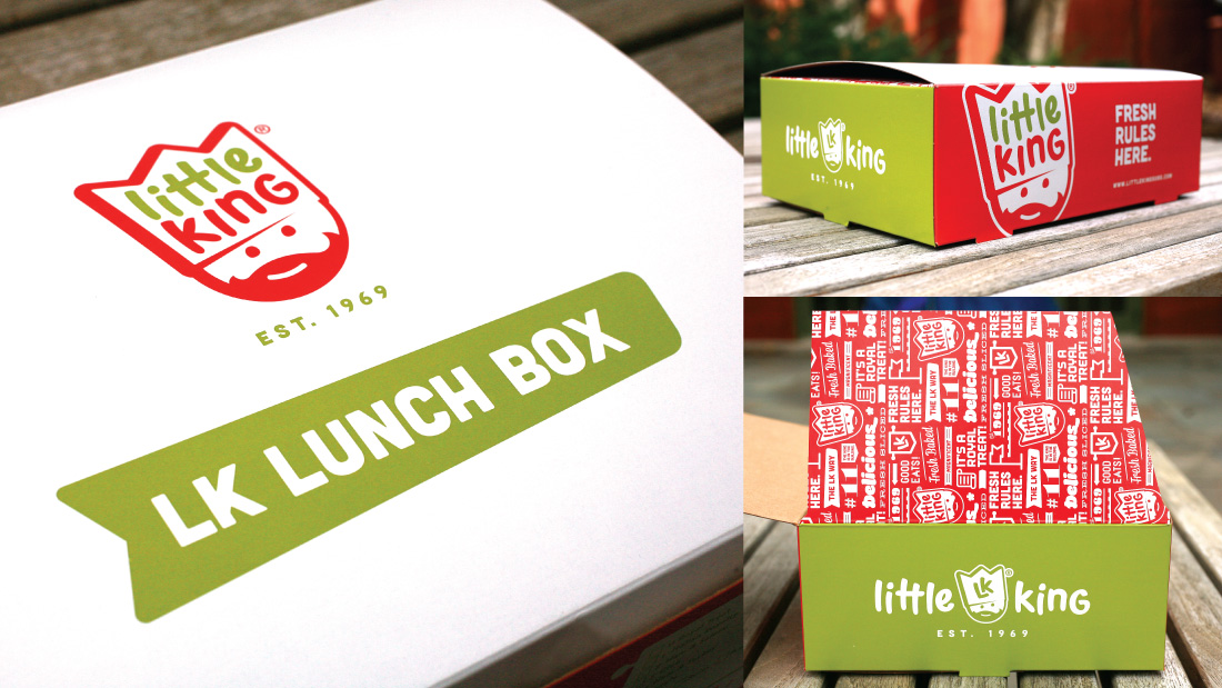
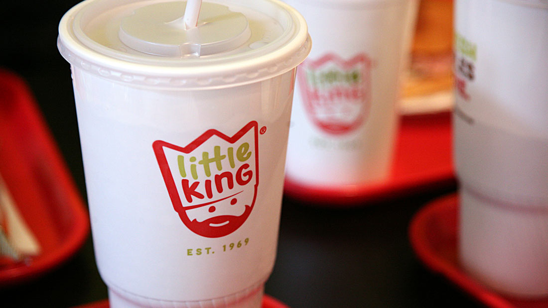
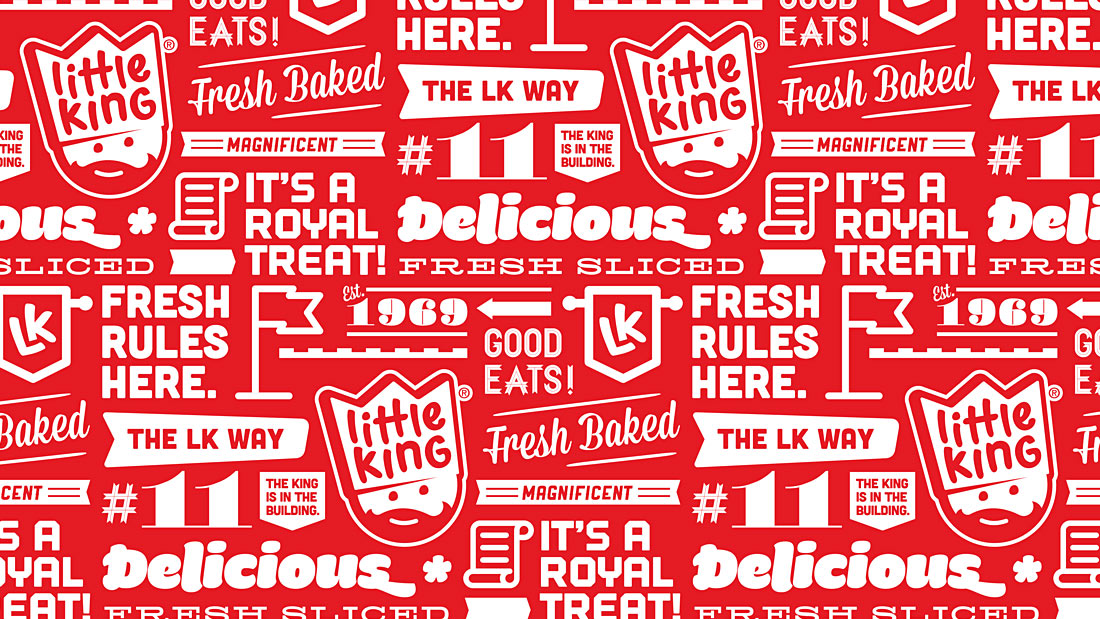
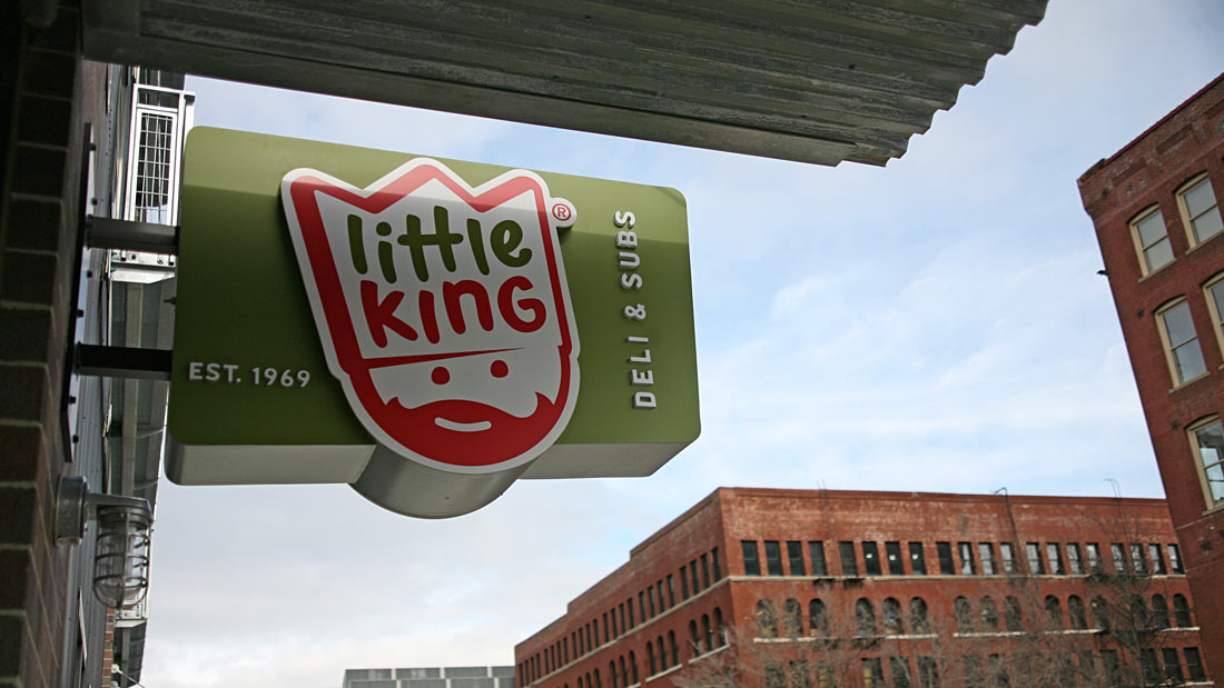
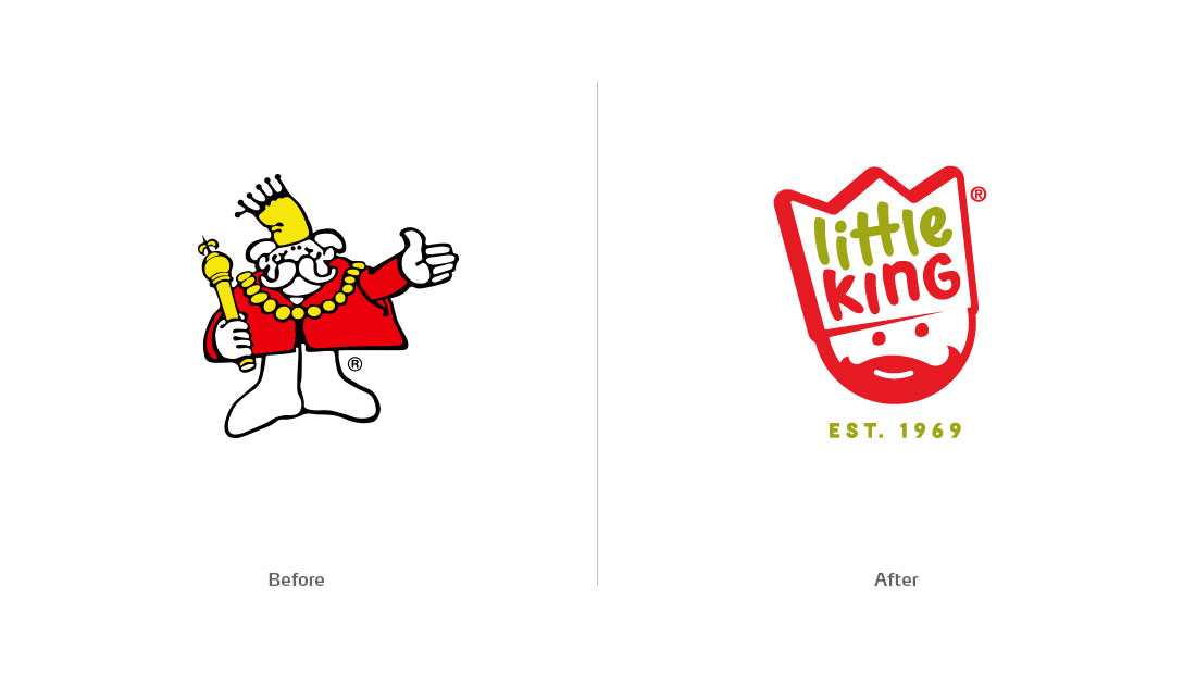
This rebranding effort by Webster for Little King involved taking a legacy identity and reformulating the approach to be of the times without losing any brand equity that existed. The previous brand left a lot to be desired with regard to design and memorability. The king mark looked stuck in the 70s and was easily forgettable. The Webster team changed all that with a keen eye for design and a new interpretation of the king. Here’s what the Webster team says about the project:

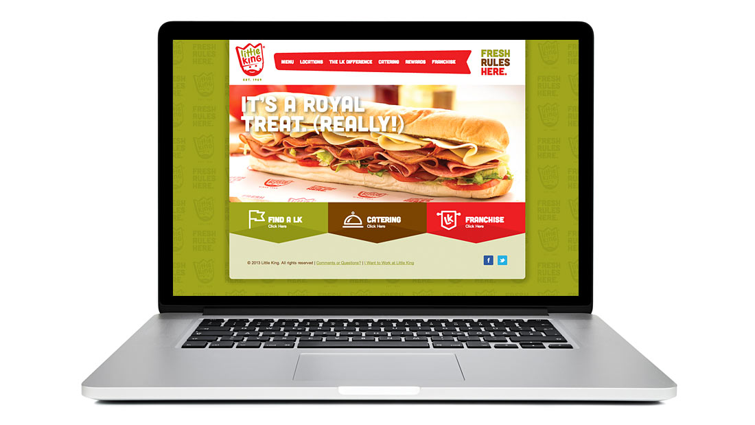
Before Subway, before Blimpie, before Jimmy John’s, there was Little King. A Midwest institution since 1969, Little King’s decades-old brand identity was well past its freshness date. To create a more modern monarchy, Webster redesigned the Little King logo, updated the font and color palette, and extended the look through signage, menus and packaging.
little.king_01alt

littleking-website-01

little.king_10

little.king_07

little.king_08

little_king_13

little.king_06

little.king_12

little.king_01

little.king-logo

The Forktales Podcast™: Interviews with restaurant industry leaders and visionaries

Restaurant and advertising industry headlines and thinking

Reviews of restaurant experiences from around the globe 

Reviews of our favorite design, business, & restaurant books

Our favorite typography and fonts

Inspiration in your inbox

Get the latest inspiration in your inbox every Monday morning, for FREE!

"*" indicates required fields

This field is for validation purposes and should be left unchanged.

Delicious Bits in your Inbox!

Get the latest and greatest content delivered to your inbox for free!

"*" indicates required fields

This field is for validation purposes and should be left unchanged.