Cafeteria Lumar restaurant branding

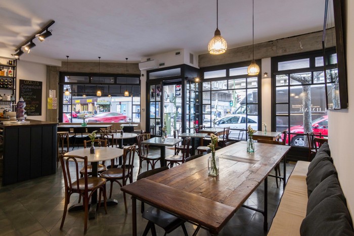
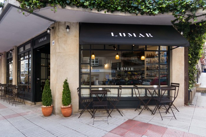
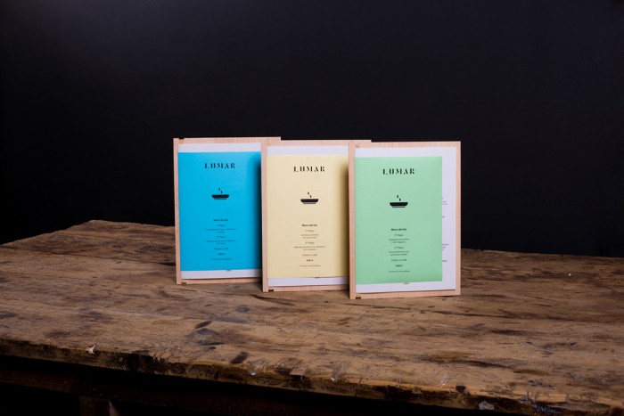
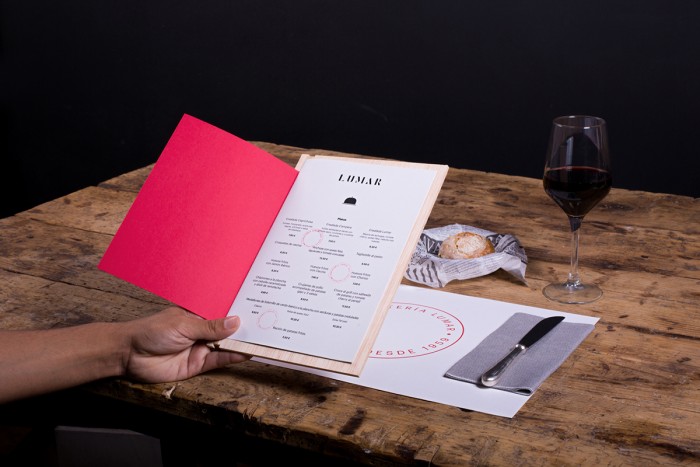
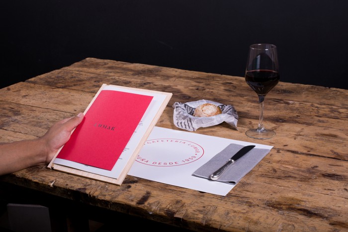
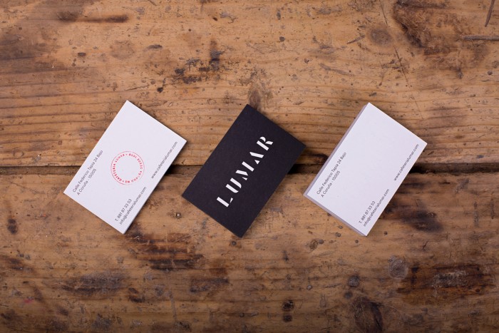
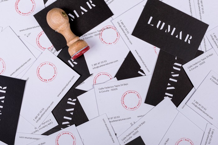
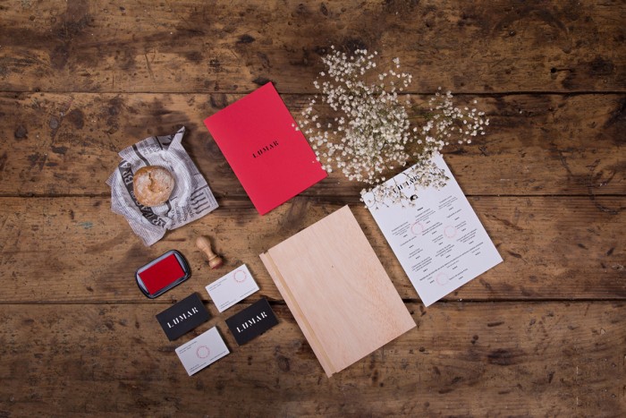
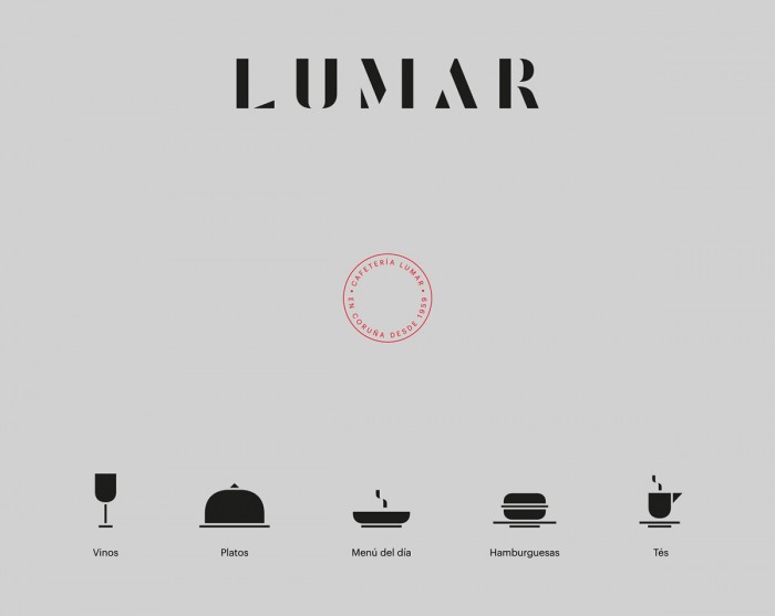
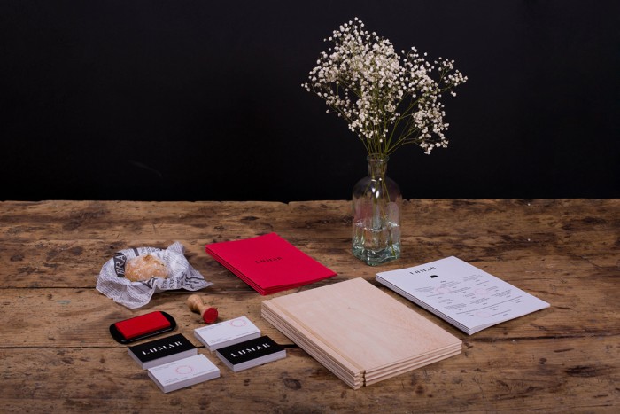
Mariano Fiore, the designer of the brand identity for Cafeteria Lumar, seems to have fun with a number of graphic elements accompanied by large planes of color. The core logo design is a simple, yet strong, typesetting in a style reminiscent of Bodoni. The simplicity sets an open foundation exploring other graphic treatments and elements that help create a language for the brand. One such treatment is the large plane of color as seen in the menu designs. A clean, modern set of icons have been designed to further denote key elements of the brand. Although more modern than the logo design, they fit nicely into the open, airy layouts.

c42ceee5ac885138b5ed7761d9d2b40b

cacdeec5b162ac51f5b67639ec4e03fa

48730c011a1399902833019758678691

22c12c462e661a1059b09518273c0eb3

ac1eeb027ff31a2357f0b70ec4c28a50

f38ece48fe90262251e0b447b6533cd4

f33a13cfd4055726f0f304f38dfebe54

b6ac683fa6c4c8a8d9f846dc7fc1a2a1

95b77cdc8a55c53c65bfb39239b4fc9d

4c501064148116730a85fa9a84e53cd3


Discuss this Project

Leave a Reply

This site uses Akismet to reduce spam. Learn how your comment data is processed.

The Forktales Podcast™: Interviews with restaurant industry leaders and visionaries

Restaurant and advertising industry headlines and thinking

Reviews of restaurant experiences from around the globe 

Reviews of our favorite design, business, & restaurant books

Our favorite typography and fonts

Inspiration in your inbox

Get the latest inspiration in your inbox every Monday morning, for FREE!

"*" indicates required fields

This field is for validation purposes and should be left unchanged.

Delicious Bits in your Inbox!

Get the latest and greatest content delivered to your inbox for free!

"*" indicates required fields

This field is for validation purposes and should be left unchanged.