Sutler’s Spirit Company gin branding

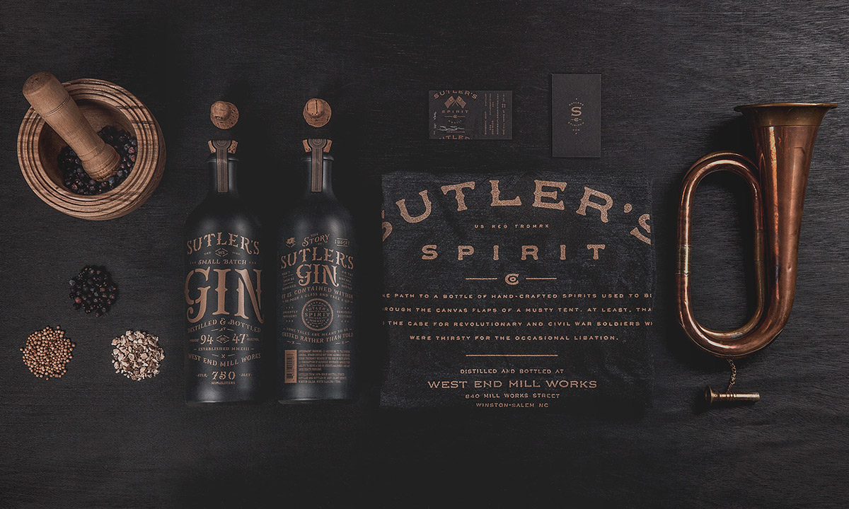
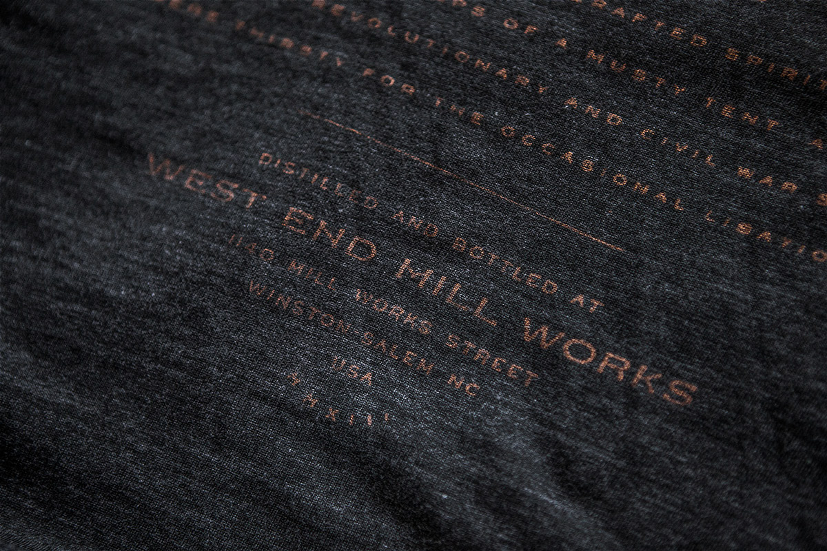
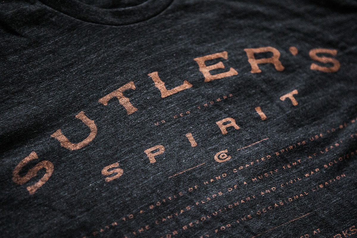
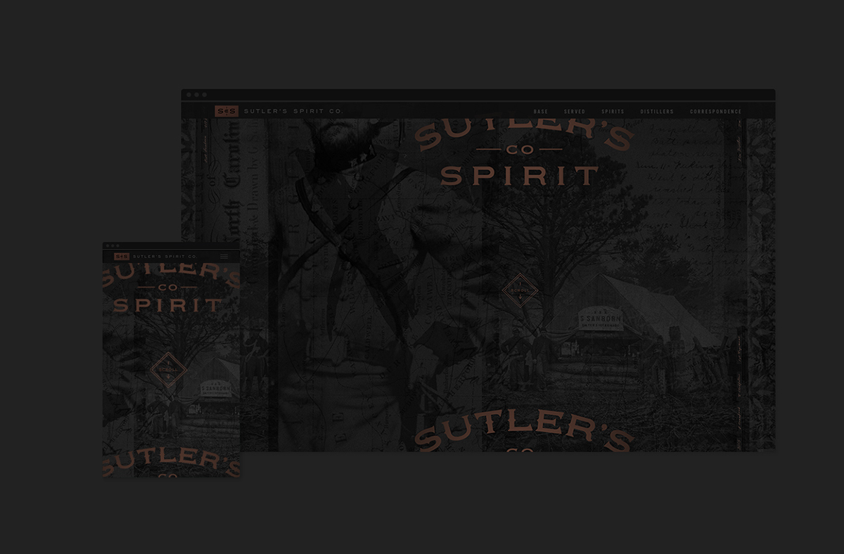
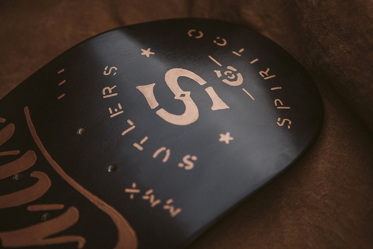
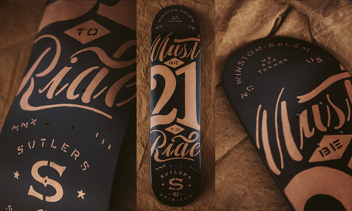
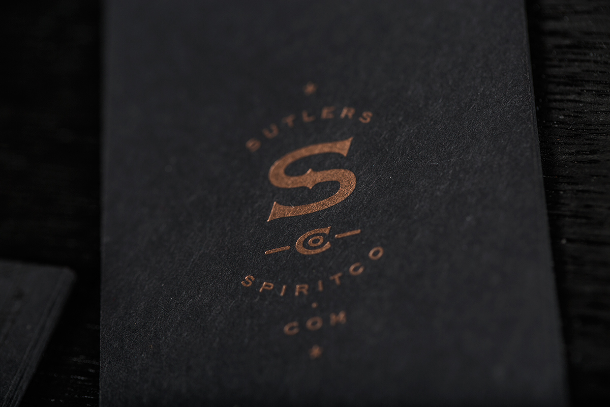
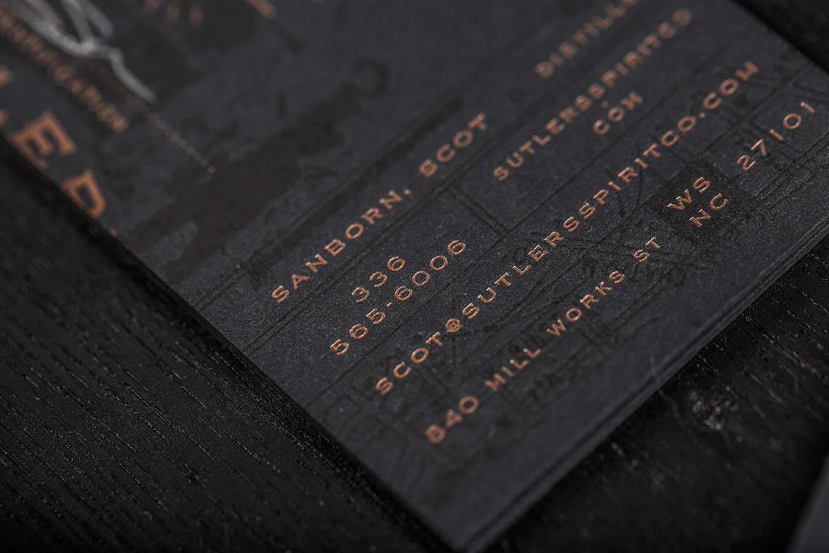
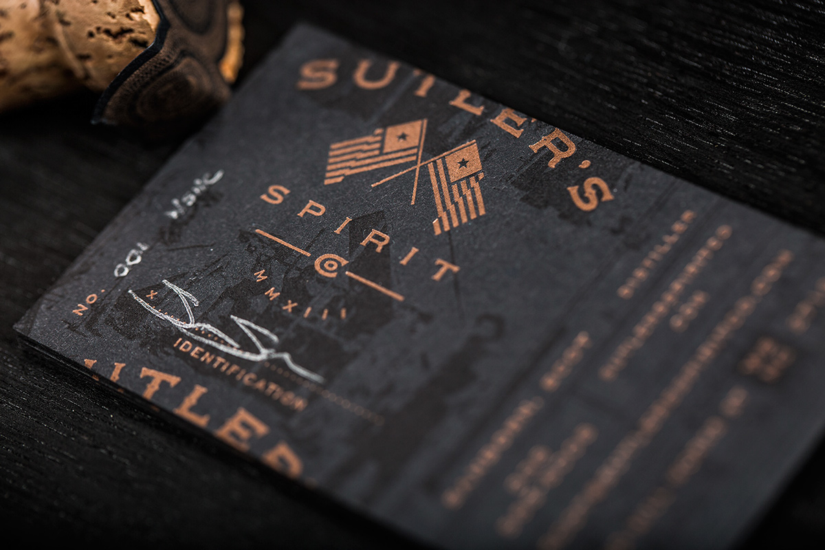
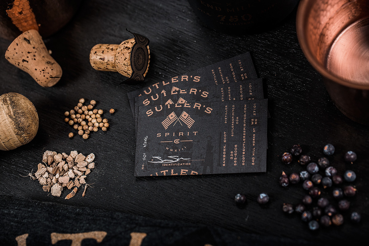
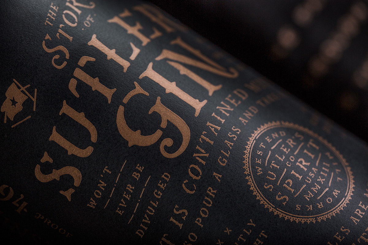
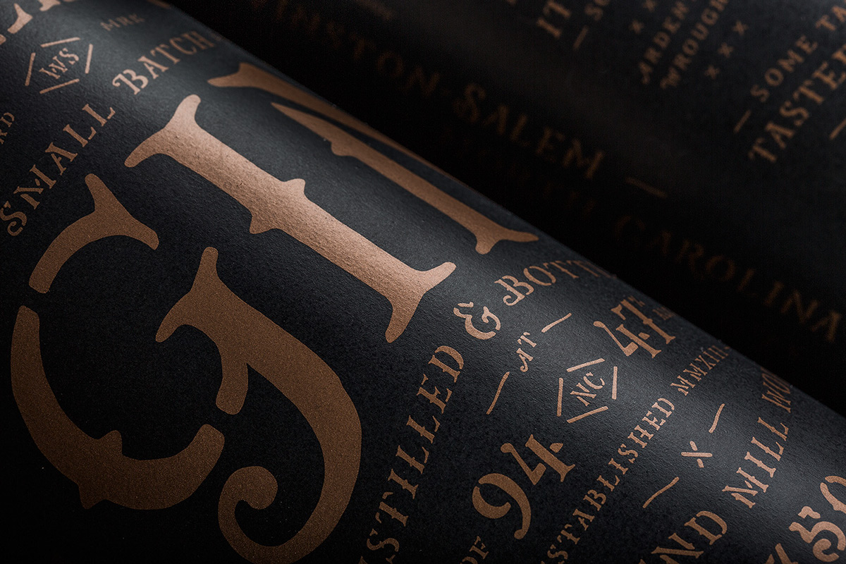
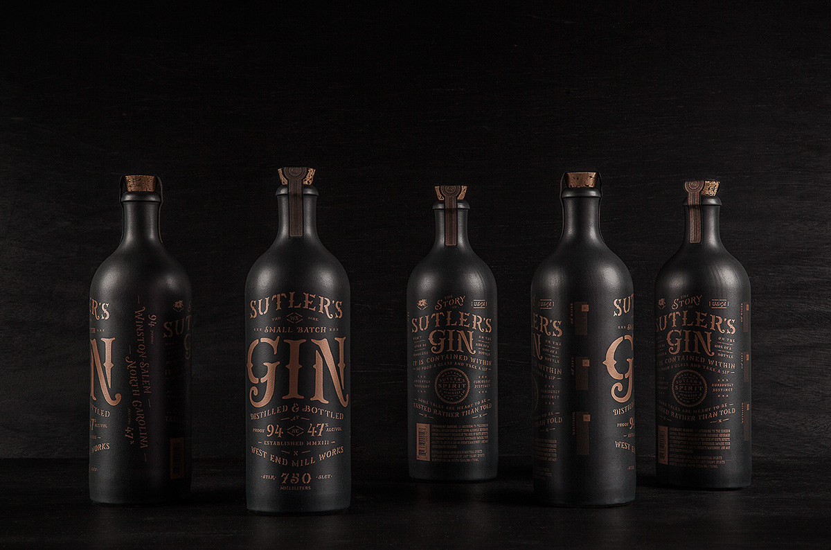
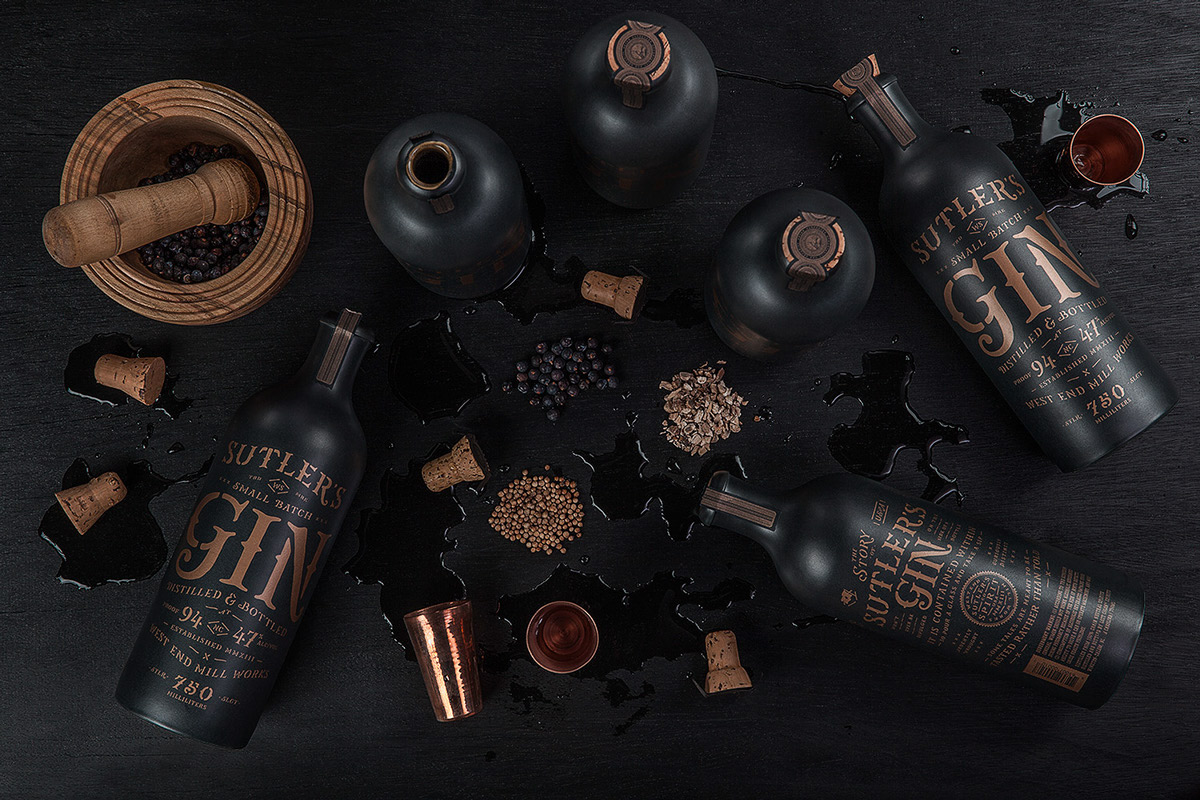
Absolutley lovely the restraint used in the color palette for this gin packaging and spirits company branding project by Device Creative in Winston-Salem, North Carolina. The identity and package design makes use of hand-rendered typography treatments throughout and a warm copper color over heavy black to create an almost speak-easy feel without having to be blatant. Excellent work.

00d07cdcb59fa241302f223646dab767

7e635062c33c1eceba8a3166a0be6f1e

e4e1ce656f3ff5efba9698c92c72aa5c

03b56aed414053246dabb7bf5080040e

392ceee8c9ebda94ce8f4c50471c19ad

5aed3c6e05aab2136fb3cdcce347e872

2254db28aaae26c1ed9203abd3351bb5

f9ef30d2dafd4c872419b1a63d7afd27

1af3d5641b02a86f2e29d43e8001d97c

f6413f2f481f418cb5268d1a62f238e9

38b53f96f187d7d1a7bdb0e7fc3d9fd3

369bee2504da33d17012b4c1807bed7b

45729b855e4ab1d5ee6cedfe5cbd18bd

96b157301079646a9619ced09865ad3f


The Forktales Podcast™: Interviews with restaurant industry leaders and visionaries

Restaurant and advertising industry headlines and thinking

Reviews of restaurant experiences from around the globe 

Reviews of our favorite design, business, & restaurant books

Our favorite typography and fonts

Inspiration in your inbox

Get the latest inspiration in your inbox every Monday morning, for FREE!

"*" indicates required fields

This field is for validation purposes and should be left unchanged.

Delicious Bits in your Inbox!

Get the latest and greatest content delivered to your inbox for free!

"*" indicates required fields

This field is for validation purposes and should be left unchanged.