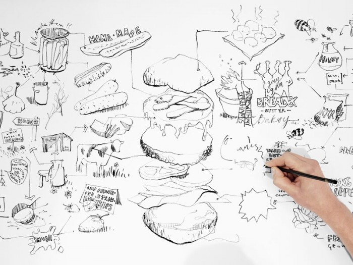
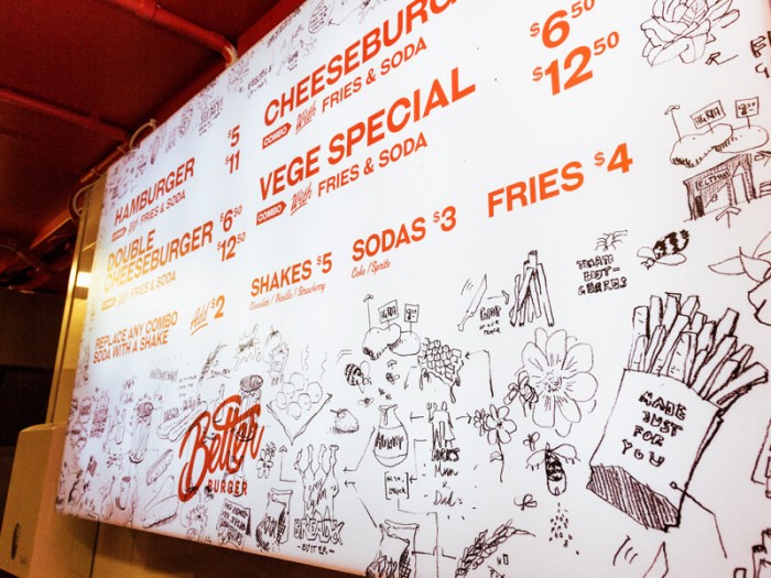
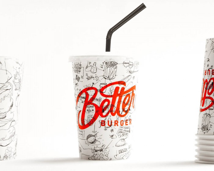
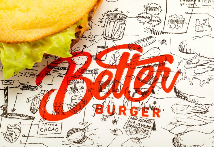
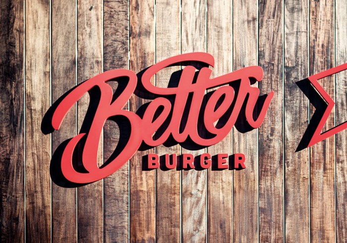
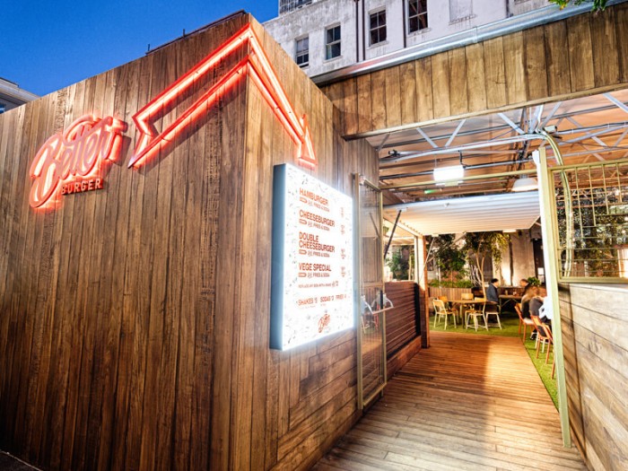
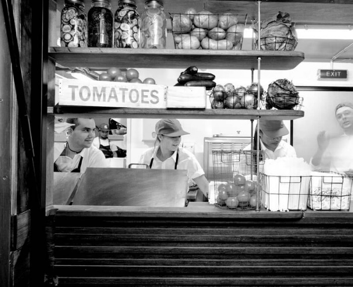
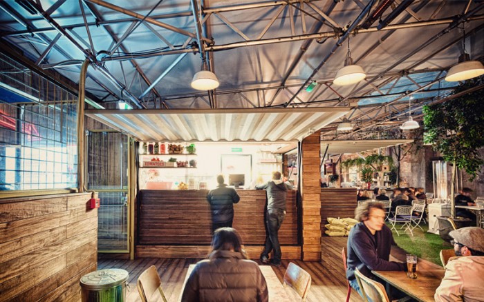
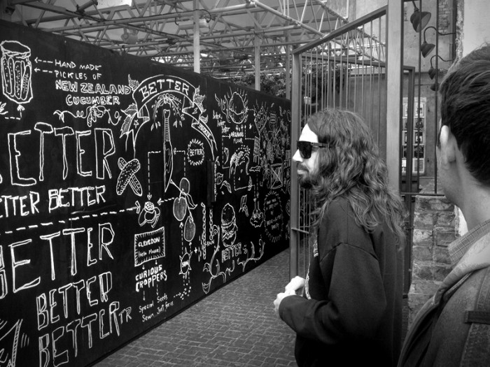
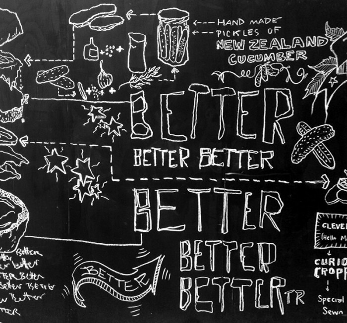
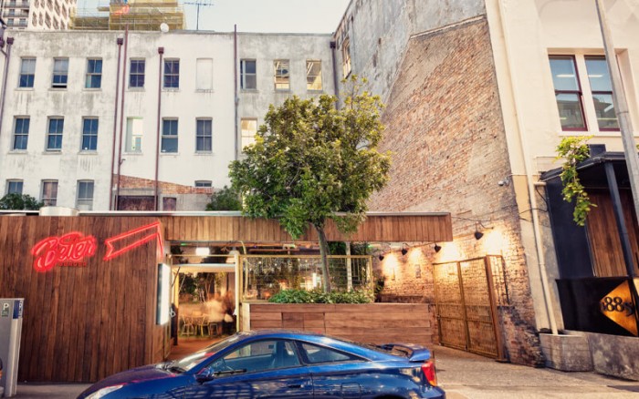
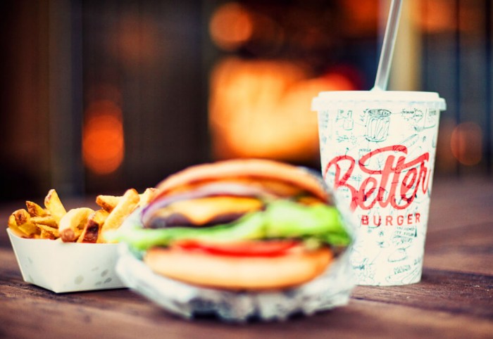
I can’t stop staring at the amazing typography in the logo for Better Burger. We’ll get to the graphic elements that use illustrative pen and ink techniques in a second. That type though. Smooth lines with ligatures that flow naturally. It has enough room to breathe, but is kerned enough to have bulk and thickness collectively. I could write about this longer, but just stare at it while I go on. The rest of the brand follows suit with the same thought and attention to detail. The pen and ink illustrations give a naturally fun and handcrafted backdrop to the solid typography used to layout the menus and other touch points. The finishing touch is the sign. Also well done. The channel lettering with acrylic color gives a neon effect while remaining readable in brand.
Designed by 485 Creative
