Caravana restaurant rebranding

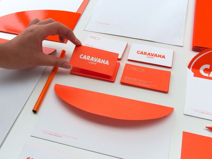
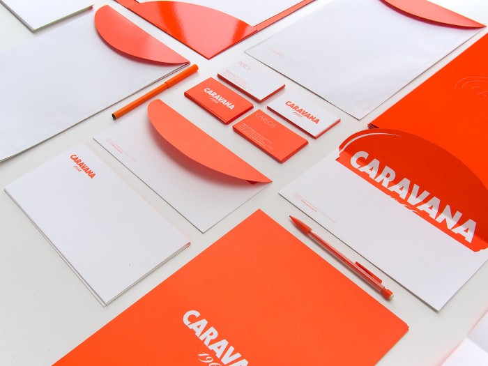
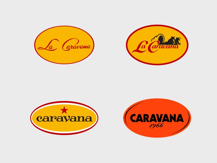
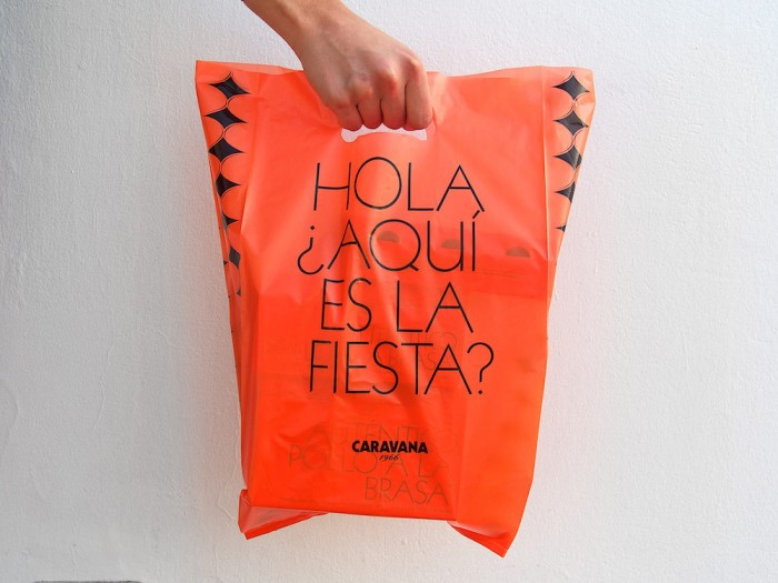
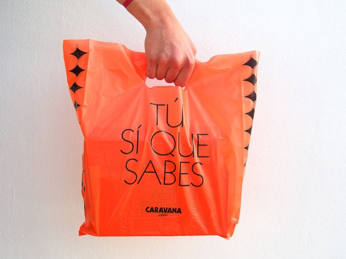
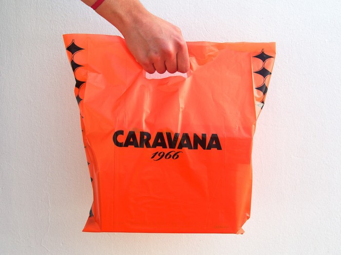
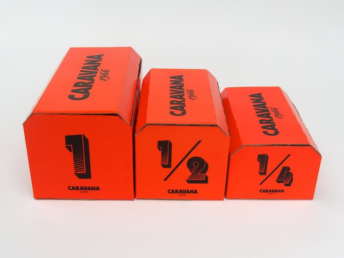
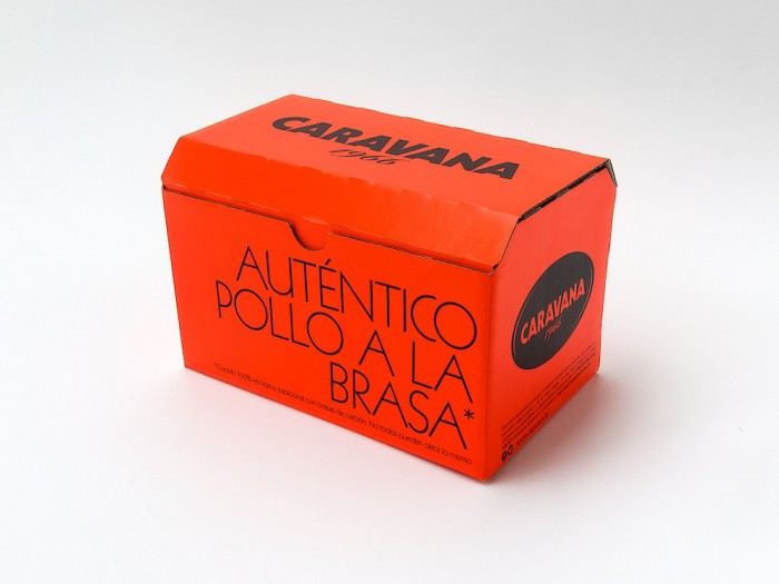
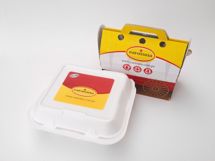
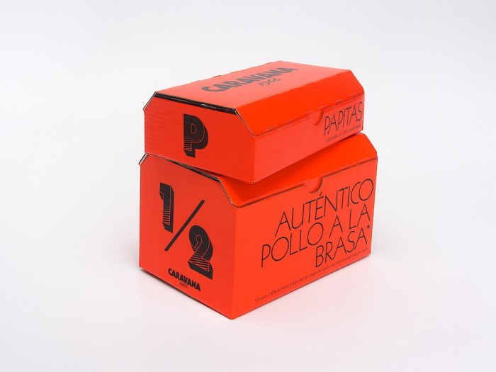
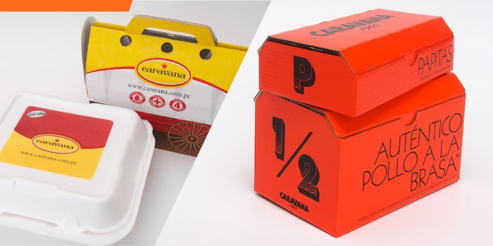
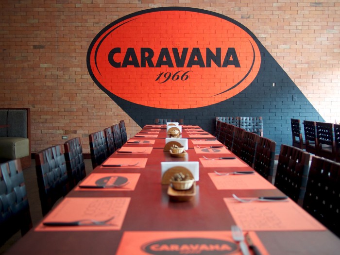
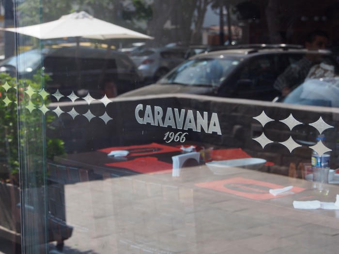
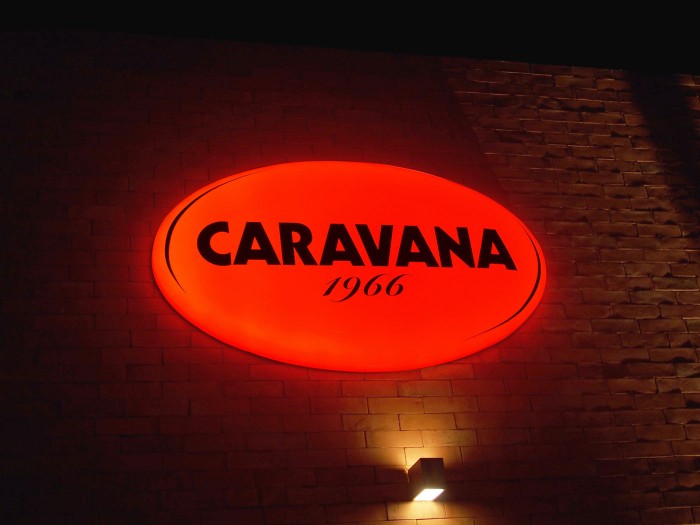
IS Creative Studio takes a typical design for a restaurant brand and simplifies it down to an eye-catching breath of fresh air. The rich, bright red-orange color grabs the eye, and rather than adding in additional illustrations and elements, the studio uses restraint to deliver a simple typographical solution.

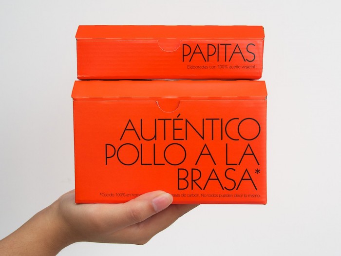
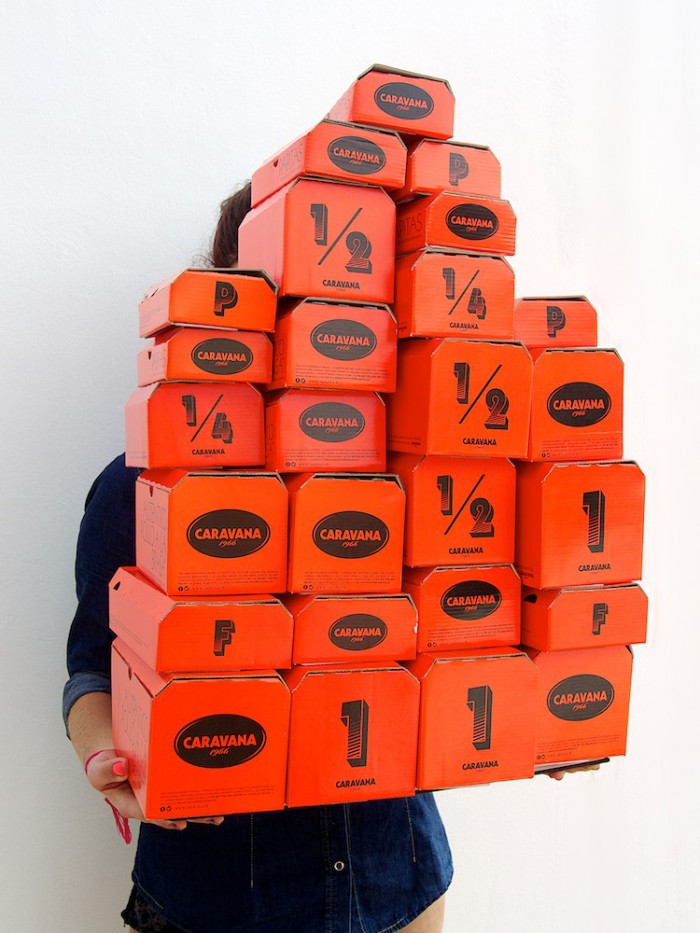
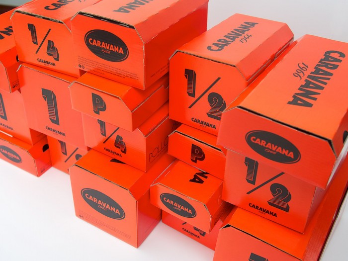
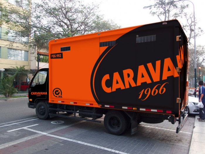
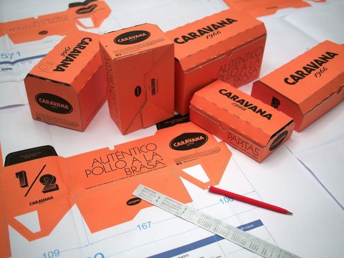
The brand identity permeates throughout each touch point nicely. It really hits its stride in the packaging design where the simple design shines.

OLYMPUS DIGITAL CAMERA

CARAVANA_IS-Creative-Studio_1 CARAVANA_IS-Creative-Studio_3 CARAVANA_IS-Creative-Studio_10 CARAVANA_IS-Creative-Studio_41 CARAVANA_IS-Creative-Studio_111 CARAVANA_IS-Creative-Studio-11 CARAVANA_logo_principal-sobre-negro

OLYMPUS DIGITAL CAMERA

OLYMPUS DIGITAL CAMERA

Logos-evolución2-02

01_04_14_caravana_20

01_04_14_caravana_25

01_04_14_caravana_24

01_04_14_caravana_23

01_04_14_caravana_22

01_04_14_caravana_26

01_04_14_caravana_15

01_04_14_caravana_9

01_04_14_caravana_3

01_04_14_caravana_13

01_04_14_caravana_5

01_04_14_caravana_1