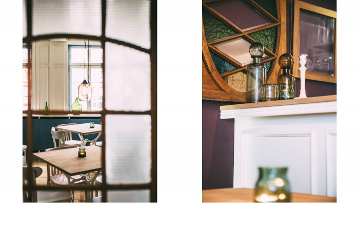
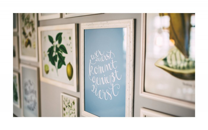
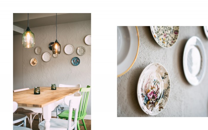
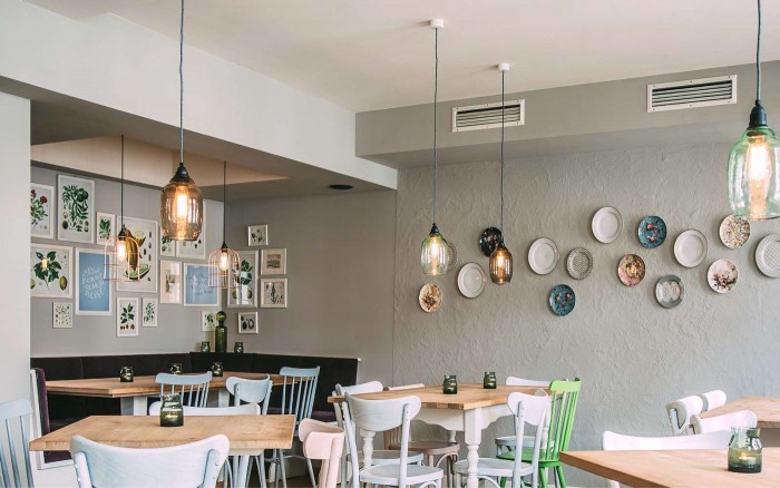
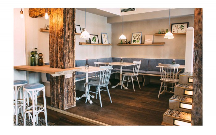
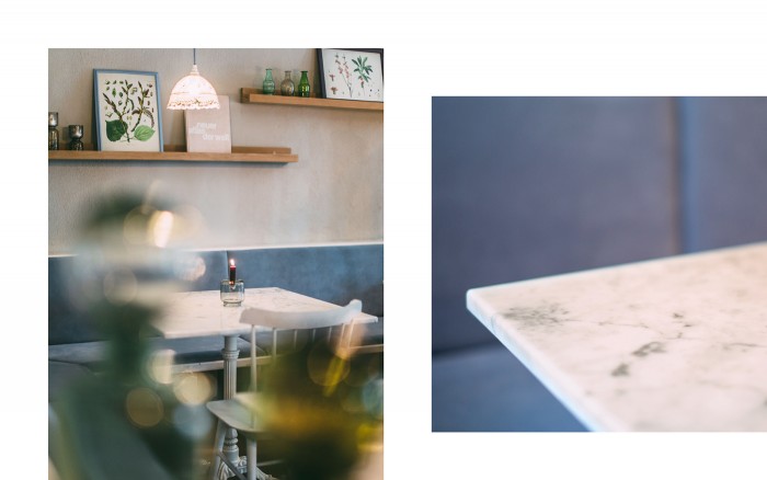
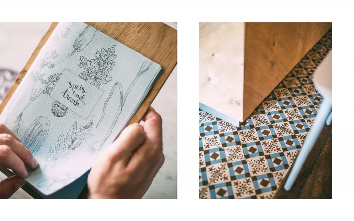
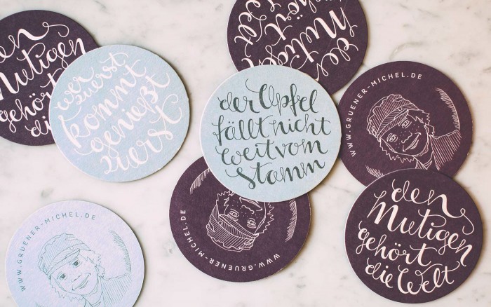
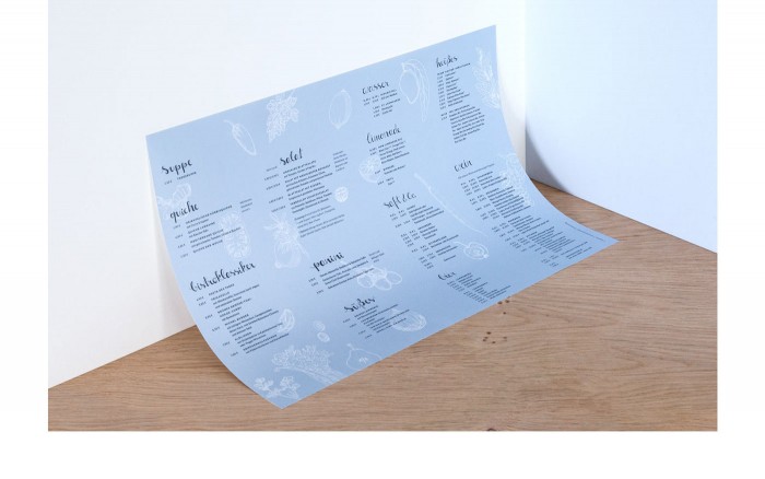
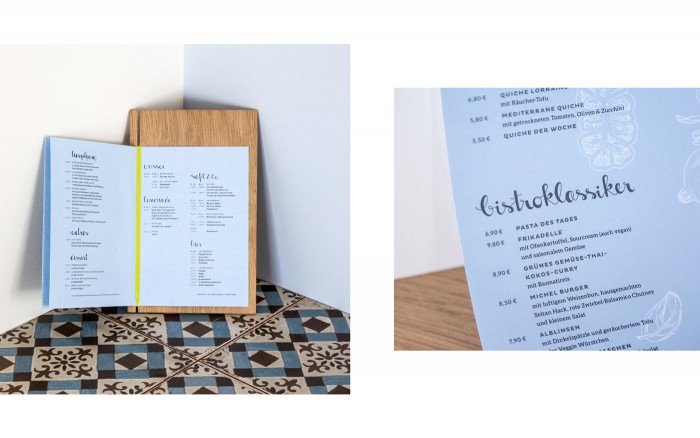
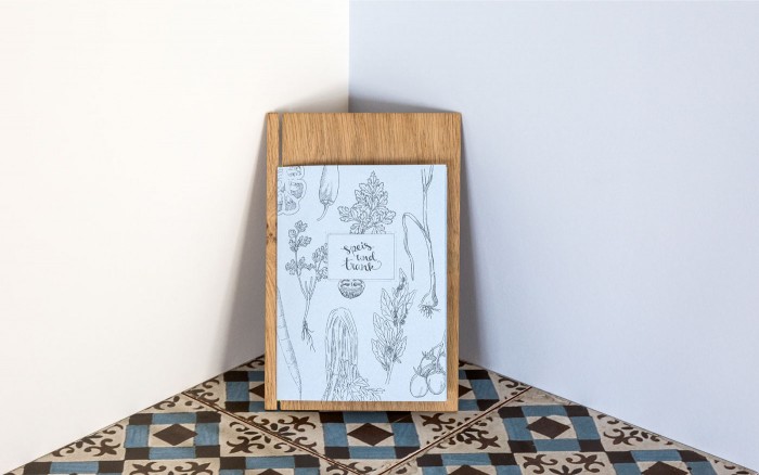
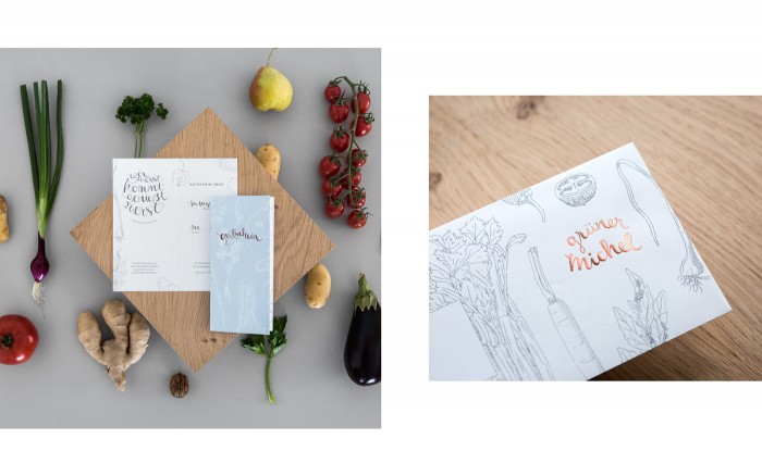
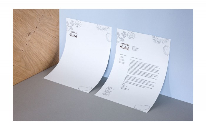
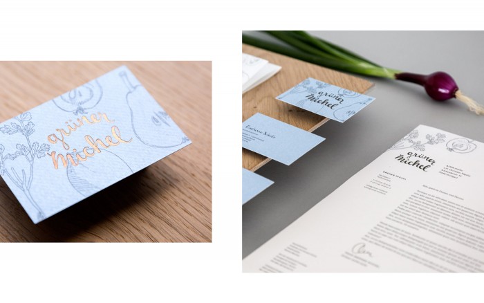
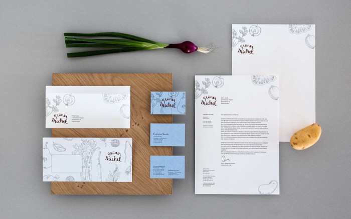
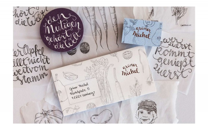
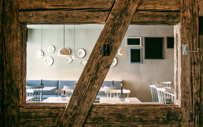
Gruner Michel restaurant’s brand identity starts with a custom, handdrawn typeface using a cola pen style. It expands into more touch points using treatments from flooded color planes of blues and purples, as well as pen and ink illustrations. There is a lot of congruency between the design style of the identity and the interiors that feature rustic picture frames with a cottage chic style. The marriage of idnetity and interiors is due to a matchup of ADDA Studio and Hochburg Design, the two studios who created the look.
