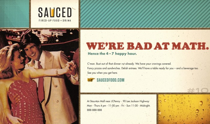
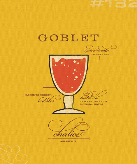
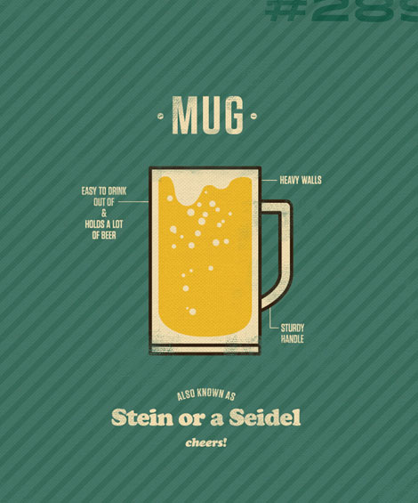
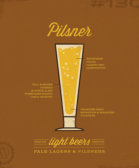
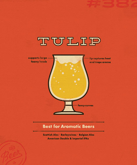
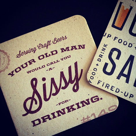
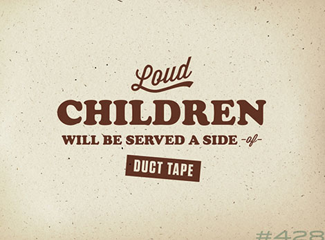
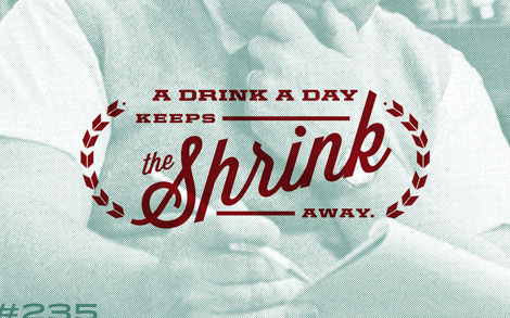
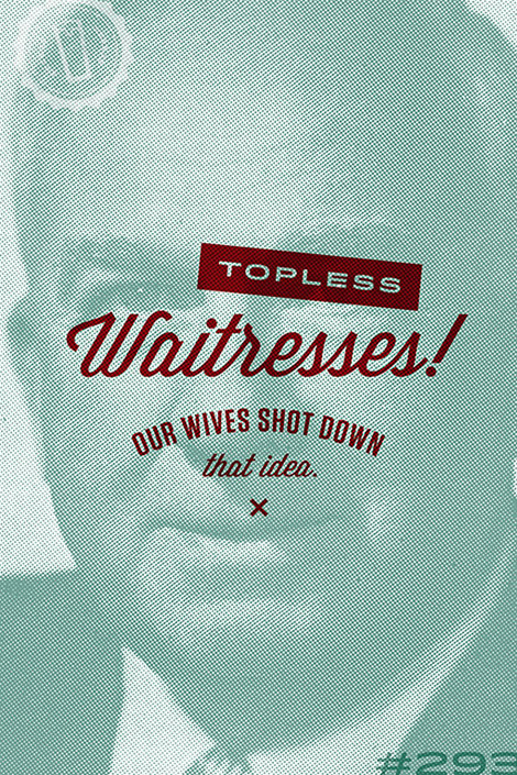
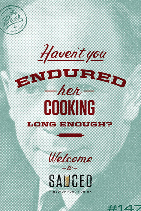
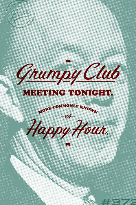
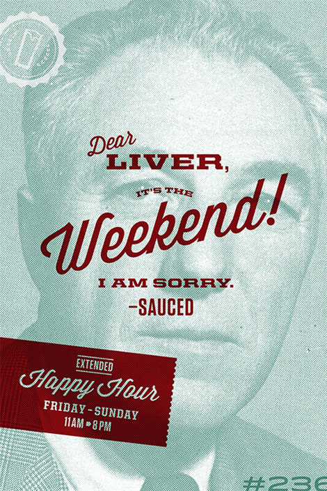
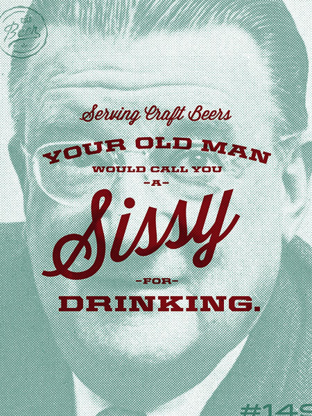
What really jumped out at me about the brand identity design for Sauced, was the tone of voice. Yes, the design work is stellar, but the brand’s tone links so excellently with the design style and delivery, it takes the experience to a new level. The voice hits its stride in the poster designs where the curmudgeon-driven tone creates playful moments. The restaurant’s logo is simple, strong, and memorable. It directly correlates to the restaurant’s offering and brand name.
Designed by Hook Worldwide.
