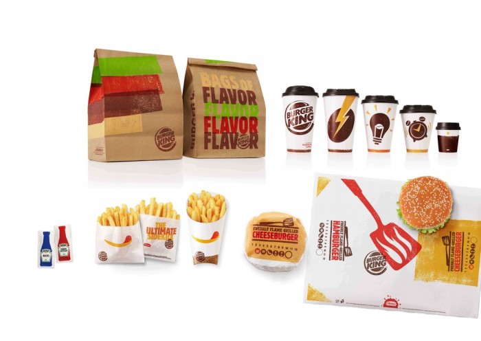
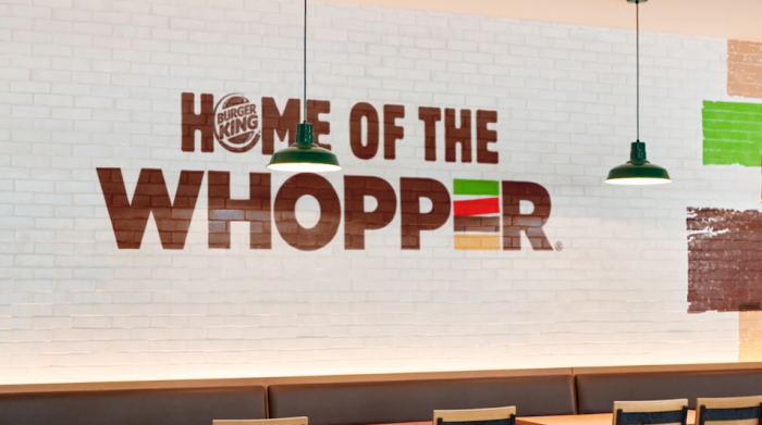
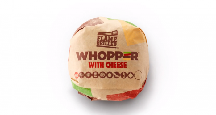
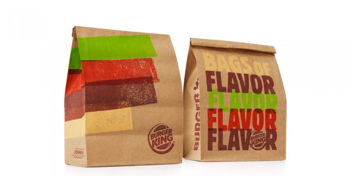
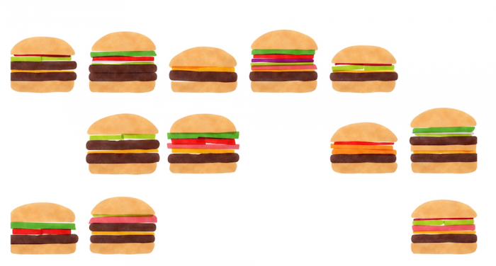
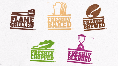
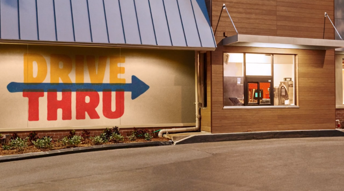
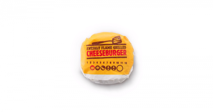
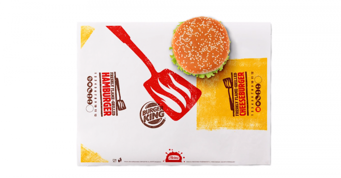
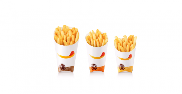
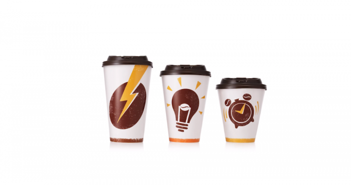
I stumbled upon this on The Dieline the other day and couldn’t believe i missed the work. Turner Duckworth freshened up the Burger King brand with a more handcrafted, artisan feel. From the fiery burger flipper graphic to the simple painted lines, the brand has that approachable feel that’s less sterile and corporate. Dare I say it’s a bit artsy? I’m really enjoying the iconography as seen across the touch points, as well as a the color palette taking influence direction from the food itself. I’d find those colors difficult to work with, but that’s one way you know it’s great design.
