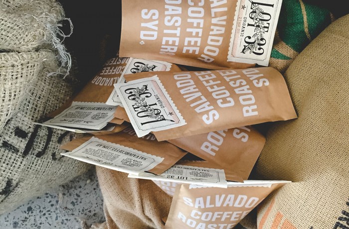
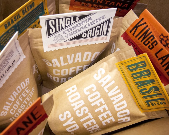
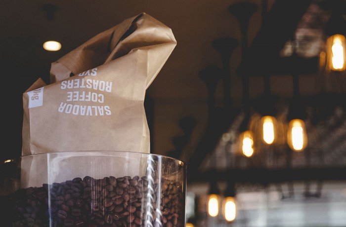
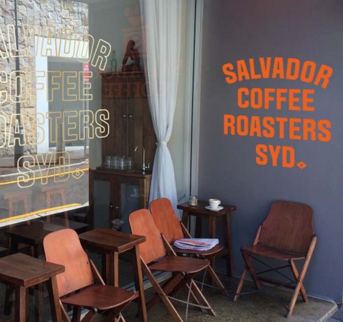
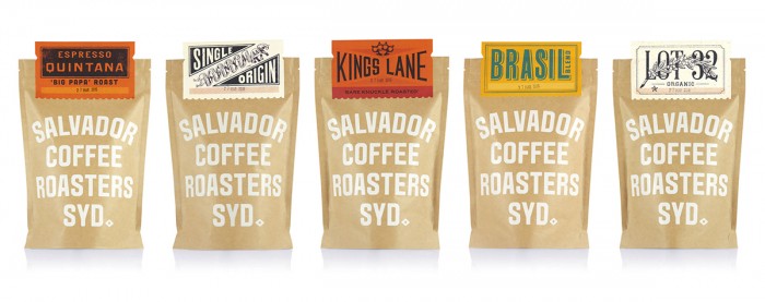
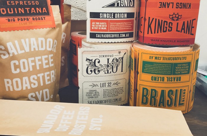
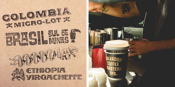
I’ve had coffee on my mind for awhile now due to a project I’m currently working on. Sorry for the over caffeination. Today I bring you a slick little brand identity and packaging design for Salvador Coffee Roasters. What’s especially different and smart about this package design is how the studio used a folded label card as the way to differentiate between each roast. This used the budget wisely as the brand only had to pay for one large run of the same back, yet gets the ability to have a multiple custom designs. The direction also shifts the common hierarchy of having the roast/flavor hero and dominate the entire package. For Salvador Coffee Roasters, it’s the brand that dominates with the roast/flavor having a smaller moment of glory. Very effective and very smart.
Designed by Co Partnership
