In part one of this series, we looked at Sbarro’s rebrand. Today, let’s tackle Cici’s.
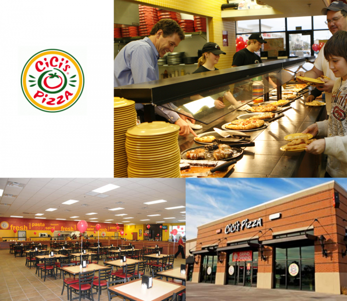
Cici’s was founded in 1985 and claims to have “invented the Unlimited Pizza Buffet concept, driven by a belief in making life more flavorful by empowering guests to find the flavors they love. At nearly 450 restaurants strong in 32 states, Entrepreneur recognized Cicis on its Franchise 500 list in 2015. Cicis also won the Technomic 2014 Consumers’ Choice award for best kid-friendly quick service restaurant.” It’s known for cheap, unlimited pizza and focuses on families on a budget. In 2015 they embarked on a rebrand starting with retooling their offering and then launching a new identity from brand logo through website and new store concept design.
When I first stumbled upon Cici’s rebrand (found it on Brand New), I was taken aback. It’s such a huge departure from the brand’s long-lasting identity that it was rather jolting. The choice to change direction is an obvious one. Cici’s, known for its uber-cheap pizza buffet, needs to offer more “beyond pizza” in order to remain competitive in the aggressive pizza vertical. A change in offering prompts the need for an identity that properly communicate said change. Cue the rebrand.
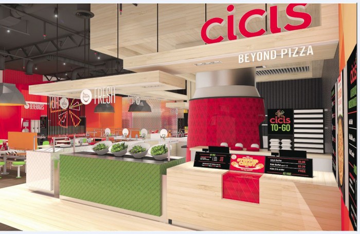
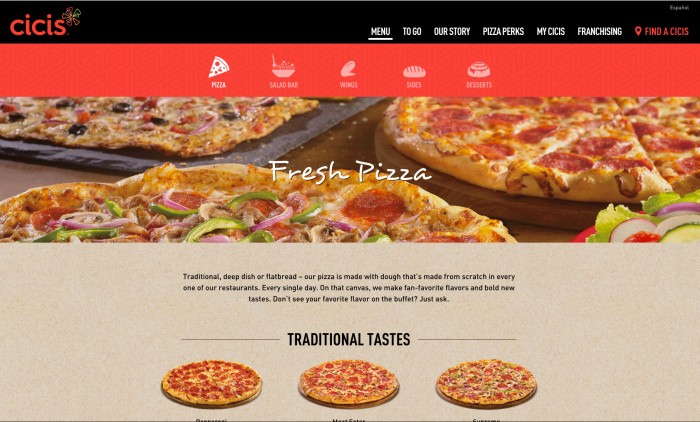
From the Cici’s press release: The new logo, which removes the word “Pizza” from its name and adds the modifier “Beyond Pizza,” acknowledges that Cicis is not just another pizza place and serves a lot more than pizza — including salad, soup, pasta, desserts and a fun gameroom experience. The logo is comprised of unique shapes of various colors converging around a central point, representing variety, as well as individuals coming together.
![]()
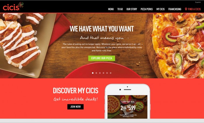
As you can see the new Cici’s logo takes the brand into a modern, artistic realm. The semi-abstract, semi-obvious brand mark is built from shapes of pizza slices. I would say having a mark that’s so directly correlated with pizza is a bad move if a brand is trying to move away from a pizza-only message. Heck, food in the logo in general is a no-brainer, forgettable idea.
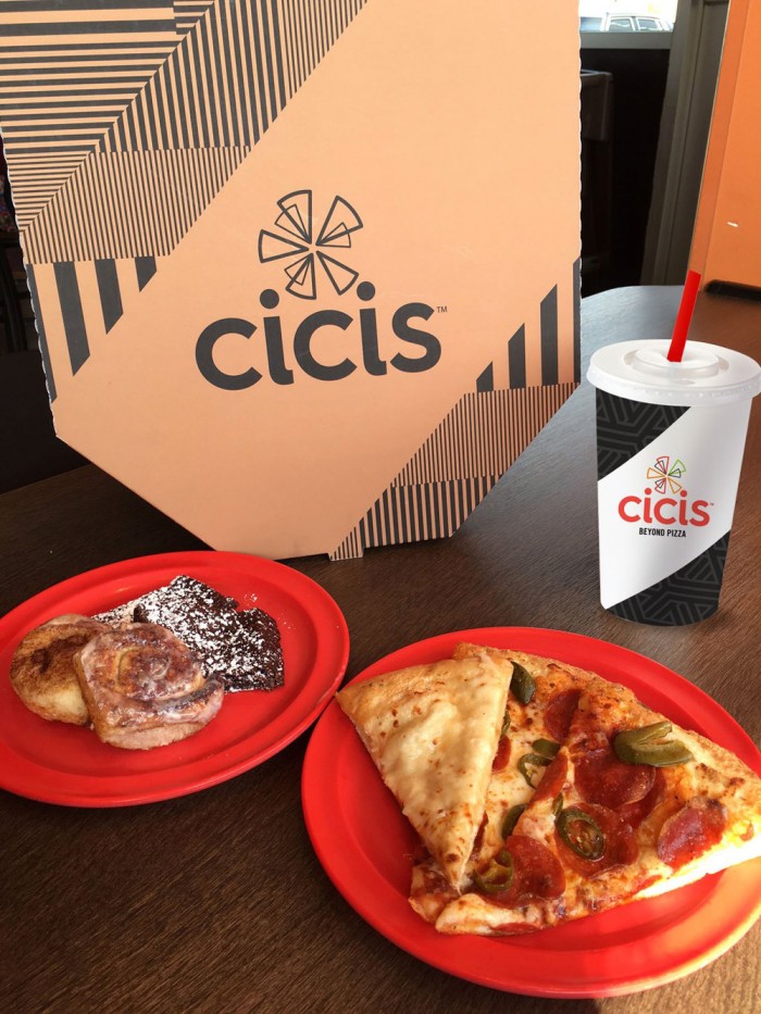
The brand identity starts to set a tone with the initial touch points design as seen in the cup and pizza box. The introduction of stripes as a graphic devices starts to become interesting, but seems incredibly disjointed from the brand logo, as Armin at UnderConsideration’s Brand New blog points out. The interiors are a nice improvement with a lot of interesting textures and pops of color. It begs the question, why did the identity fall so short? Where’s the life in the touch points?
In closing, I’d like to touch on their tagline: Better. Believe it!™ Yikes. That seems incredibly domineering and presumptuous. Better by who’s standards? Definitely not mine. It also comes of as if they’re clamoring to diminish an insult with a childlike, “No I’m not! Nuh-uhhhh!” I imagine them stomping their feet in a circle while reading it. Again, Cici’s has made changes for the better, but without a clear vision of why they exist, the identity and angle come off like the novelty of a ploy.
Designed by Stering-Rice Group. Implementation by Backlot Productions.