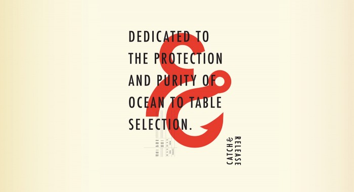
This project has been making the rounds on the design blog circuit (I think there’s a circuit.) Either way, it’s phenomenally well thought out and executed from beginning to end.
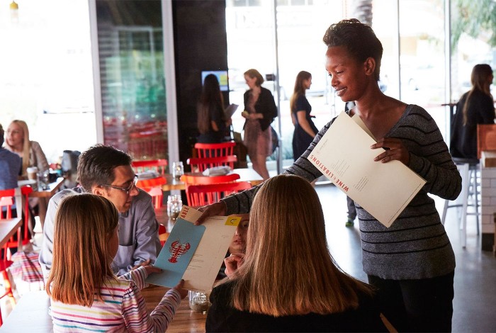
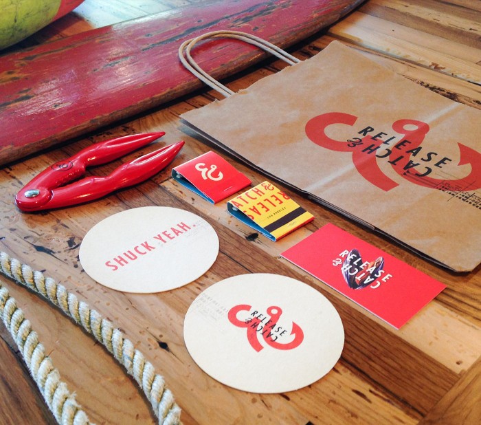
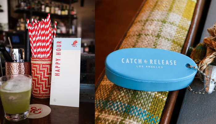
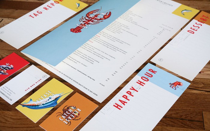
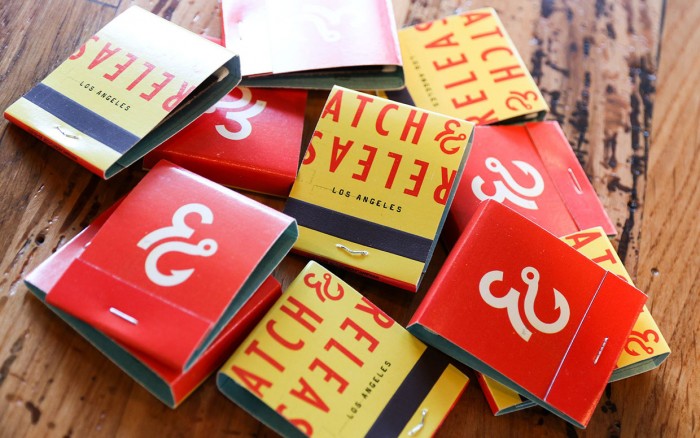
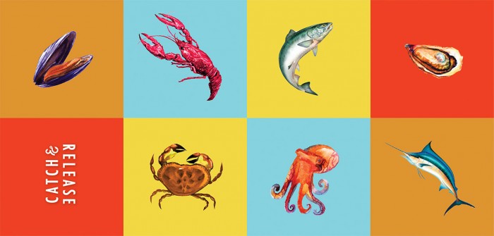
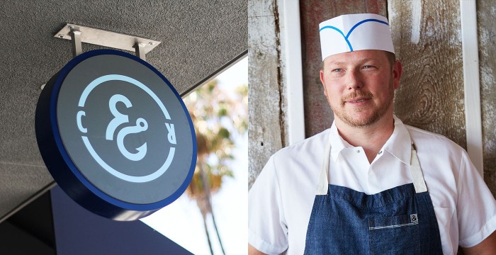
Starting with the logo design, the Catch & Release restaurant brand takes a transitional approach to the design. It’s a smart mix of modern and classic styles that meld to create an approachable and fresh experience from identity through interiors. The logo is marked by an ampersand/hook graphic element that quickly interprets the core food offering of seafood in a unique, memorable way. From there, the identity is built on planes of soft colors overlayed with a strong compressed sans-serif modern type treatment. Use of a grid, sometimes visibly, creates an orderly, strong layout for menu elements, website and other touch points.
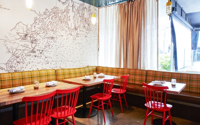
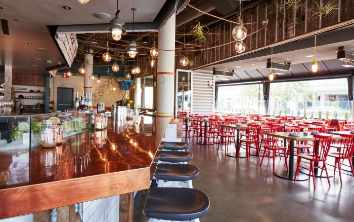
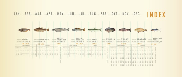
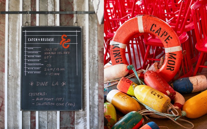
What’s so strong about this brand identity is the fluidity of the elements. Everything works together to create an overarching identity while dodging the “slap the same logo on everything” approach. Smart use of new phrases like “ocean to table” takes the idea of farm to table into the seafood world. The interiors bring the often expected shoreline/beach look to a modern style with excellent design touches like the brilliant use of nautical charts and maps to inspire design elements. And how awesome is the thinking and execution of the calendar that shows availability of different fish/seafood types throughout the year?
This restaurant brand identity had me saying, “Shuck Yeah!” … as they say at Catch & Release.
Designed by Farm Design.
