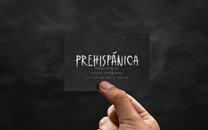
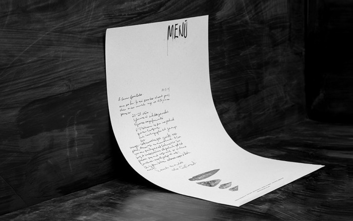
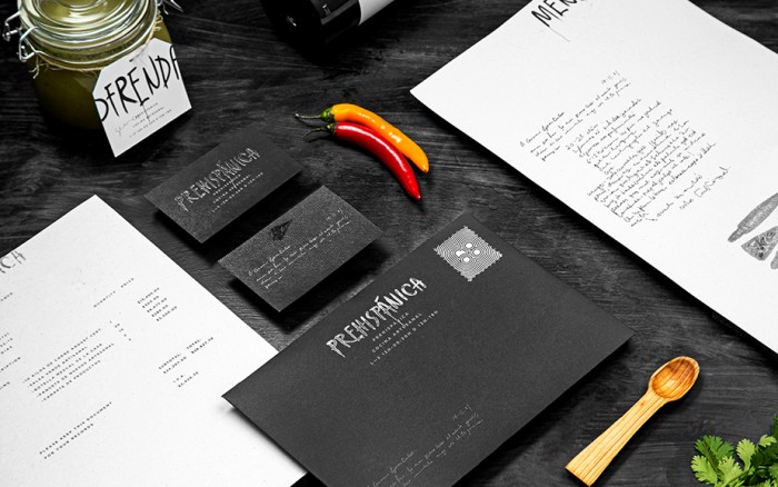
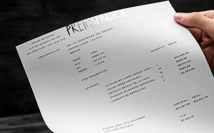
Prehispanica is a “traditional Mexican cuisine restaurant located in Guadalajara, Jalisco where you will be able to enjoy any typical Mexican dish.” The brand is a mix of modern and raw that conveys a passionate craft. It’s one part refined and one part guerilla. The team at Anagrama describes their work perfectly:
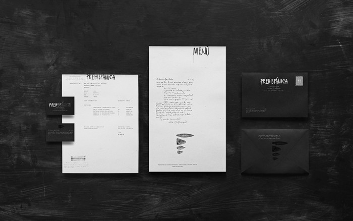
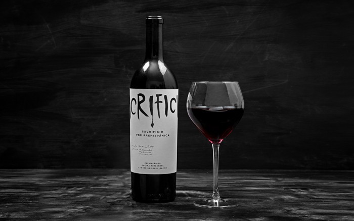
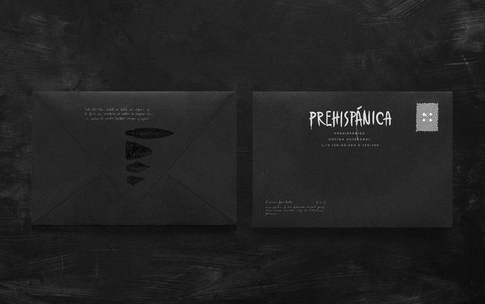
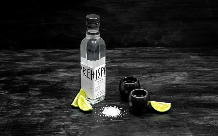
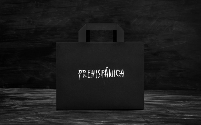
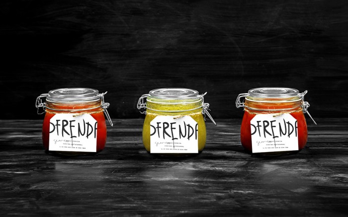
The logotype was inspired, mainly on traditions and rites performed in Mexico in the days before the Spanish Conquest. The names for some products such as the wine, mezcal and sauces were based on the same idea.
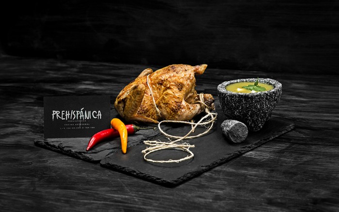
The restaurant brand employs icons based on prehispanic tools used in the rites from that era. The color palette in Prehispánica is dark, representing the toughness of the era. At the same time, a silver foil is used on the logo printing a modern twist on the brand and its collateral.