Steve’s Ice Cream packaging design

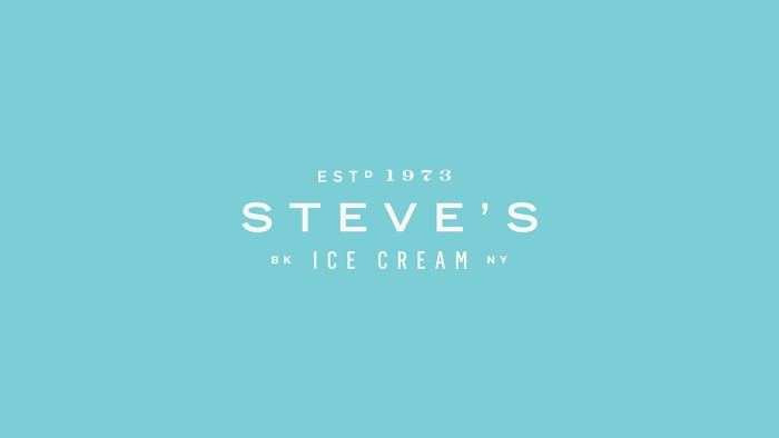
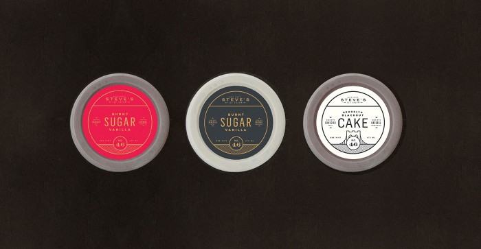
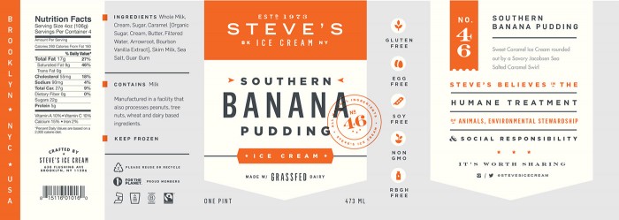
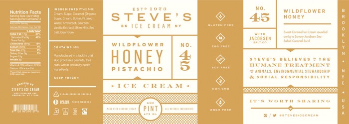
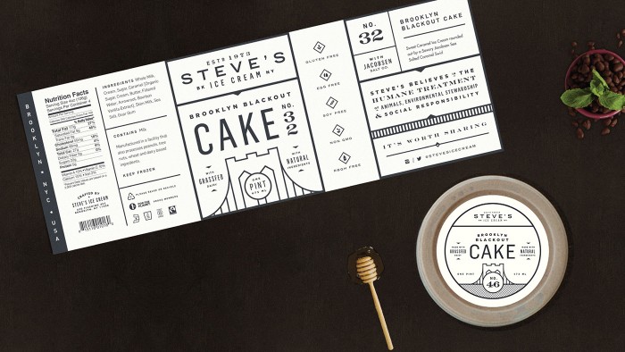
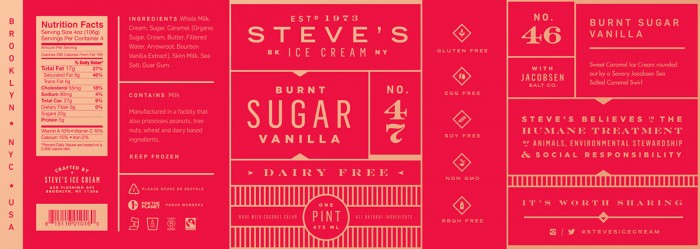
I don’t often post work that wasn’t used or didn’t see the light of day, but this one is too good to leave in the dark. Chris Allen crafted this lovely  ice cream package design and brand family for Steve’s Ice Cream in Brooklyn. Unfortunately, the client killed the direction, but it’s absolutely too stellar to not show.

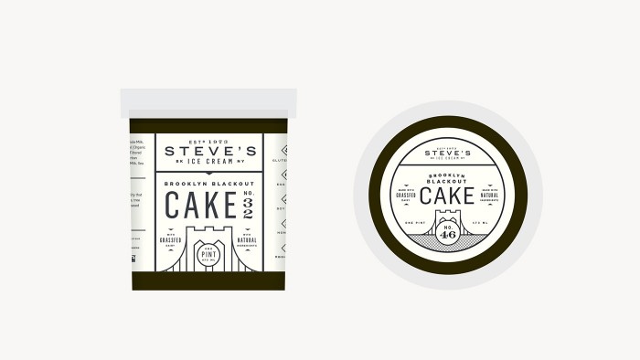
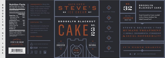
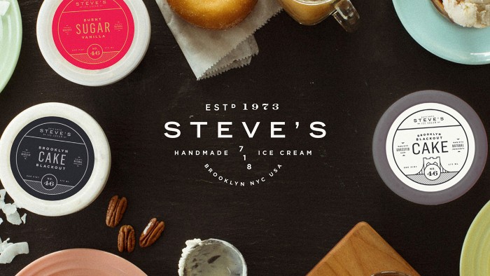
Chris melds classic design accoutrements like the stamp with strong grid layouts and color treatments to create a family of packaging. Each product has it’s own vibe and feel while adding to the strength of the overall Steve’s brand. The beautifully crafted numbers make for an amazing nod to classic craftsmanship, while the clean lines add a note of modernism to brand packaging.

Designed by Chris Allen

StevesIceCreamBehance


StevesIceCreamBehance


StevesIceCreamBehance


StevesIceCreamBehance

StevesIceCreamBehance

StevesIceCreamBehance

StevesIceCreamBehance

StevesIceCreamBehance

StevesIceCreamBehanceStevesIceCreamBehance


StevesIceCreamBehance

StevesIceCreamBehance

StevesIceCreamBehance


The Forktales Podcast™: Interviews with restaurant industry leaders and visionaries

Restaurant and advertising industry headlines and thinking

Reviews of restaurant experiences from around the globe 

Reviews of our favorite design, business, & restaurant books

Our favorite typography and fonts

Inspiration in your inbox

Get the latest inspiration in your inbox every Monday morning, for FREE!

"*" indicates required fields

This field is for validation purposes and should be left unchanged.

Delicious Bits in your Inbox!

Get the latest and greatest content delivered to your inbox for free!

"*" indicates required fields

This field is for validation purposes and should be left unchanged.