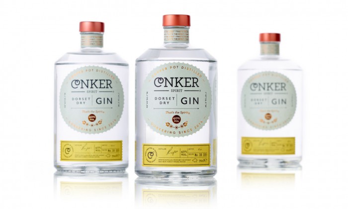
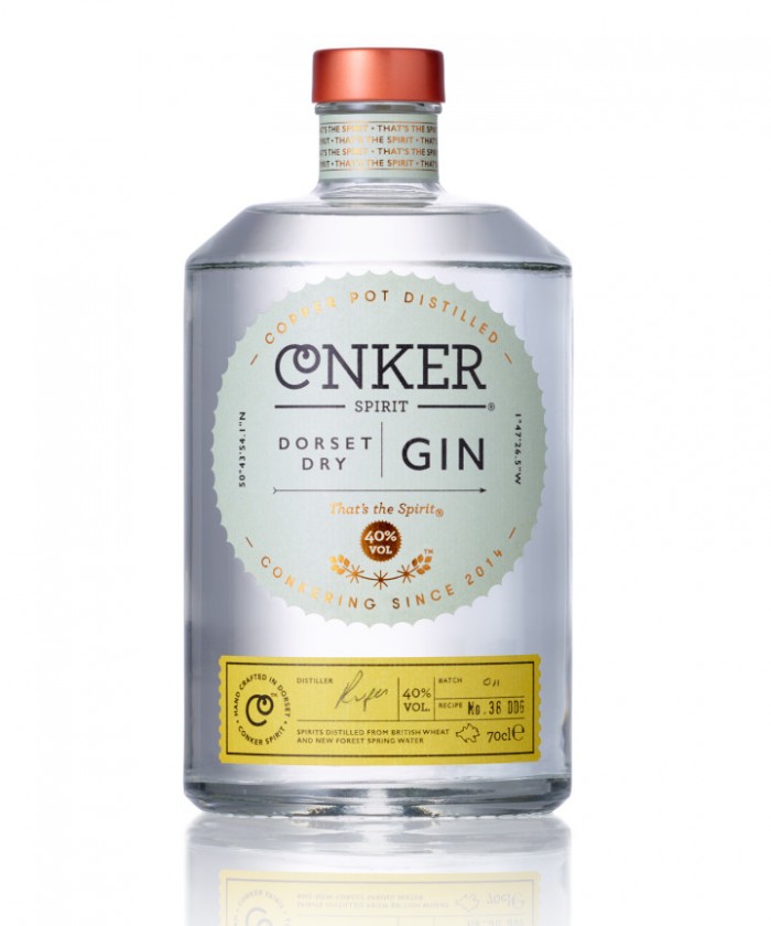
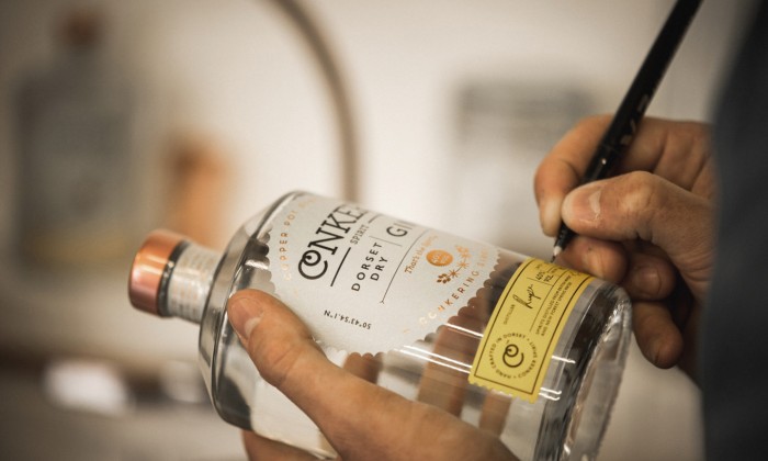
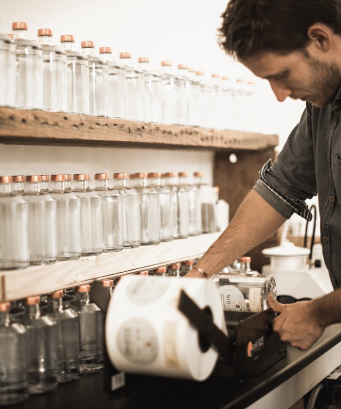
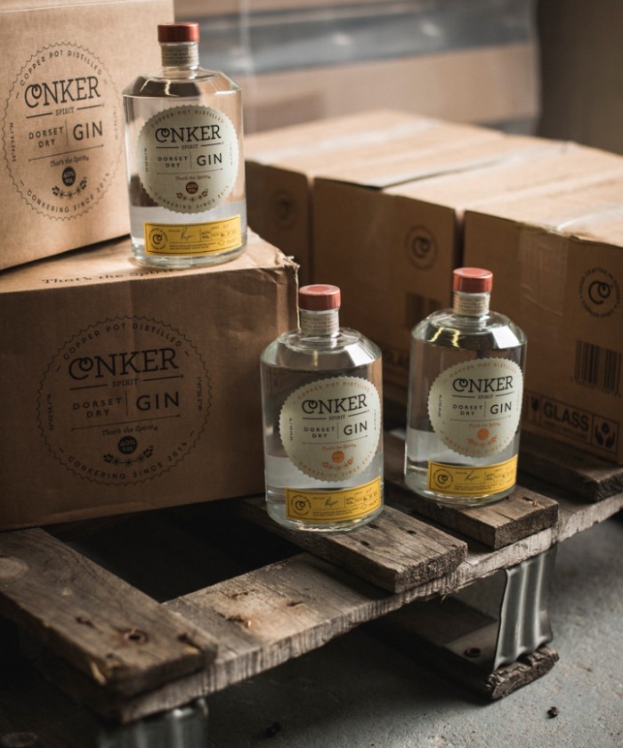
Loving the design for this gin brand by Interabang in the UK. It’s a great mix of classic, vintage styles and new directions.

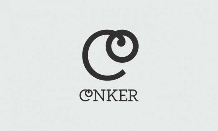
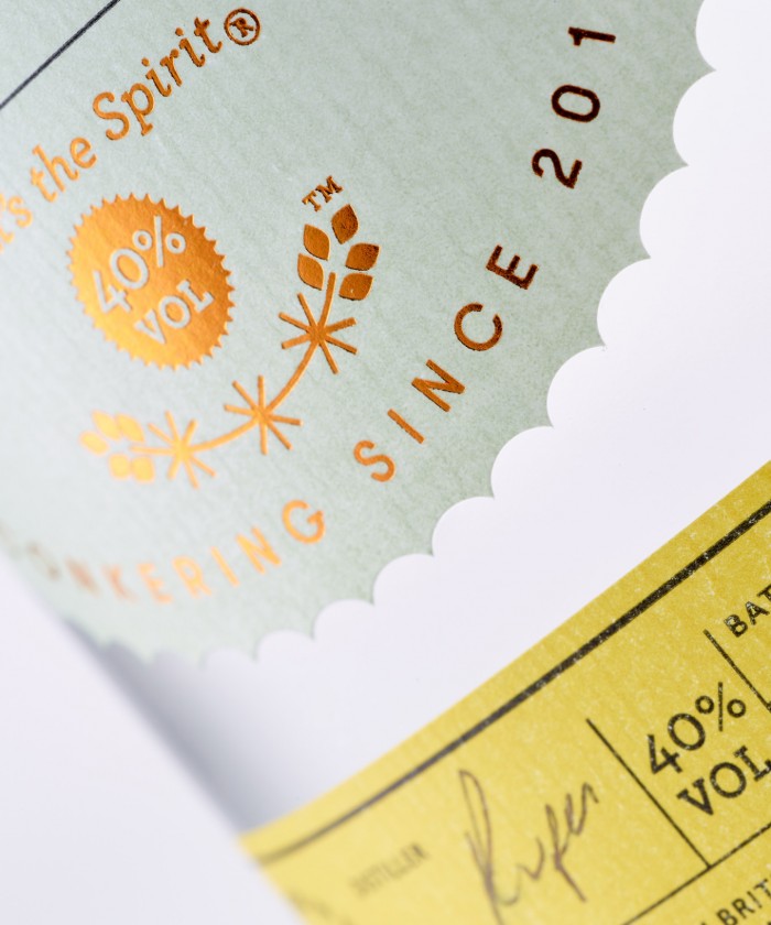
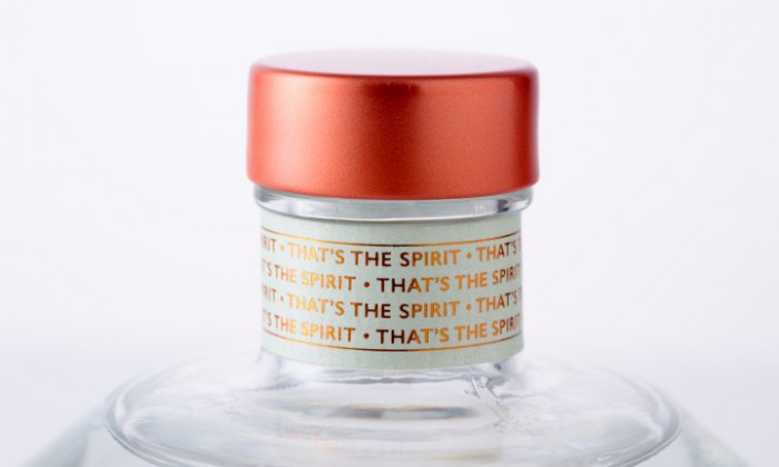
“Inspired by the coast, we looked to the typography of vintage railway signs, tickets and posters to evoke the nostalgia of trips to the seaside, and the bottle itself was chosen for its nautical feel. Design cues were taken from the name, which inspired the shell-like shape of the main label. The name also led to the ‘CO’ ligature in the word marque (a graphic conker on a string), which is used as a visual shorthand for the brand.”

CO_CO1_2800X1680-1360x816

CO_CO2_2800X1680-720x432

CO_CO3_1400X1680-720x864

CO_CO4A_1400X1680-1360x1632

CO_CO5_big_2800X1680-1360x816

CO_CO7_1400X1680-720x864

CO_CO8_2800X1680-720x432

CO_CO9_1400X1680-720x864

The Forktales Podcast™: Interviews with restaurant industry leaders and visionaries

Restaurant and advertising industry headlines and thinking

Reviews of restaurant experiences from around the globe 

Reviews of our favorite design, business, & restaurant books

Our favorite typography and fonts

Inspiration in your inbox

Get the latest inspiration in your inbox every Monday morning, for FREE!

"*" indicates required fields

This field is for validation purposes and should be left unchanged.

Delicious Bits in your Inbox!

Get the latest and greatest content delivered to your inbox for free!

"*" indicates required fields

This field is for validation purposes and should be left unchanged.