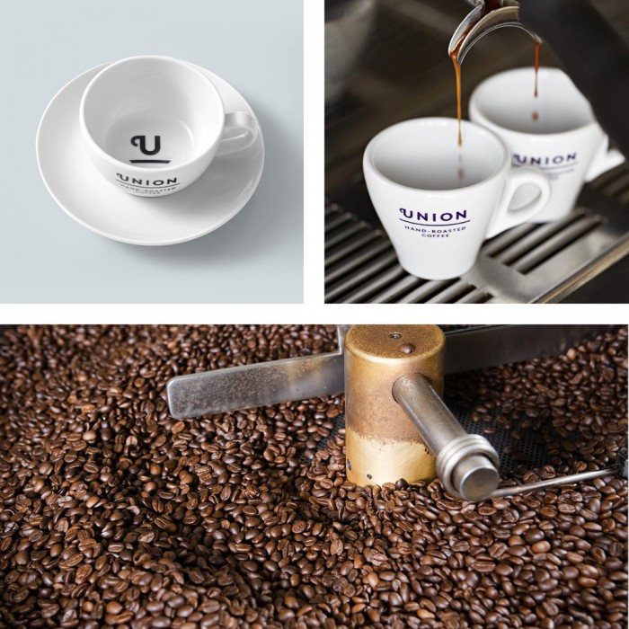
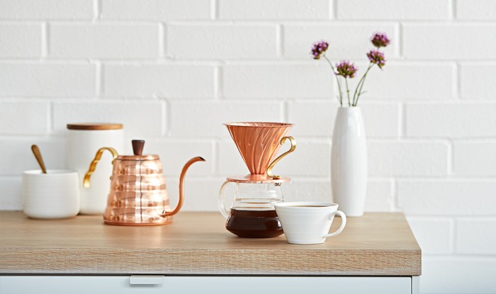
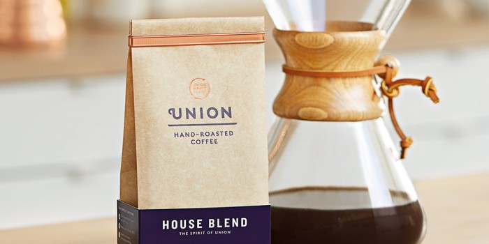
There’s nothing quite like a subtle, poignant, well placed mnemonic device to take an identity to all new levels. That’s exactly what’s happenining with the brand identity for Union, a hand roasted coffee company. Union is a small batch hand roasted coffee from East London. The main goal of the new brand identity was to portray the premium quality. Union doesn’t sell a coffee roast unless it scores 84+ on the SCAA sensory scale. Secondarily Union wanted to simplify the visual elements used across the brand’s touch points. I think it’s safe to say: Mission Accomplished.

Designed by Studio Output

download (1)

download (2)

Union_HalfWidth_091

Union_Square12

download (3)

download (4)

download (5)

download (6)

download (7)

download

The Forktales Podcast™: Interviews with restaurant industry leaders and visionaries

Restaurant and advertising industry headlines and thinking

Reviews of restaurant experiences from around the globe 

Reviews of our favorite design, business, & restaurant books

Our favorite typography and fonts

Inspiration in your inbox

Get the latest inspiration in your inbox every Monday morning, for FREE!

"*" indicates required fields

This field is for validation purposes and should be left unchanged.

Delicious Bits in your Inbox!

Get the latest and greatest content delivered to your inbox for free!

"*" indicates required fields

This field is for validation purposes and should be left unchanged.