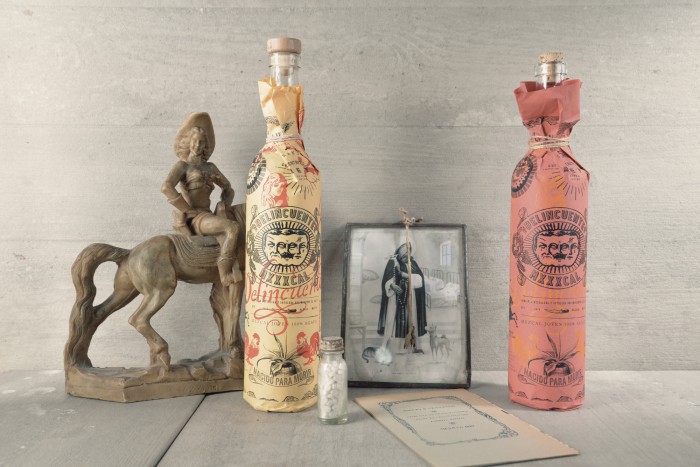
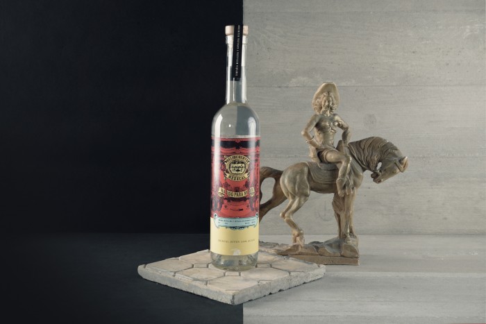
Just got back from a week in Mexico and still have the need for more. So, why not post this cheeky, bold Mezcal branding and packaging design work by Estudio Yeye?
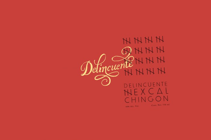
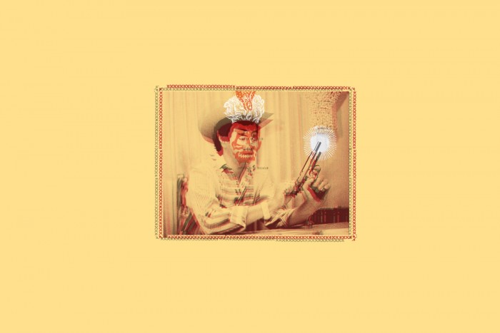
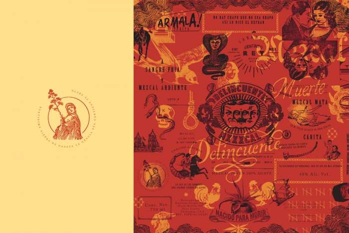
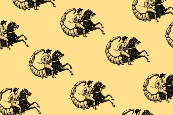
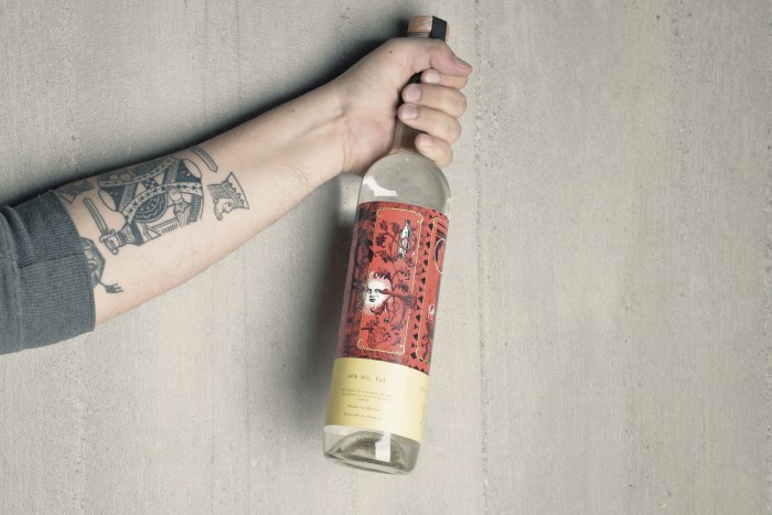
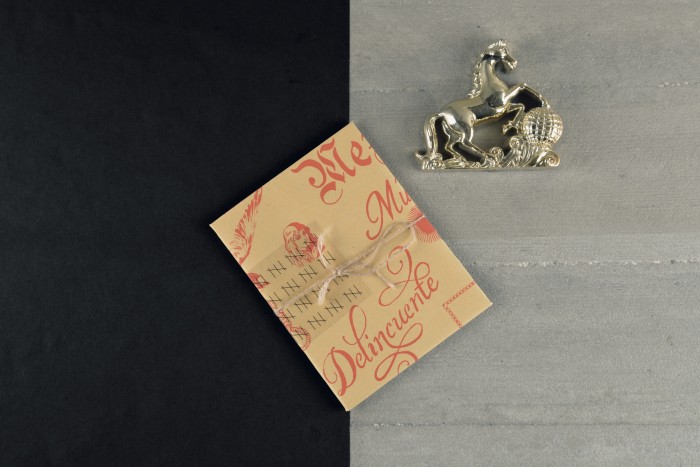
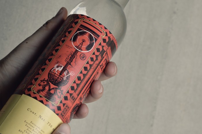
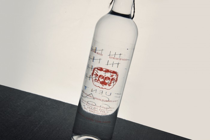
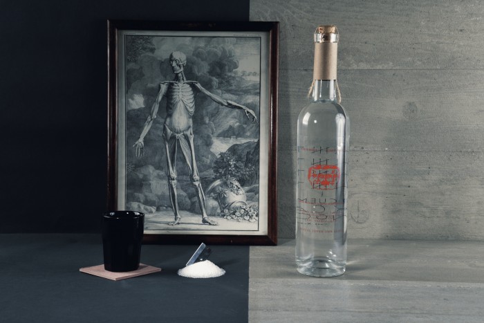
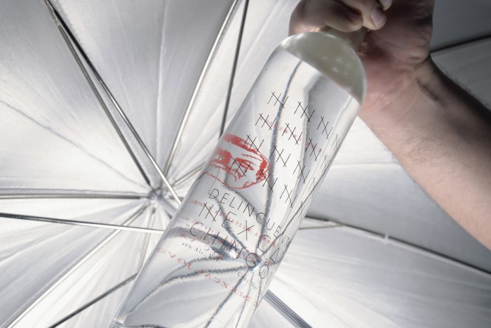
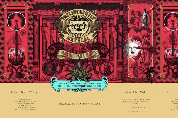
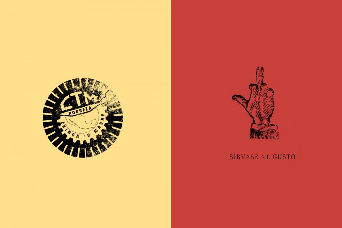
The brand name is Delincuente which translates to “criminal” or “Offenders” in English. The brand takes that and runs with a bold brand from middle fingers to rancheros riding scorpion-horse hybrids. The style is very “Mexican” with the muddy reds and golden yellow colors. The typography is hand rendered which nods to the craft and rustic nature of the brand. Here is the studio’s approach:
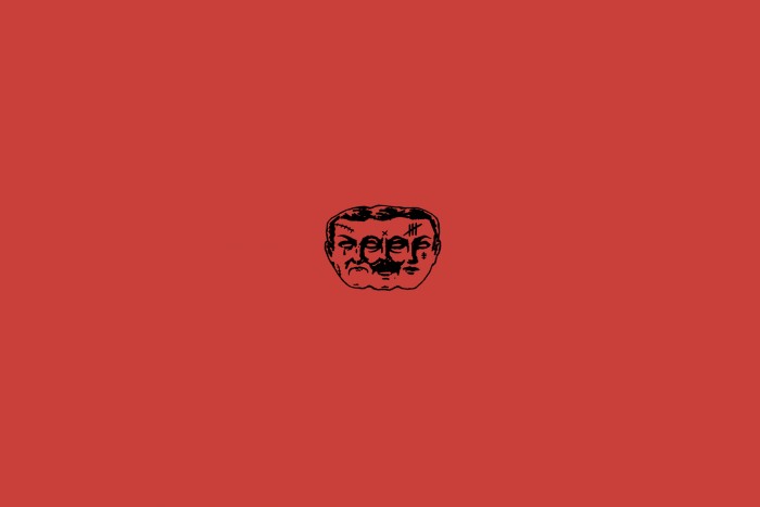
Offenders is a leading mezcal With its graphic, visual culture and STI Chalino Sanchez as the main character. He is Considered the king of the corrido, a Mexican folk song Which tells us About the great deeds of Mexican criminals. Achieving two brand logos by portraying the drug dealing and the illegal Peasants glam poverty, the One Who harvest out casted in the Sierra. A single product With an easy and economical design execution, but full in message.
Designed by Estudio Yeye