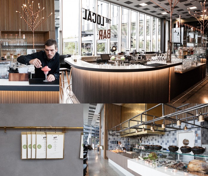
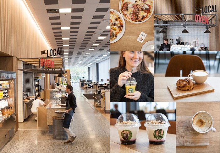
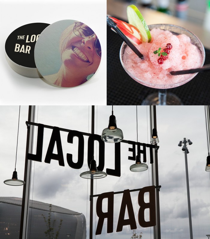
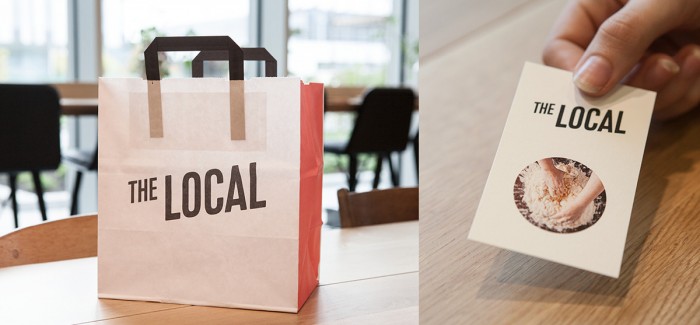
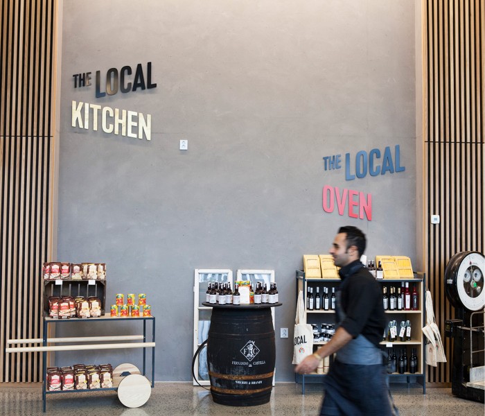
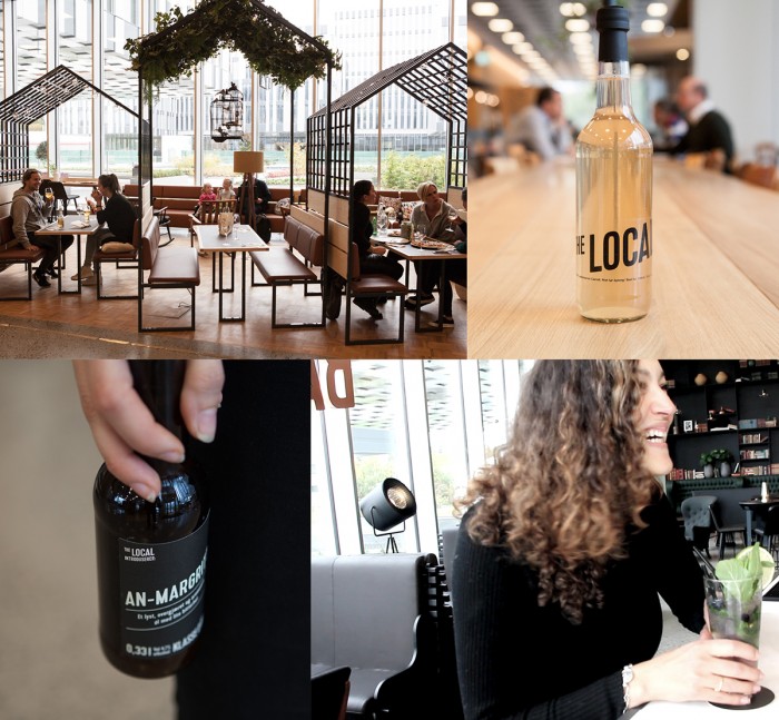
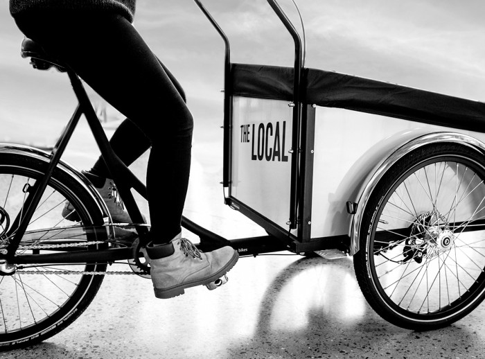
From the Dinamo website: The Local is a food court and restaurant located at Fornebu just outside Oslo, Norway. The Local provides a destination focusing on local food and products presented within the three concepts The Local Oven, The Local Kitchen and The Local Bar. Situated in a recently developed suburb of Oslo, it’s crucial that The Local constitutes a meeting point for people living and working in the area.
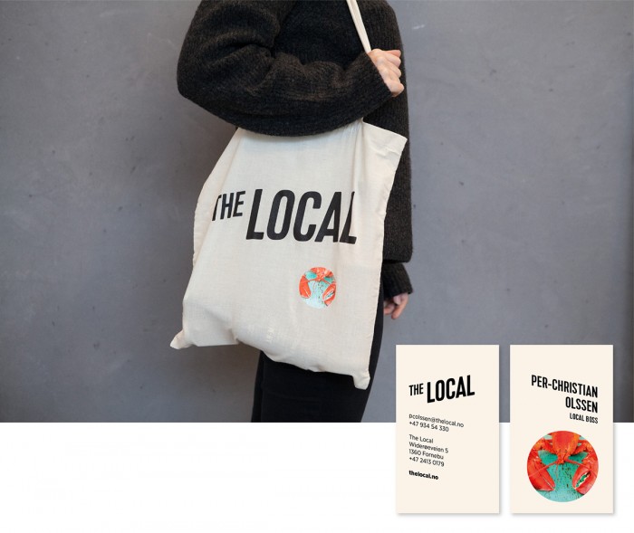
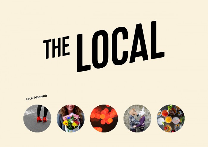
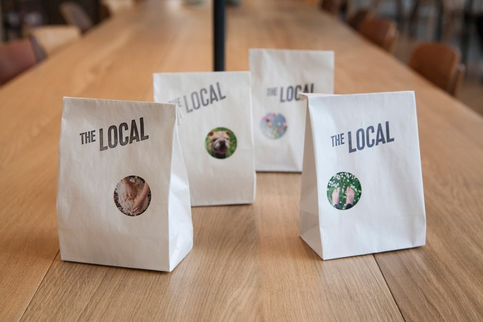
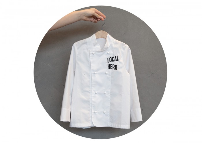
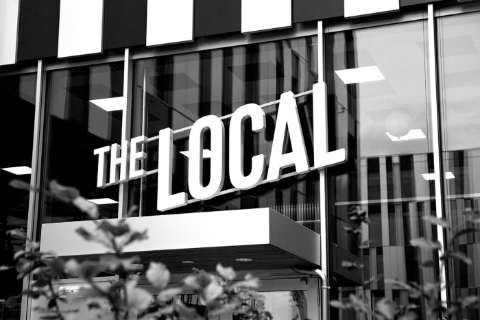
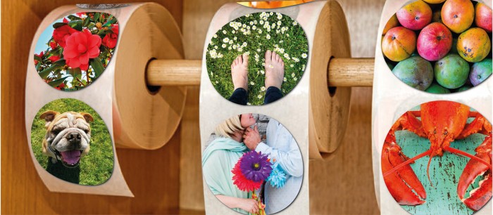
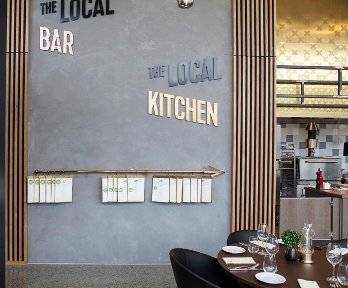
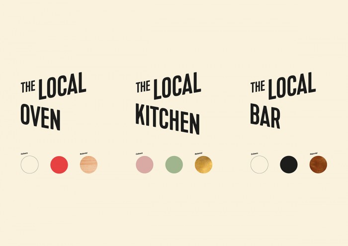
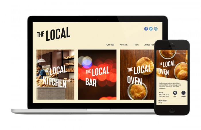
Dinamo developed the concept, name, visual identity and interior concept and guidelines for The Local. The toolbox is kept rather simple to keep the identity flexible and easy to implement with the use of stickers, single colour logo and tilted typography.
What’s really working for this identity is the simplicity of the design. It’s subtle, but effective in marking the space as modern. The slanted type treatment creates this dimension when used with the sub brand titles. Almost like a city block in perspective.
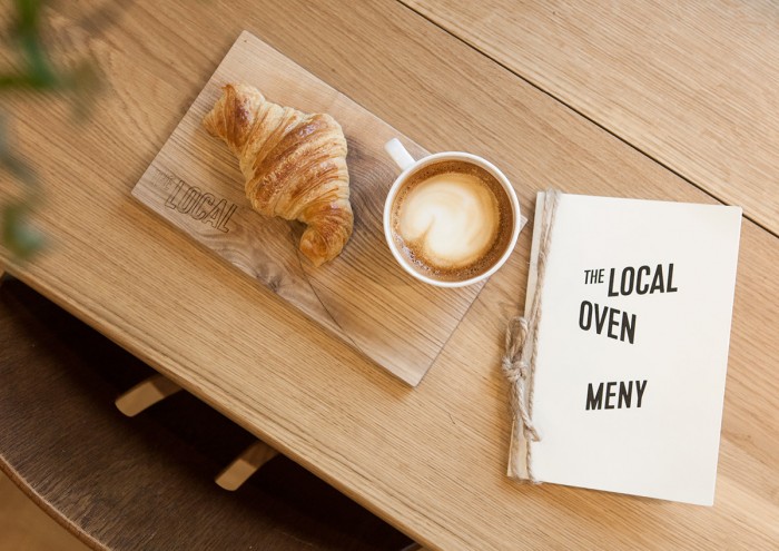
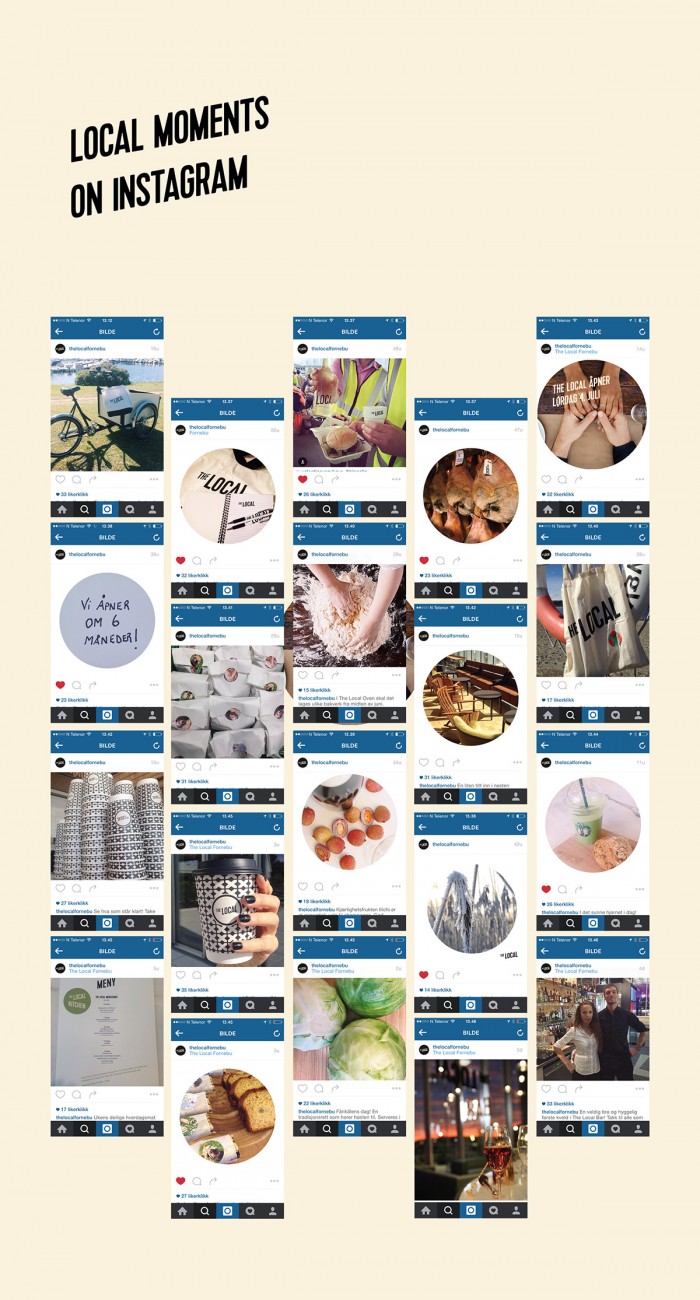
The design and layout for menus and other touch points support the core identity elements perfectly with simple, strong aesthetics. Photographic circle elements create a pop of uniqueness that glues the identity elements together even with social media. Quite beautifully done.
Designed by Dinamo Design – Rikke Hatlo, Simen Grankel, Alexandra Schou Salbu
