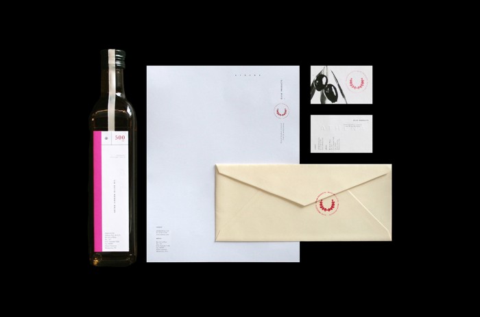
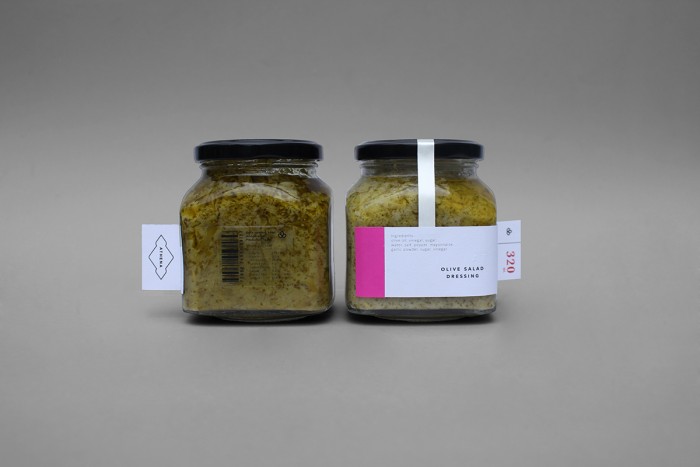
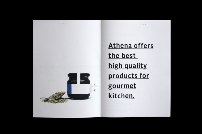
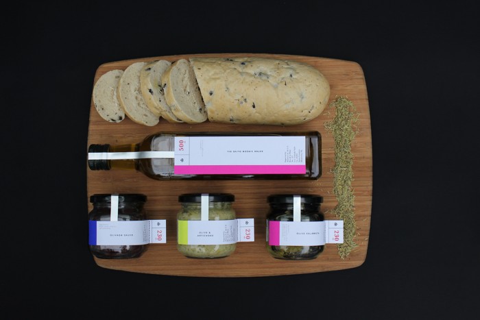
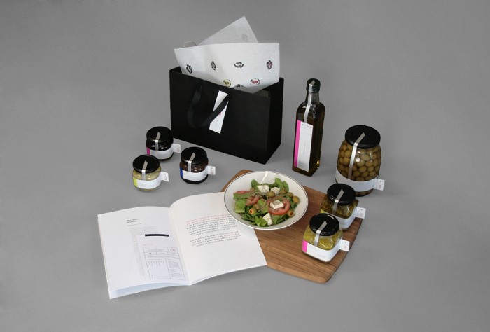
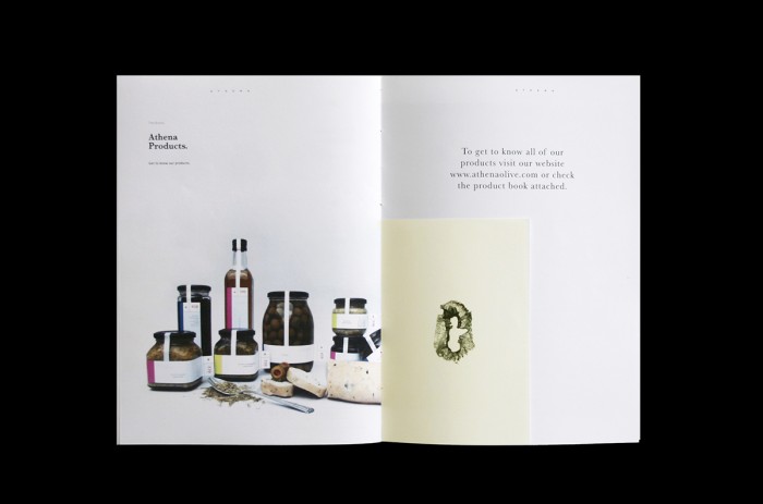
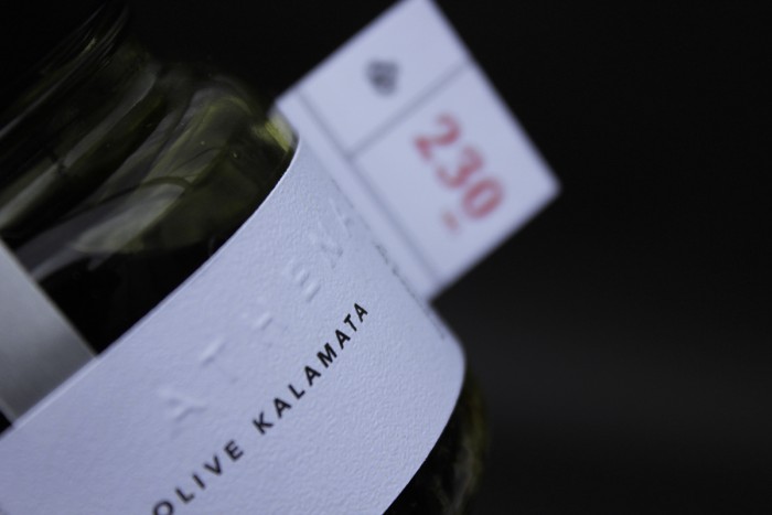
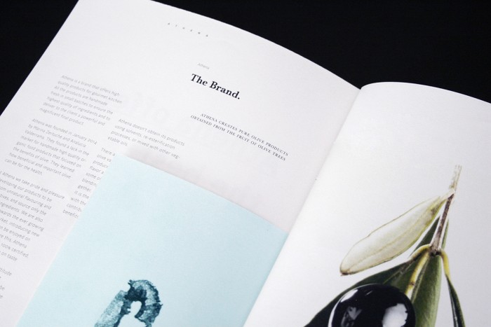
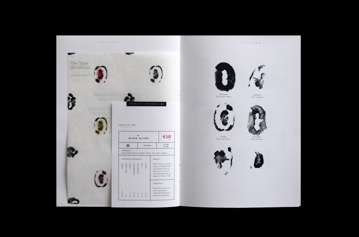
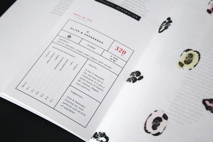
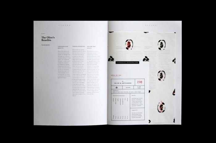
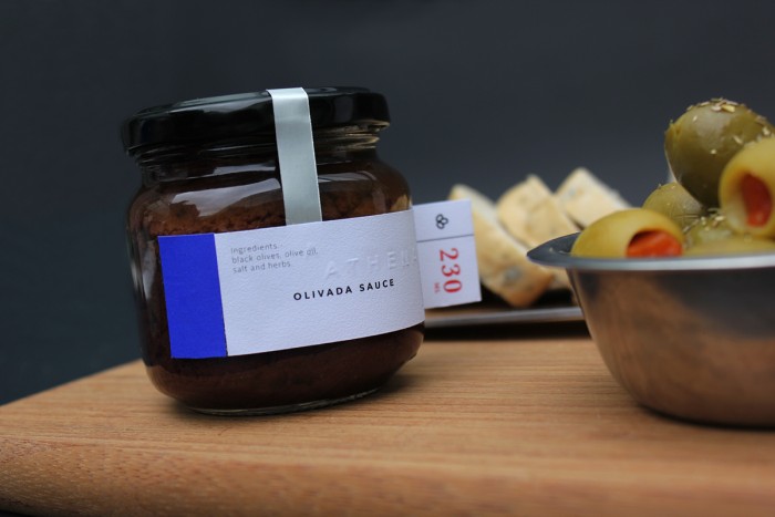
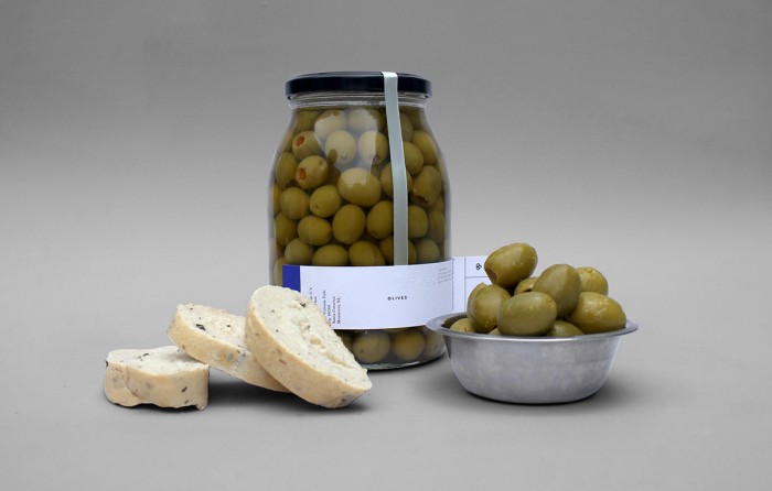
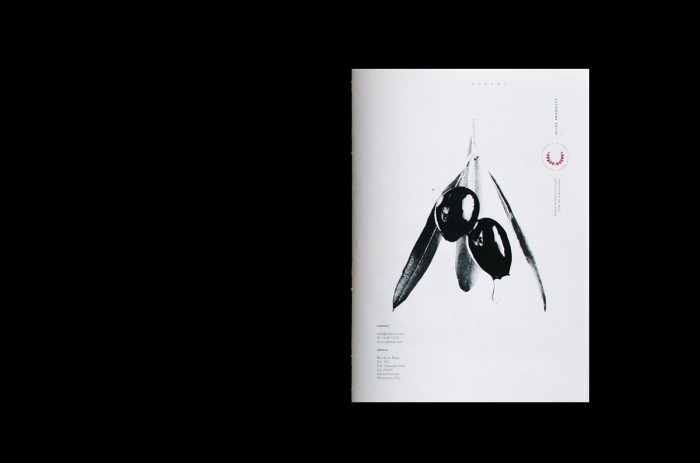
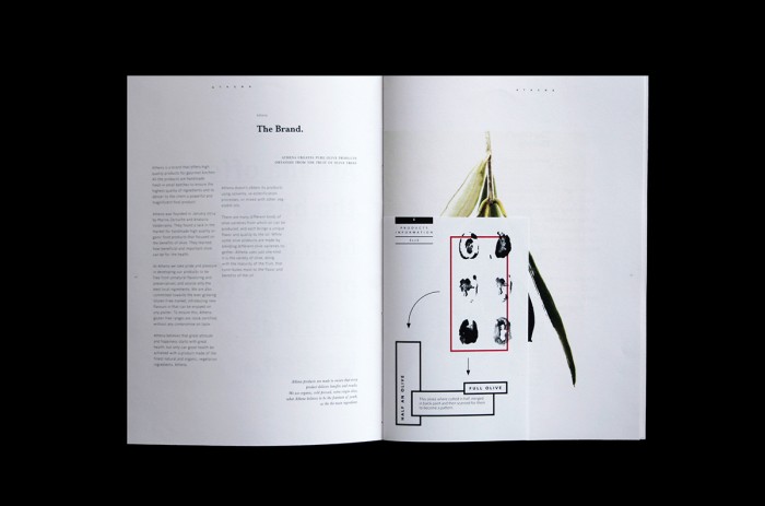
I’ve always had a secret yearning for working on an olive oil product brand and packaging. It’s so easy to fall into cliche’s with the product. The brand identity and packaging for Athena skews different. It’s very minimal and simple, but with notes of classic design influence. Specifically the laurels are a device that looks quite dramatic set on the stark white plates used throughout the design touch points.
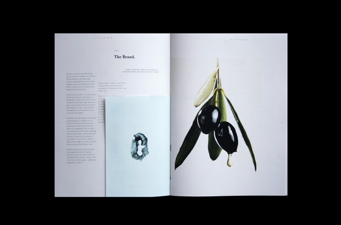
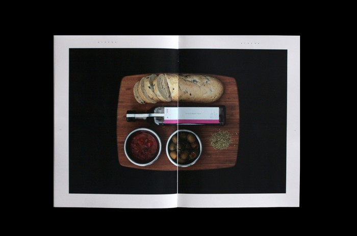
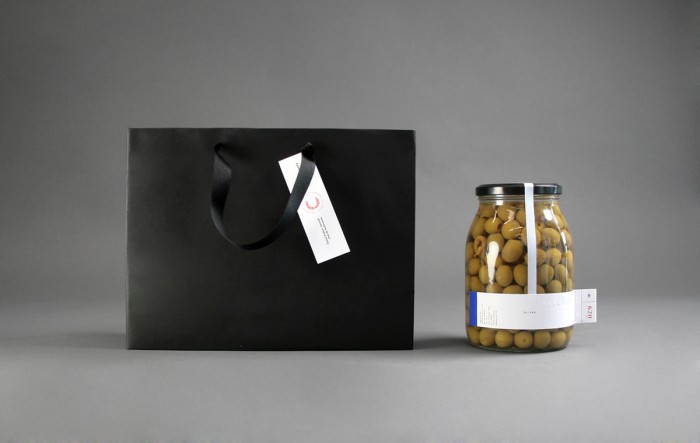
The minimal design allows space for special treatments, like rubber stamps and embossing, to shine and create unique moments in a piece. We’re seeing that here with the label design and various elements. A bright magenta creates exhilaration when used, which plays nicely with the uber photography of the product origins.
Designed by Marina Zertuche & Ana Lucía Valderrama
