Chapman’s Brewery branding

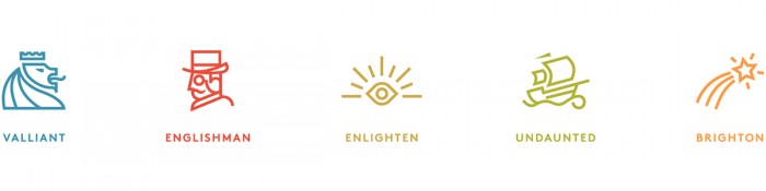
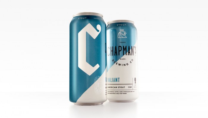
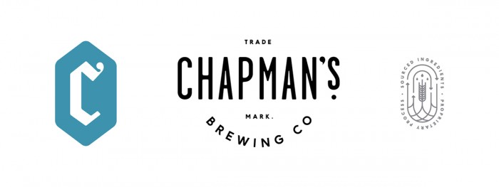
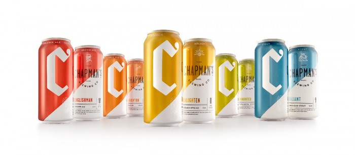
This one is a bit older, but when I came across it I just had to share. The bold clean planes of color set a beautiful backdrop to the “C” letterform that champions this brewery’s brand. Other elements break that plane creating intrigue while iconography helps denote the brew style in conjunction with the color. The family of brews jump out with their simplicity in a sea of craft beer that seems to try to out hipster each other. Quite well done.

Designed by Cue

b7754635412185.56f5b2eb0f82c

SONOS_Work_BlueNote

1c861a35412185.56f5b2eb0ec8c

aa733735412185.56f5b2eb0f2b6

The Forktales Podcast™: Interviews with restaurant industry leaders and visionaries

Restaurant and advertising industry headlines and thinking

Reviews of restaurant experiences from around the globe 

Reviews of our favorite design, business, & restaurant books

Our favorite typography and fonts

Inspiration in your inbox

Get the latest inspiration in your inbox every Monday morning, for FREE!

"*" indicates required fields

This field is for validation purposes and should be left unchanged.

Delicious Bits in your Inbox!

Get the latest and greatest content delivered to your inbox for free!

"*" indicates required fields

This field is for validation purposes and should be left unchanged.