Dasani® Sparkling water package design

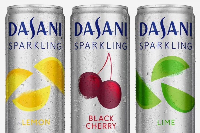
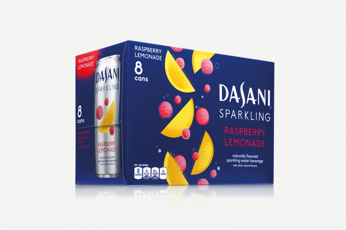
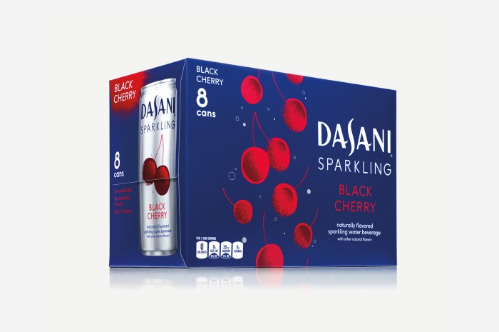
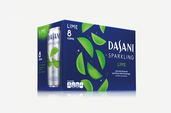
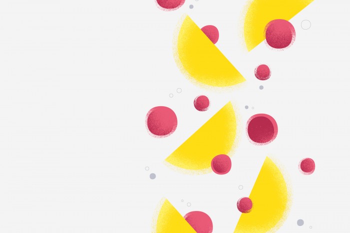
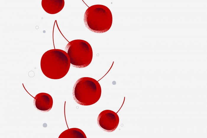
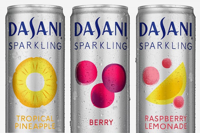
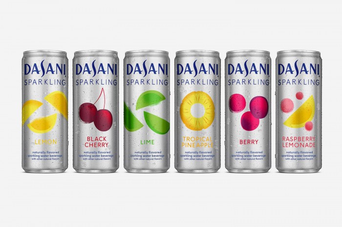
Moniker posted their latest work for Dasani’s line of sparkling water recently. I had to repost it right away. It’s simple, clean and refreshing to the eye. The highly diffused illustrations make use of a beautiful texture seen more and more in the illustration world. This is offset by clean, modern typography creating a lovely visual message. The design team’s approach:

Our strategy sought to elevate and simplify the brand by creating a clean and sophisticated look and feel. We streamlined the entire system including logo, typography, color palette and packaging to enhance shelf impact while maintaining a strong connection to the parent brand.

Designed by Moniker

DASANI_Sparkling_02_A

DASANI_Sparkling_05

DASANI_Sparkling_04

DASANI_Sparkling_03

DASANI_Sparkling_09

DASANI_Sparkling_08

DASANI_Sparkling_07

DASANI_Sparkling_06

DASANI_Sparkling_11

DASANI_Sparkling_01

DASANI_Sparkling_02_B

DASANI_Sparkling_02


The Forktales Podcast™: Interviews with restaurant industry leaders and visionaries

Restaurant and advertising industry headlines and thinking

Reviews of restaurant experiences from around the globe 

Reviews of our favorite design, business, & restaurant books

Our favorite typography and fonts

Inspiration in your inbox

Get the latest inspiration in your inbox every Monday morning, for FREE!

"*" indicates required fields

This field is for validation purposes and should be left unchanged.

Delicious Bits in your Inbox!

Get the latest and greatest content delivered to your inbox for free!

"*" indicates required fields

This field is for validation purposes and should be left unchanged.