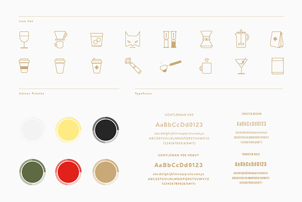
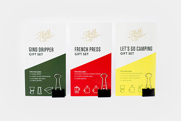
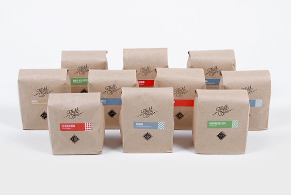
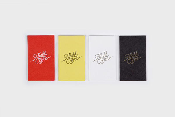
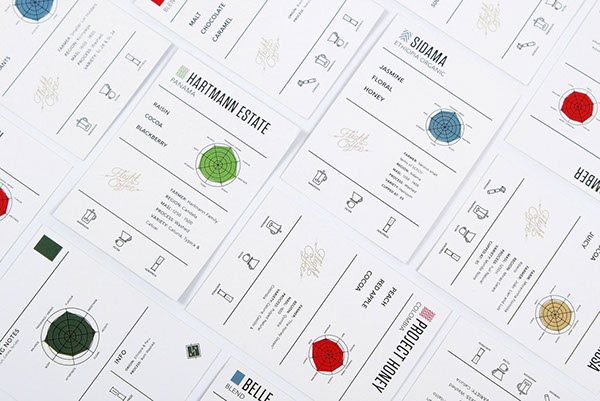
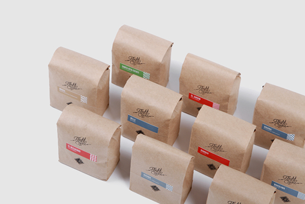
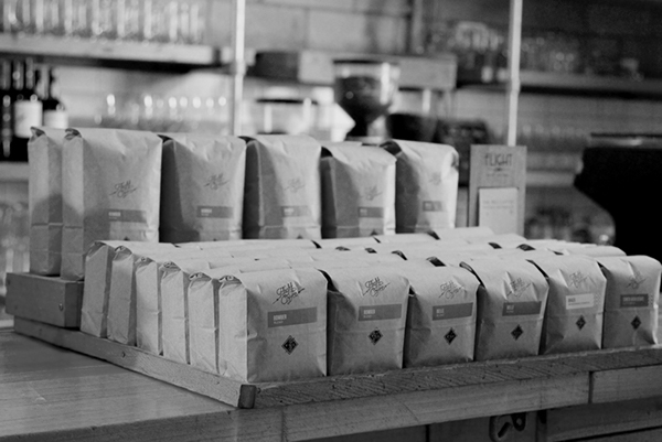
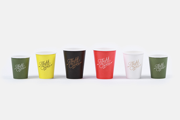
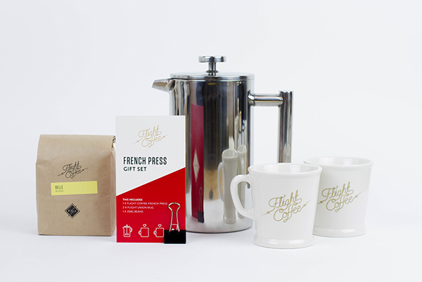
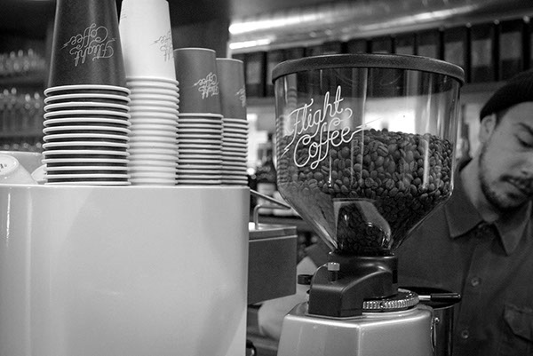
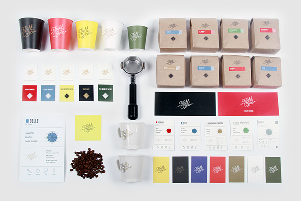
The identity for Flight Coffee is colorful with overlays on natural textures. A custom script typeface heroes the brand with the feeling of taking off. The lightning bolt accoutrements convey energy and charge. Two things you want in a coffee. I really enjoy the subtle use of pattern in the packaging design. It’s not over the top or too much.
One of the elements that make this identity smart, is the designer’s use of tip-on labels and rubber stamping for the packaging. This saves the budget and leaves the door open for growth in product line.
Here’s a bit of backstory: Flight Coffee are Wellington’s leading coffee specialists. Their focus is on coffee appreciation, education and development. In the past five years Flight Coffee have won a range of awards illustrating their dedication and commitment to the coffee trade. Our mission was to create a timeless brand to sit alongside their youthful, energetic approach. We referenced Flight’s founding brand elements, coffee culture and also the spectacular art of 1940’s WWII fighter aircrafts. We then responded by designing an elegant hand-drawn typographic logo, which features in a range of vibrant colours and is accompanied by gold accents. The brand collateral includes naturally textured paper stocks, embossing and vegetable based inks. This provides a comprehensive visual and tactile experience for the customer. Flight Coffee now has a cohesive look across their ever-expanding coffee empire.
Designed by Inject Design
