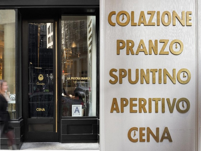
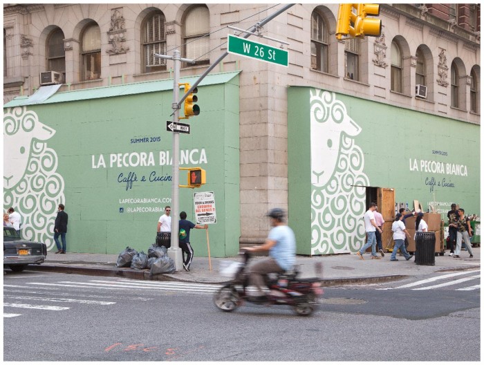
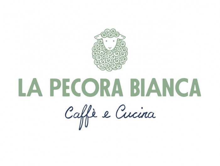
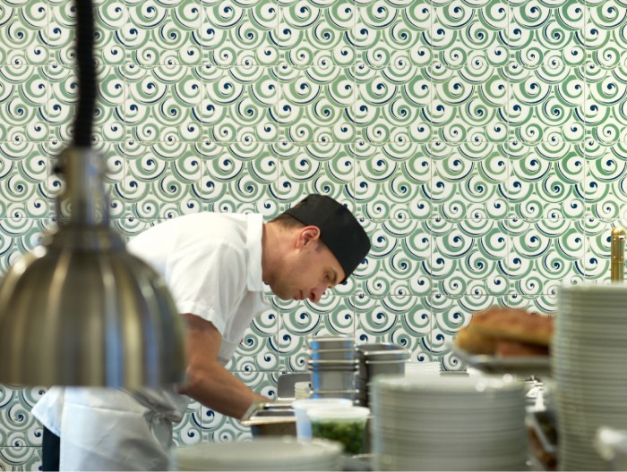
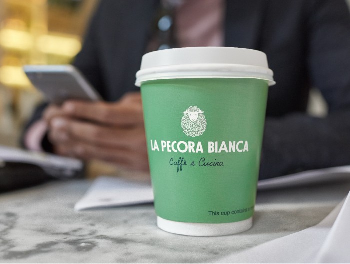
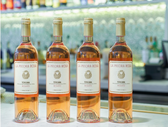
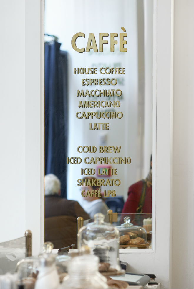
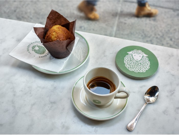
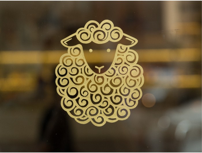
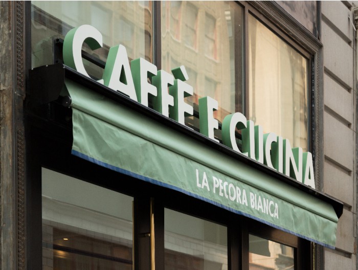
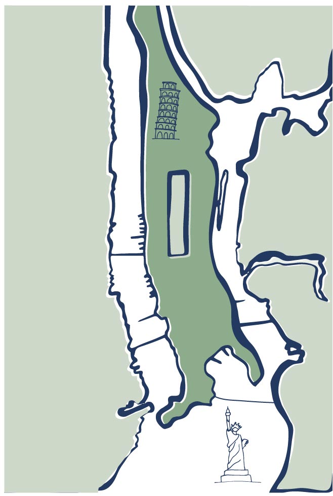
Sharing another Pentagram gem this morning. This one has been getting a lot of media hype with good reason. The design for this cafe and cucina is absolutely beautiful. The restaurant is inspired by farm-to-table cooking found in rural Italy. Their use of handcrafted textures offset by clean type helps create this feeling visually. From the many different hand rendered interpretations of a sheep, to the typography that roots it in an art deco style feel, the branding for this new restaurant jumps out the a sea of competition in New York. It’s especially interesting how the identity was brought into the interior space (or vice versa) as seen with the tile work. Little touches that inject more than just a logo through a space helps tie the brand to the experience effectively.

Designed by Pentagram
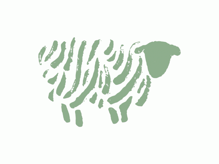
All-Logo-GIF_SM_0.26sec

EMO_LaPecoraBianca

LPB_Blog-Post_FINAL-15

LPB_Blog-Post_V2-01

LPB_Blog-Post_V2-03

LPB_Blog-Post_V2-05

LPB_Blog-Post_V2-06

LPB_Blog-Post_V2-07

LPB_Blog-Post_V2-08

LPB_Blog-Post_V2-10

LPB_Blog-Post_V2-12

LPB_Blog-Post_V2-14


The Forktales Podcast™: Interviews with restaurant industry leaders and visionaries

Restaurant and advertising industry headlines and thinking

Reviews of restaurant experiences from around the globe 

Reviews of our favorite design, business, & restaurant books

Our favorite typography and fonts

Inspiration in your inbox

Get the latest inspiration in your inbox every Monday morning, for FREE!

"*" indicates required fields

This field is for validation purposes and should be left unchanged.

Delicious Bits in your Inbox!

Get the latest and greatest content delivered to your inbox for free!

"*" indicates required fields

This field is for validation purposes and should be left unchanged.