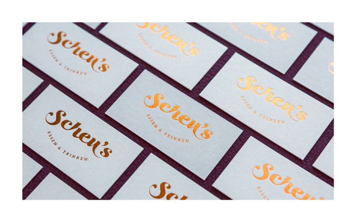
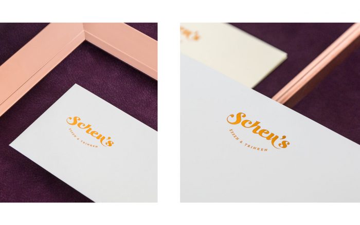
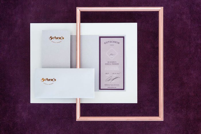
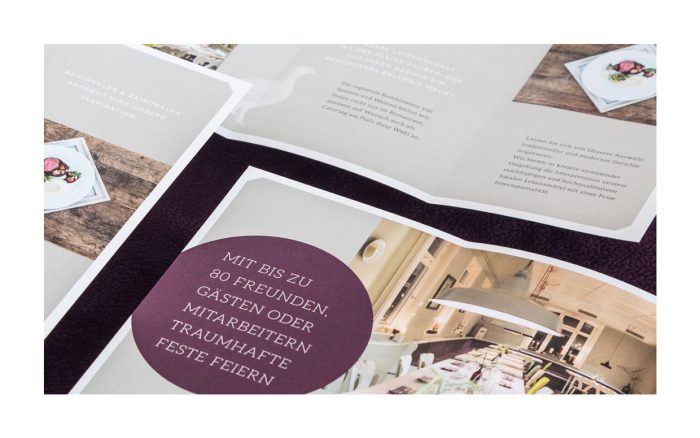
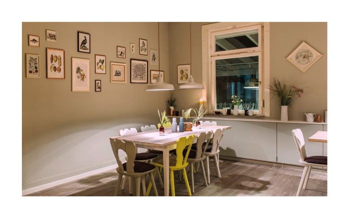
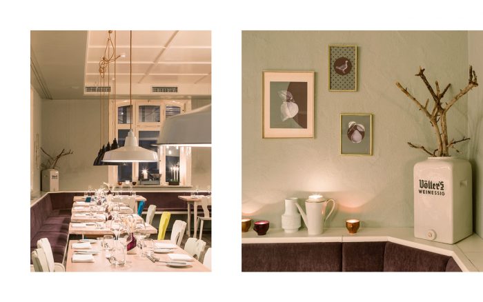
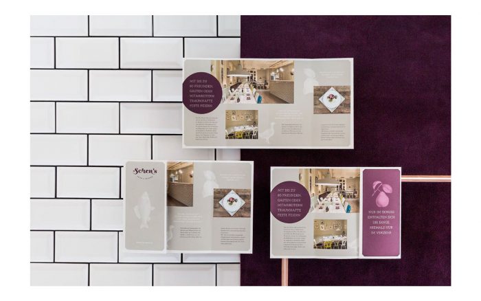
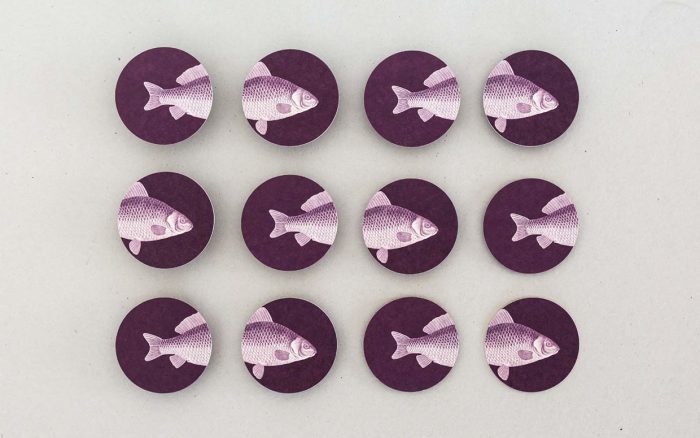
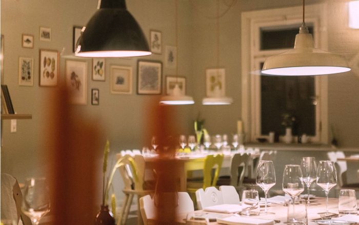
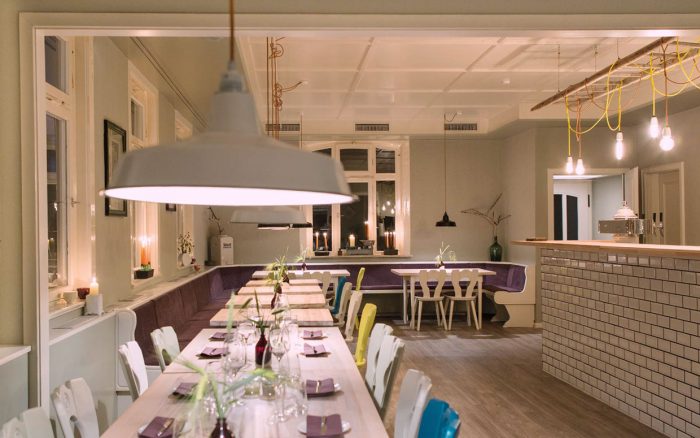
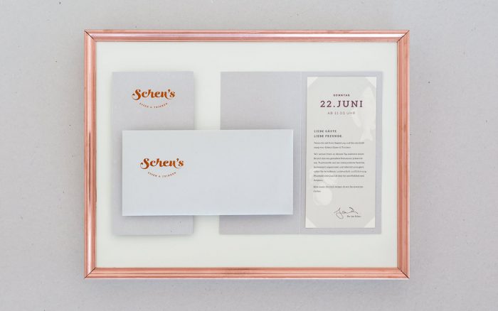
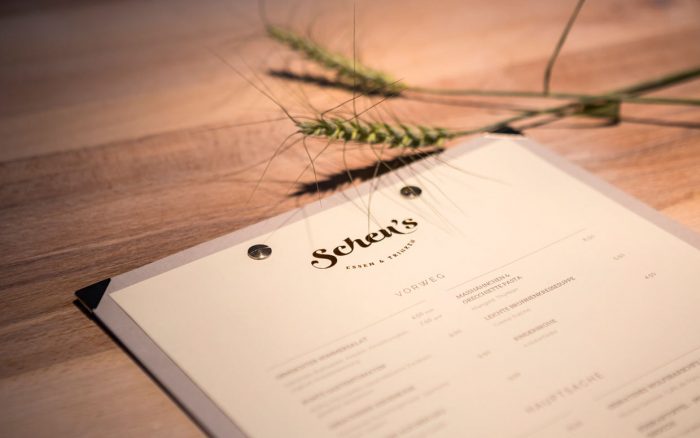
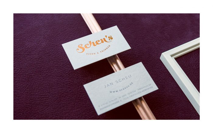
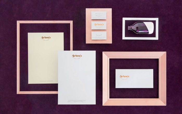
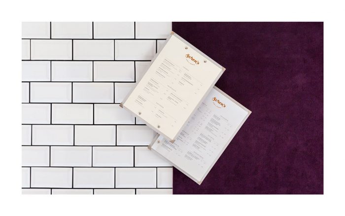
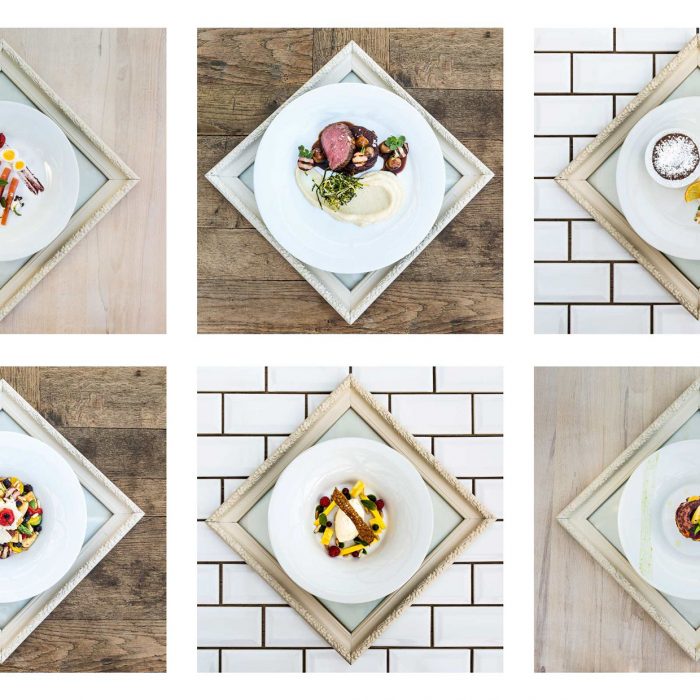
Elegance is one word I’d use to describe the brand identity for Scheu’s, a restaurant in Germany. The use of basic materials throughout the interiors is mirrored by simple design elements and bolstered by classic illustrations of raw ingredients. The color palette is based in light beige and white which sets a beautiful base for pops of aubergine purple and rose gold in key areas like the logo. The combination is refreshing and refined. This is a restaurant identity and interior design that’s done with taste.

Designed by ADDA Studio
0b9af328376819.55bcbd8842e81

2eb2c228376819.55bcbd8835915

3aad6128376819.55bcbd8843e70

3bfdab28376819.55bcbd88479d2

6f4a1328376819.55bcbd883c3b2

9bbee428376819.55bcbd883f8d2

9fba8128376819.55bcbd8846059


47e8fb28376819.55bcbd883aedd


117c9c28376819.55bcbd883d57b

976ba128376819.55bcbd8841ec0

52928f28376819.55bcbd8840a7e

a6ad8d28376819.55bcbd8837c74

c90afd28376819.55bcbd883e4df

c3550728376819.55bcbd8834637

dcfc7d28376819.55bcbd8836b01

ed97a228376819.55bcbd8838ebc


The Forktales Podcast™: Interviews with restaurant industry leaders and visionaries

Restaurant and advertising industry headlines and thinking

Reviews of restaurant experiences from around the globe 

Reviews of our favorite design, business, & restaurant books

Our favorite typography and fonts

Inspiration in your inbox

Get the latest inspiration in your inbox every Monday morning, for FREE!

"*" indicates required fields

This field is for validation purposes and should be left unchanged.

Delicious Bits in your Inbox!

Get the latest and greatest content delivered to your inbox for free!

"*" indicates required fields

This field is for validation purposes and should be left unchanged.