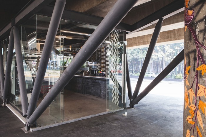
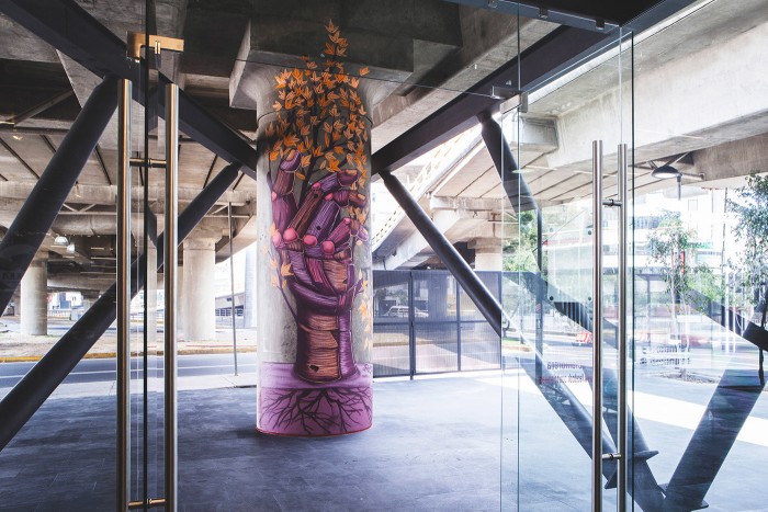
Mexico City is an metropolis on the rise. Progressive in thought, they’ve been looking to utilize space often times over looked. In the case of Yumi Yumi located in the “Mercado Morera”, the space is below one of the most congested freeways.
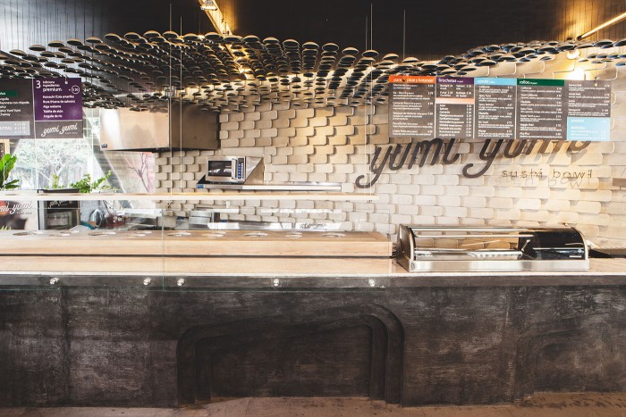
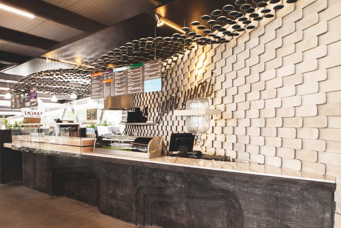
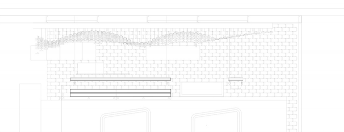
Yumi-Yumi is a brand new concept for Japanese cuisine, the client hired us to design an integral project including the brand identity. The design proposal had the objective of being easily replicated in multiple locations. We worked through a multidisciplinary process to engage the industrial design, typographies and architecture. The result transforms the typical sushi bar and integrates a whole concept for the traditional rice bowl.
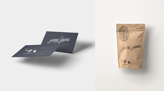
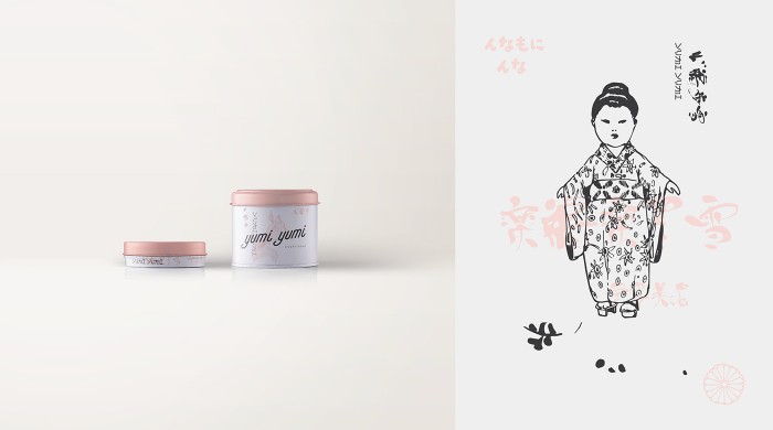
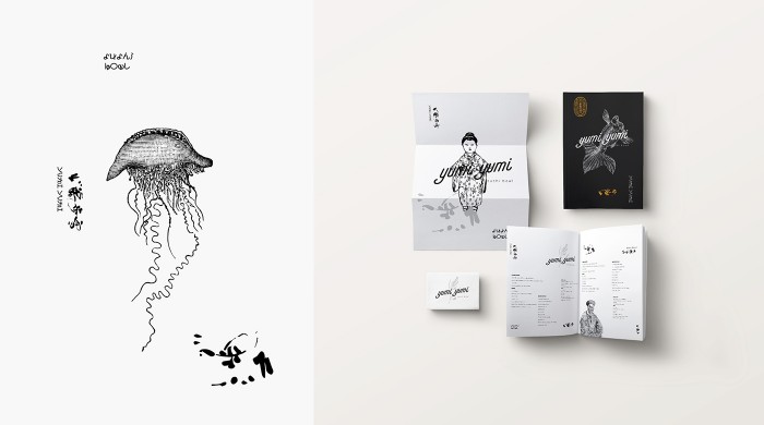
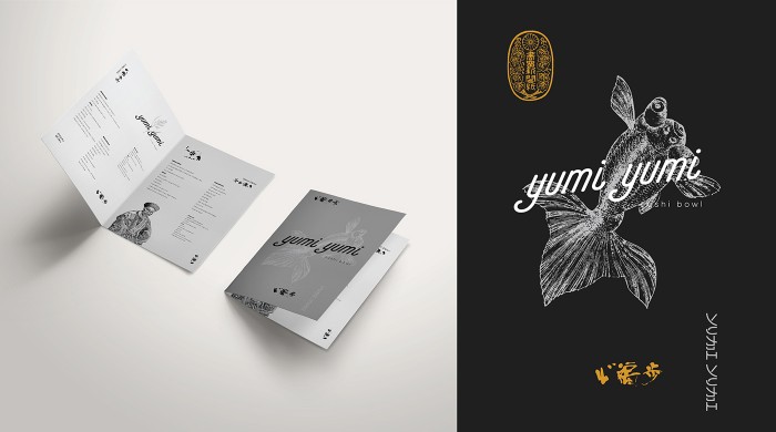
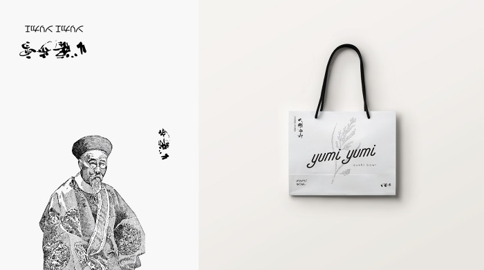
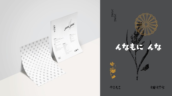
The brand identity for Yumi Yumi explores Japanese imagery and style in a fresh way. It’s a meld of classic Japan and a modern feel. Playing simple script typography against classic brush-style illustrations is a perfect example of this.
Industrial/Interiors: TDDA
Graphic/Branding: Nhomada
