Bennelong restaurant branding

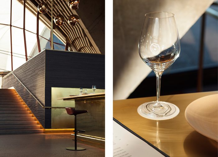
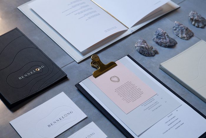
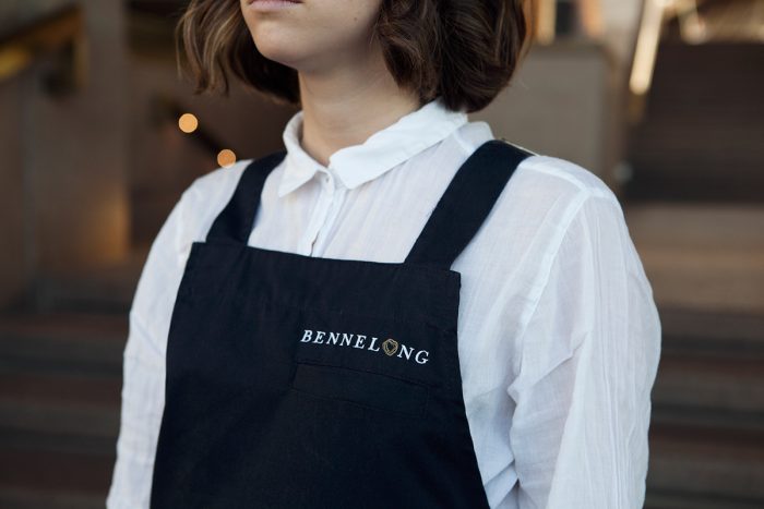
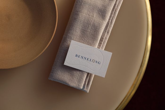
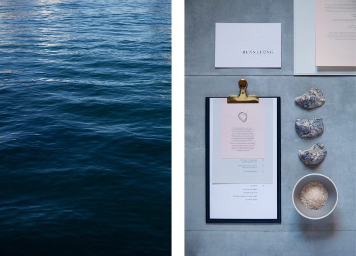
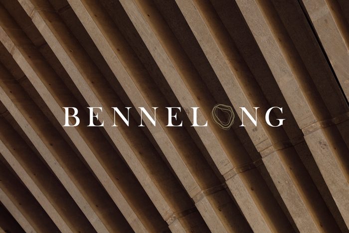
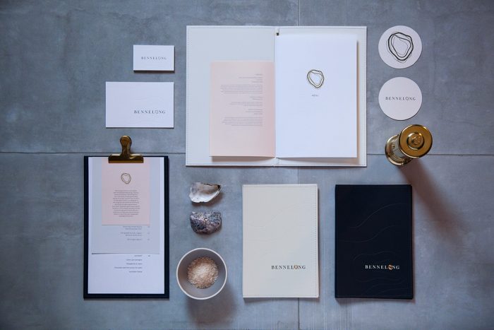
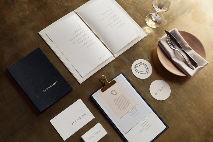
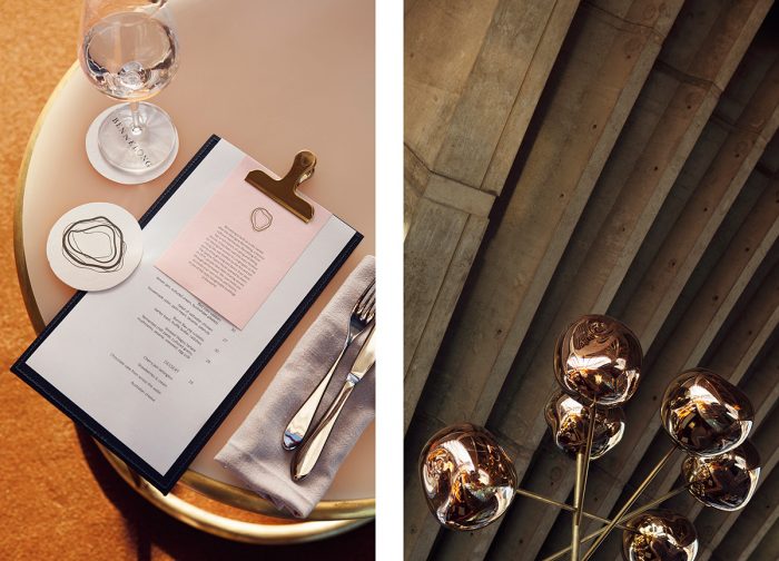
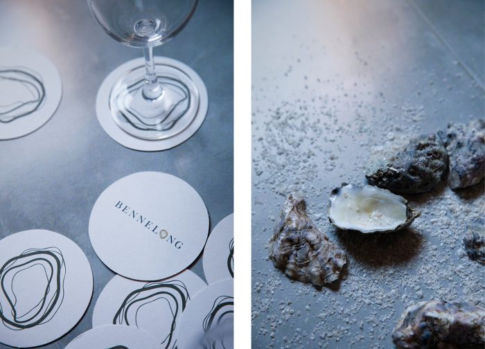
The branding work for the restaurant Bennelong is an exploration in minimalist representations of oysters mixed with simple, strong typography. Located at the Sydney Opera House in Australia, Bennelong had to have an identity as inspiring and iconic as the building itself. That’s a big ask, but the design team delivered with an organic and confidently simple solution.

The topographic lines mimic an oyster’s texture excellently while nodding to the history of the island and experience. Those lines are pulled throughout the identity elements in subtle ways serving as a visual glue that keeps everything cohesive.

Designed by Laura Jones, Pierre-Antoine Gilles, and Elliott Walsh.
0cb18b000b2a78f727d30b2dbe3bcfbc

6a424628107925.55c07fcf50c6e

6af0aeab6939f457a27e98012e57a8ee

2285e9313bb8c68f097ab7ad382bcc8e

8115c35e6dc903f8ae663e249d6f938b

b85ed9db5777e912feebfff265a99909

ced860a6811255788d3a6977dacbf6b0

dfe8506046a89a7d2c3f0cd49bde5b57

e5f0310156ea4942b1a08916555daf5d

e07e0128107925.55c07fcf4fc35

The Forktales Podcast™: Interviews with restaurant industry leaders and visionaries

Restaurant and advertising industry headlines and thinking

Reviews of restaurant experiences from around the globe 

Reviews of our favorite design, business, & restaurant books

Our favorite typography and fonts

Inspiration in your inbox

Get the latest inspiration in your inbox every Monday morning, for FREE!

"*" indicates required fields

This field is for validation purposes and should be left unchanged.

Delicious Bits in your Inbox!

Get the latest and greatest content delivered to your inbox for free!

"*" indicates required fields

This field is for validation purposes and should be left unchanged.