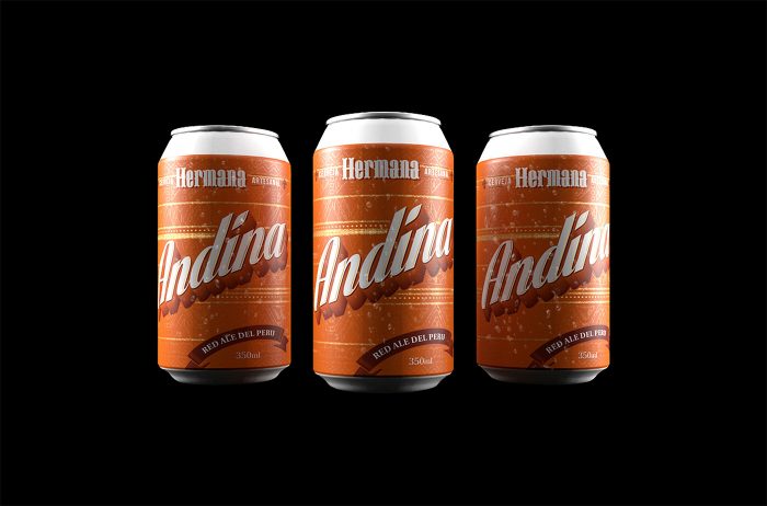
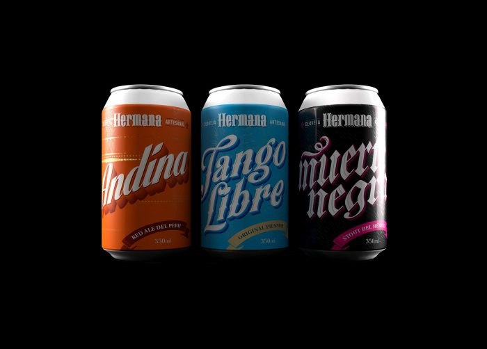
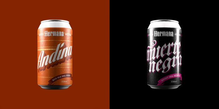
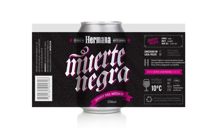
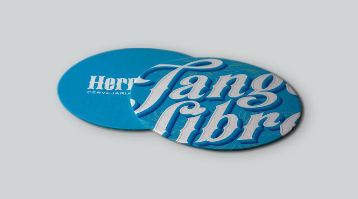
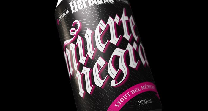
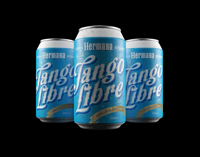
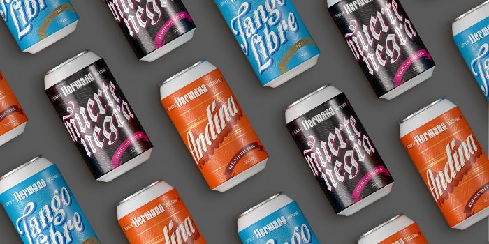
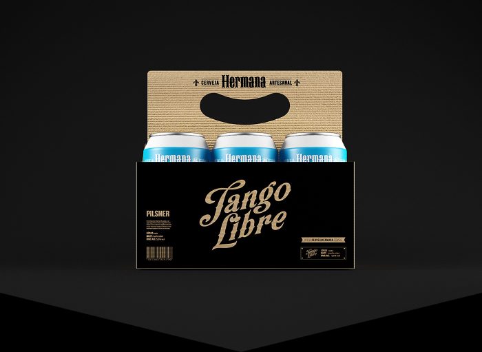
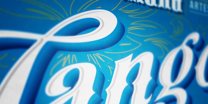
As I scour The Net (yeah, i said it) for awesome beverage and restaurant branding work, I often store it for sharing down the road. Not this one. This bad boy gets shared righta way. The colors. The typography. The layout. The detail. This is absolutely excellent. Hermana Craft Beer , and I’m pretty sure it’s student work which means it doesn’t exist which means I’m a little bit bummed. That doesn’t change the level of the work and how great it really is. Here’s how the design team explains the work:
Hermana is a craft beer inspired by the rich local art from different countries in america. The brand name suggests that we can all be brothers, celebrating it next to a mug of beer. The package design was directed to a creative direction using typographic elements with lot of weight and originality, differing among themselves through artistic styles and color palette. The typography of the logo has been specially designed from scratch to make the single brand. Each beer refers to a bit of your country, from its visual appeal to your taste. If Hermana could speak a war cry, it would be “all for the beer.”
Designed by Alexandre Fontes and Renata Venturini, both from Brasil
