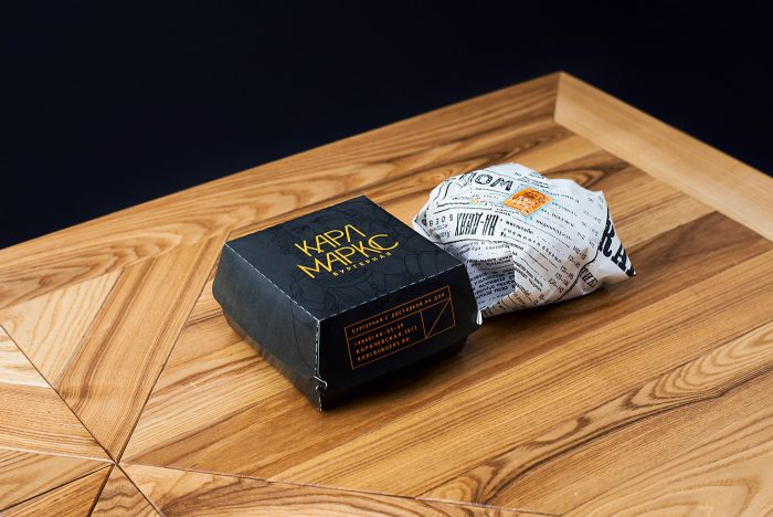
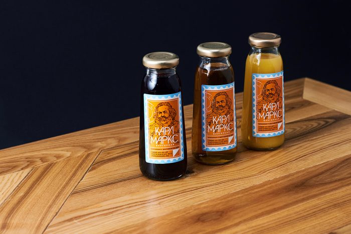
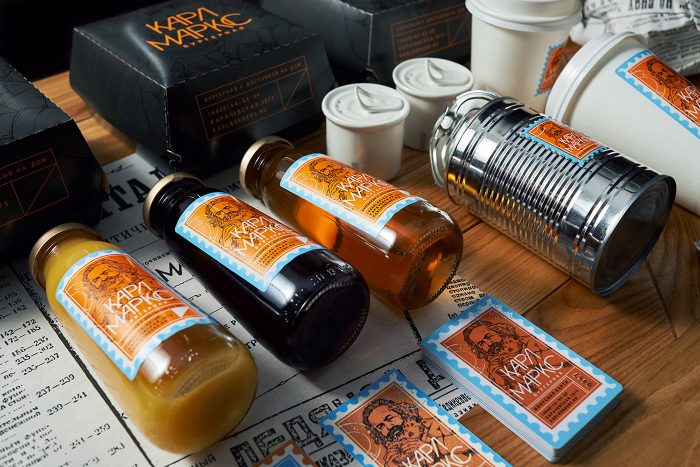
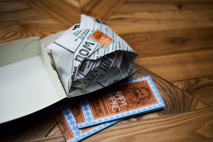
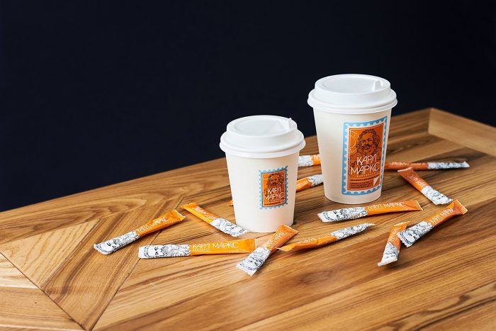
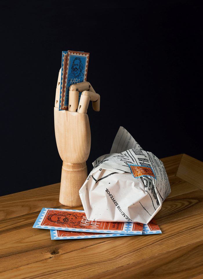
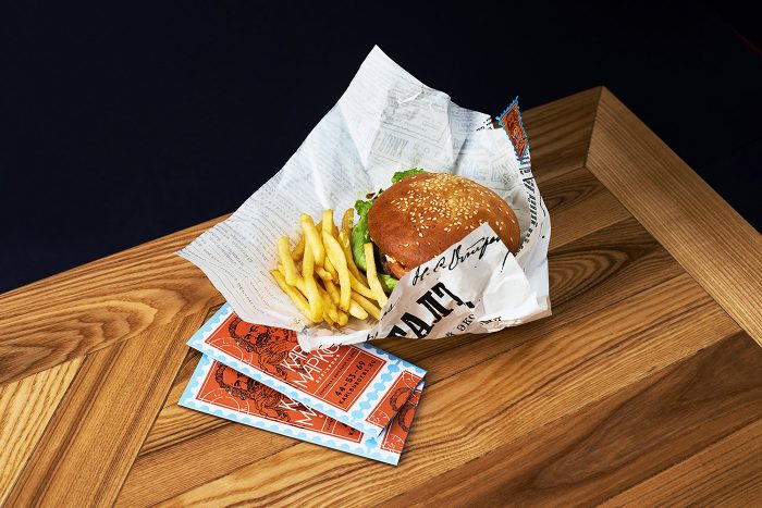
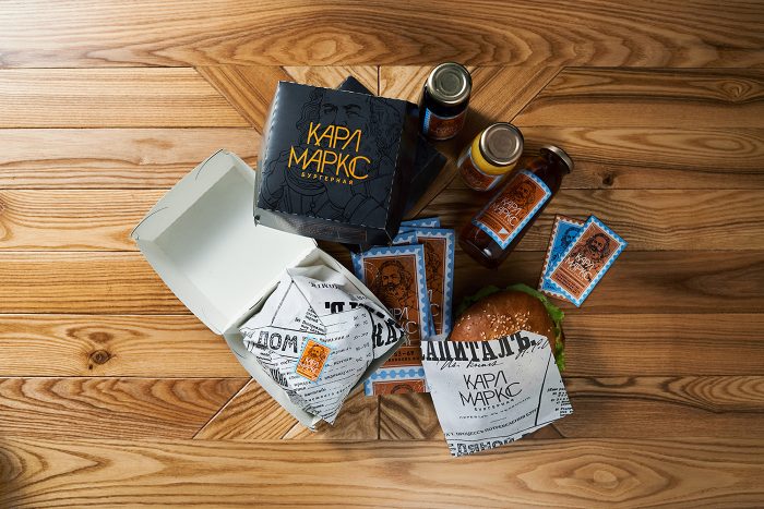
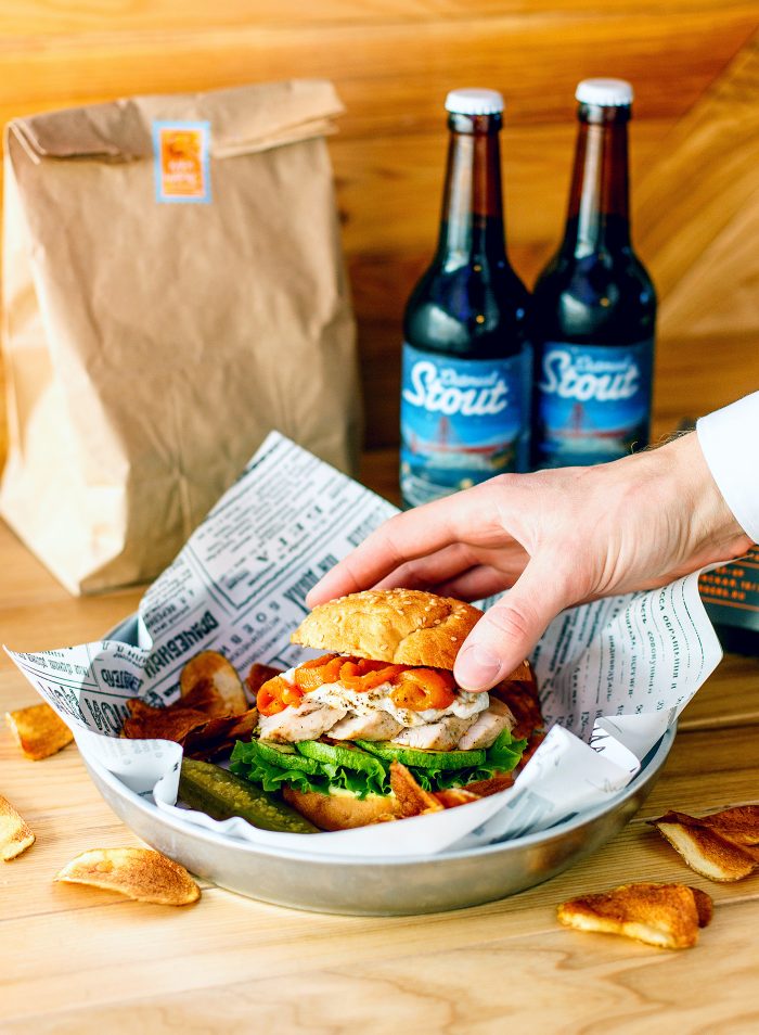
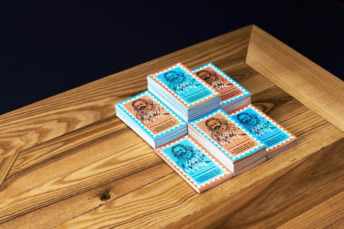
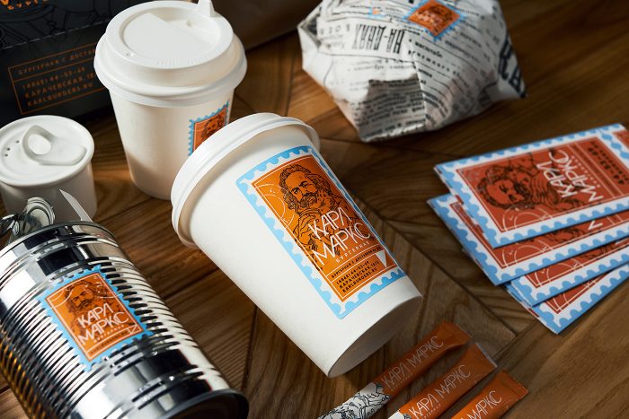
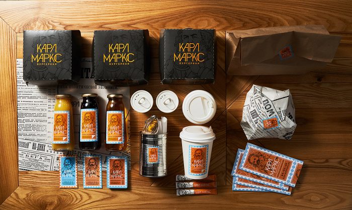
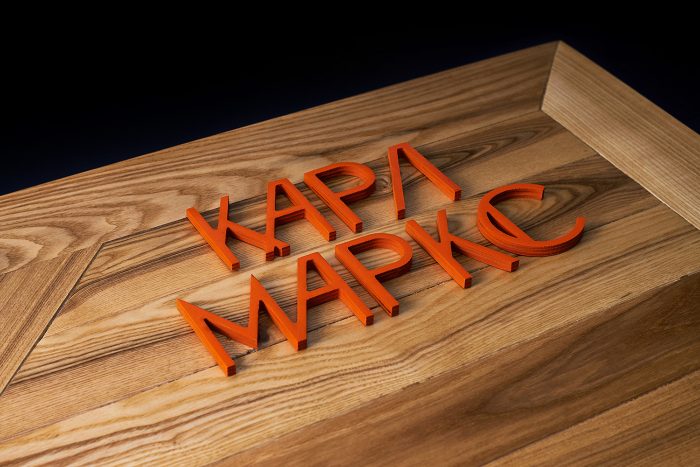
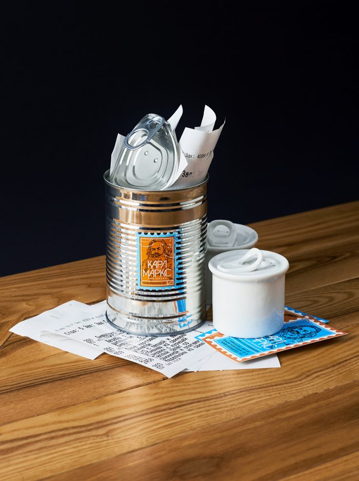
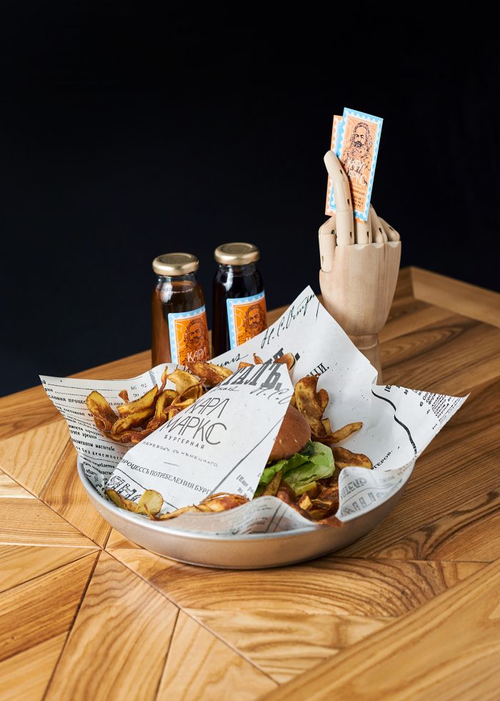
Before this goes political, I’m strictly critiquing the design, not the political persuasion of Karl Marx and those who follow his thinking. That said, checkout the delicious design elements and touch points for this burger restaurant branding in Russia! I love the mix of blue, orange, yellows and blacks. Usually these colors are hard to make work with a fresh look, but the design nails it. They meld classic illustration of Karl Marx drinking some soda with newspaper-like design elements to create a unique look for this burger joint.
Designed by Dmitry Neal
Illustration by Boomaga
