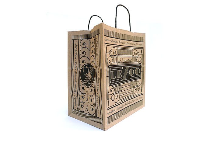
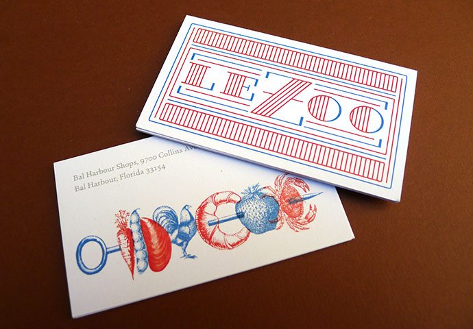
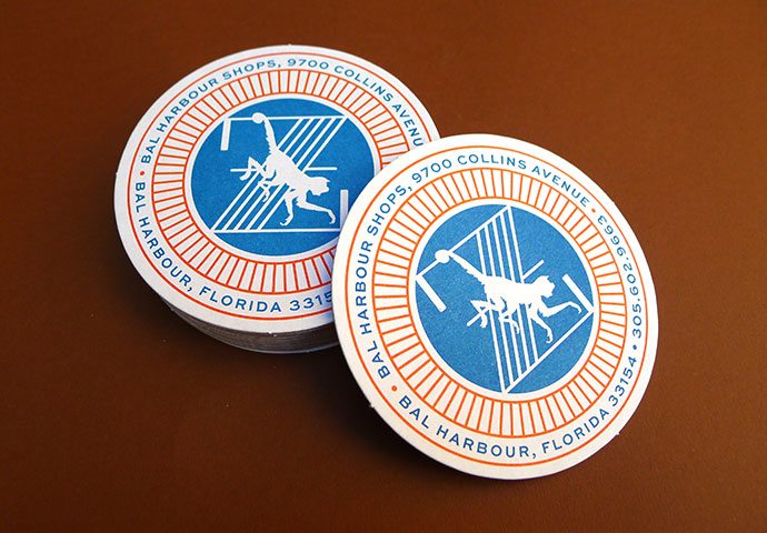
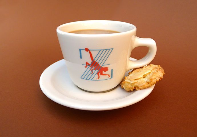
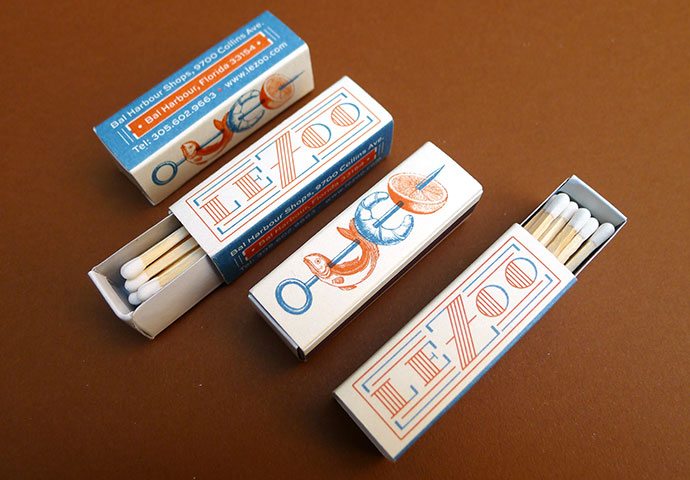
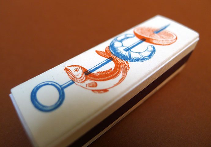
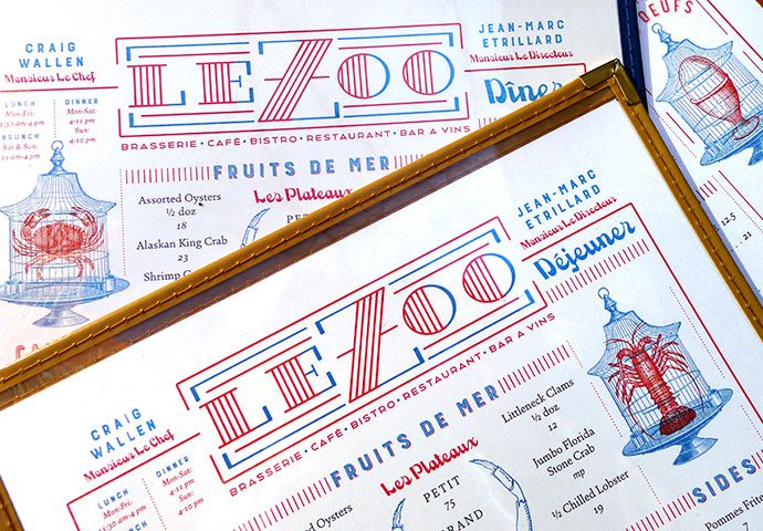
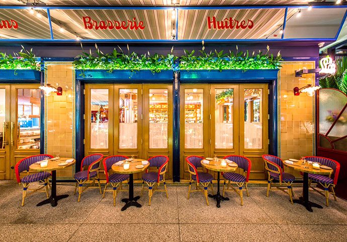
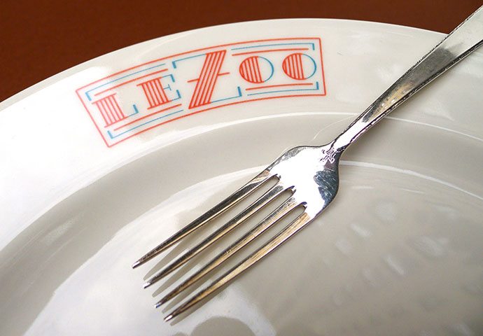
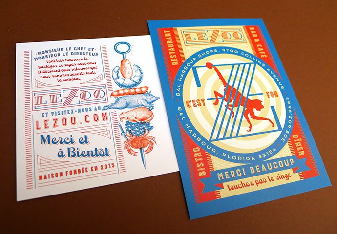
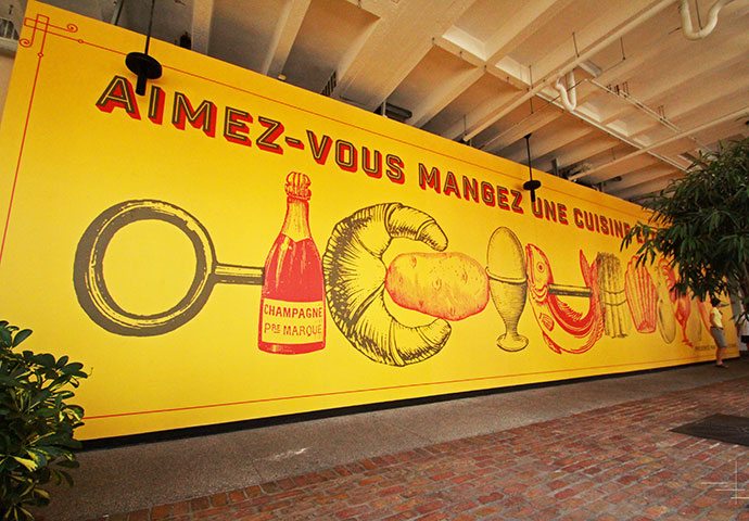
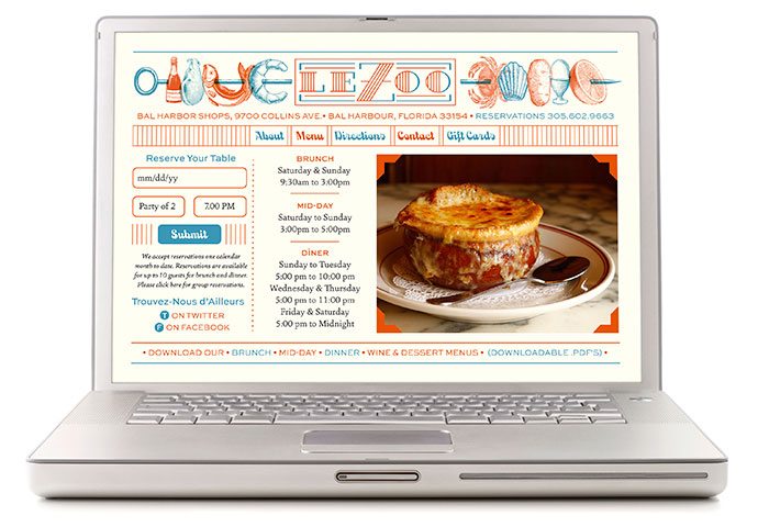
Le Zoo’s brand identity is spearheaded by intricate illustrations that challenge the viewer to spend more time with whichever touch point they happen to be holding. From classic typographical illustration through pen and ink style drawings, the brand fuses Art Deco magic throughout each piece. Normally red, white, and blue can be hokey and campy, but the De Vicq executes it with excellence making for a fresh, interesting approach for the restaurant in Miami, Florida.

Designed by De Vicq
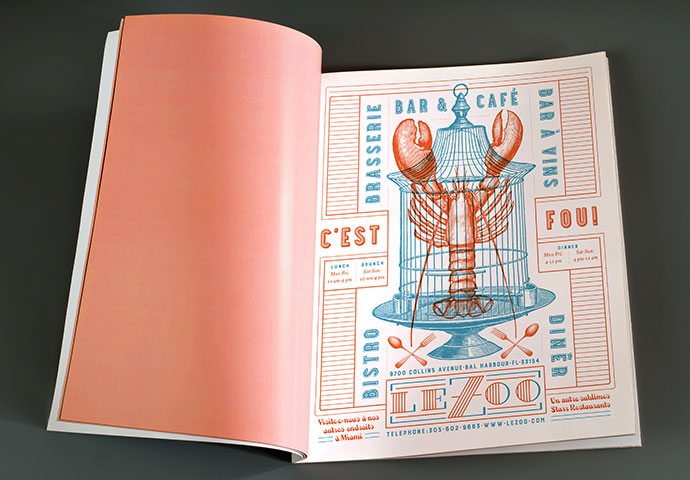
LZ_ad_2

LZ_bag

LZ_bcards

LZ_coaster

LZ_cup

LZ_matches2

LZ_matches3

LZ_menu1

LZ_outdoors

LZ_plate

LZ_postcard

LZ_sign

LZ_site


The Forktales Podcast™: Interviews with restaurant industry leaders and visionaries

Restaurant and advertising industry headlines and thinking

Reviews of restaurant experiences from around the globe 

Reviews of our favorite design, business, & restaurant books

Our favorite typography and fonts

Inspiration in your inbox

Get the latest inspiration in your inbox every Monday morning, for FREE!

"*" indicates required fields

This field is for validation purposes and should be left unchanged.

Delicious Bits in your Inbox!

Get the latest and greatest content delivered to your inbox for free!

"*" indicates required fields

This field is for validation purposes and should be left unchanged.