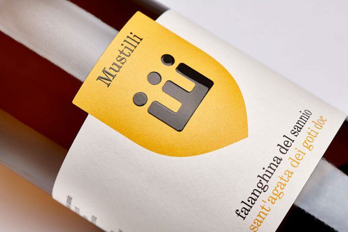
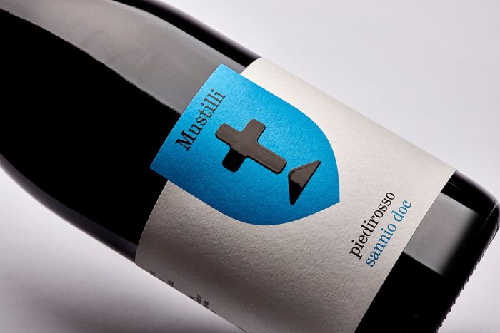
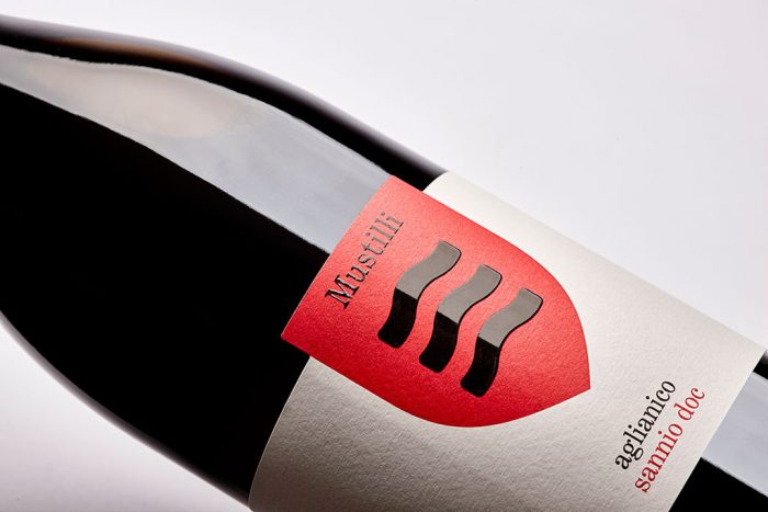
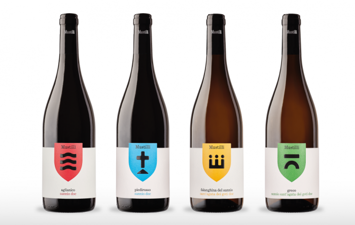
There is so much wine out there that standing out with design is a complex and arduous task. From classic to modern the bases have been covered three times over if not more. However, there are those label and package designs that seem to break through. Mustilli is one of them.
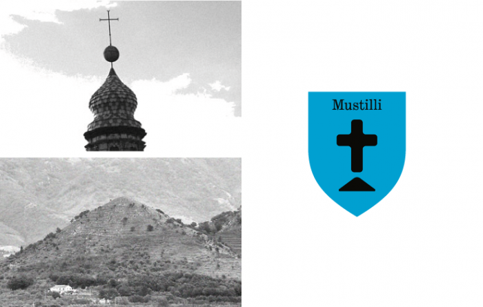
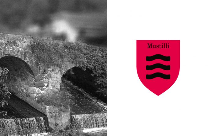
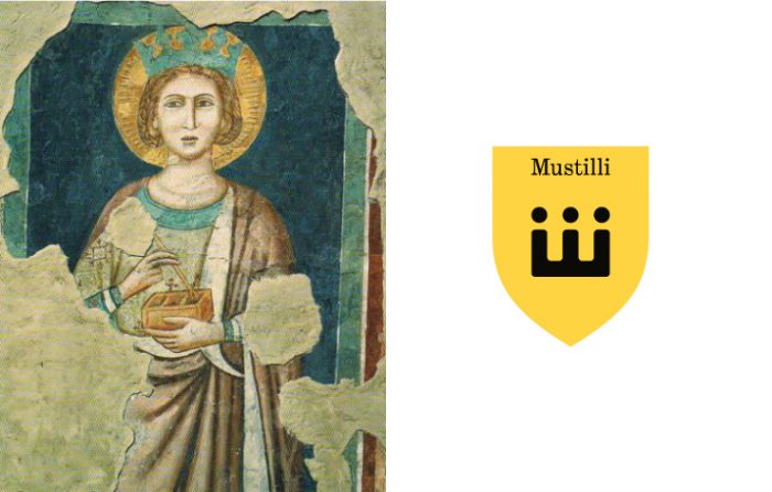
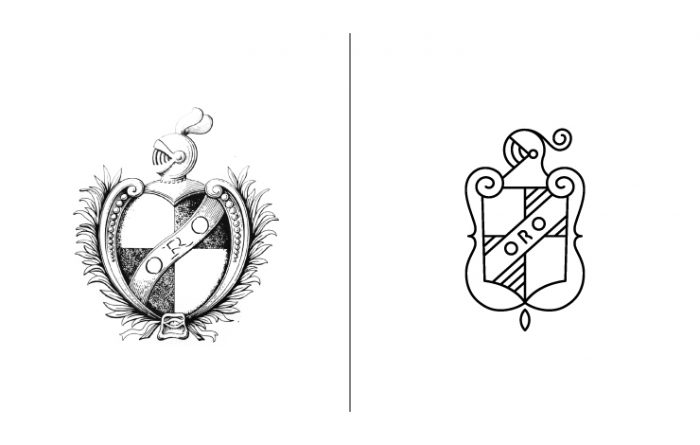
Taking inspiration from landmarks and architecture found in the region of origin, the designer crafts a simple, modern brand identity. The four elements of inspiration were the Isclero river water, the Sant’Agata’s crown, the pyramidal Ariella hill, the icon of the bridge that cross the medieval hamlet.
This melding of new and classic creates a forward facing brand with roots in heritage. Using a primary color palette helps keep things simple and rudimentary in a good way. Nothing is overdone or over designed creating an air of confidence. Very good things for a longstanding brand like Mustilli.
Designed by NJU Communications in Eboli, Italy
