Hay Rosie Craft Ice Cream branding

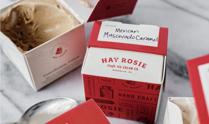
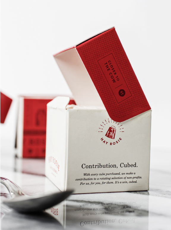
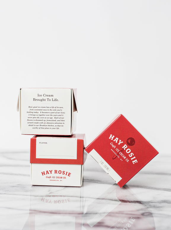
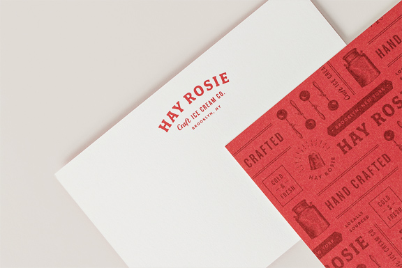
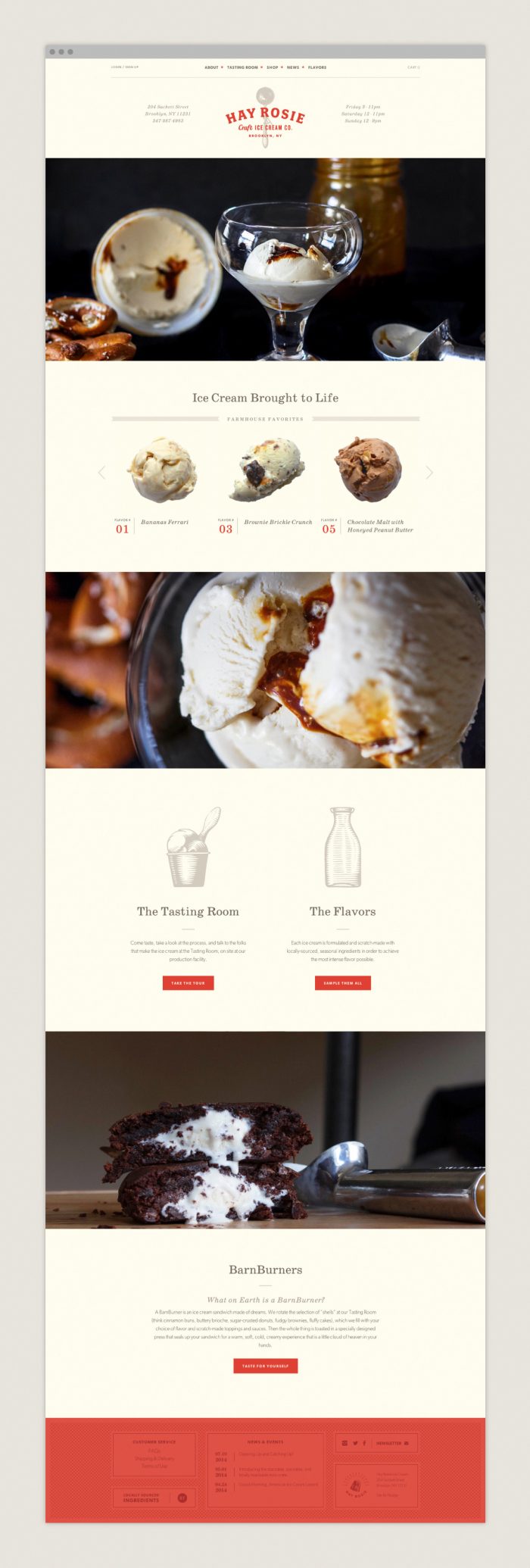
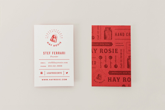
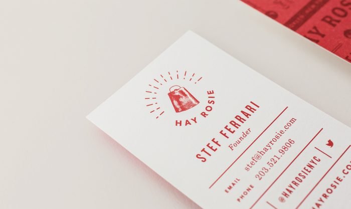
This brand identity is so beautifully classic and fresh at the same time. Studio Nudge, the design team behind the work, handles the many elements of the brand with confidence and, well, craft. The limited color palette, and classic illustrations help drive home the idea of the farm to glass creamery in a fresh way that melds modern design style with classic technique.

One of the main things that stand out in this work is the copywriting. It’s smart, semi-witty, and doesn’t rely on forced puns to drive home the voice. The copy is given glory with beautiful typography that accentuates the words while leading the reader into to details. It’s hard not to read it all!

Designed by Studio Nudge

hay-rosie-business-cards-02

hay-rosie-business-cards

hay-rosie-illustrations

hay-rosie-logo

hay-rosie-packaging-01

hay-rosie-packaging-02

hay-rosie-packaging-03

hay-rosie-stationery

hay-rosie-submark

hay-rosie-website


Discuss this Project

Leave a Reply

This site uses Akismet to reduce spam. Learn how your comment data is processed.

The Forktales Podcast™: Interviews with restaurant industry leaders and visionaries

Restaurant and advertising industry headlines and thinking

Reviews of restaurant experiences from around the globe 

Reviews of our favorite design, business, & restaurant books

Our favorite typography and fonts

Inspiration in your inbox

Get the latest inspiration in your inbox every Monday morning, for FREE!

"*" indicates required fields

This field is for validation purposes and should be left unchanged.

Delicious Bits in your Inbox!

Get the latest and greatest content delivered to your inbox for free!

"*" indicates required fields

This field is for validation purposes and should be left unchanged.