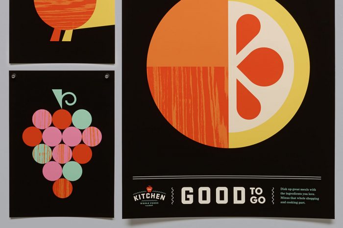
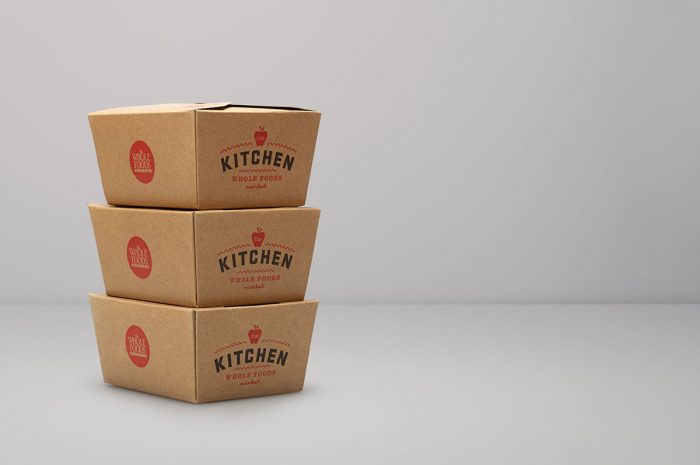
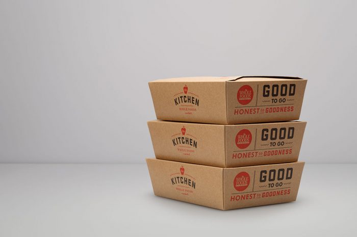
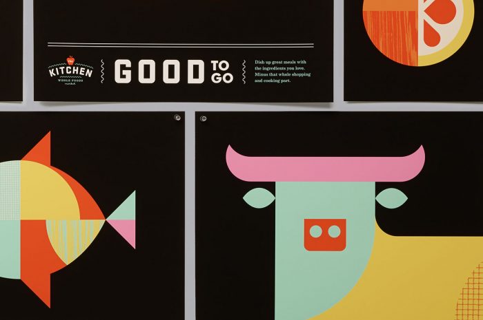
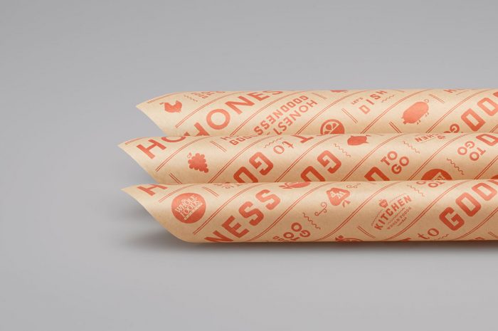
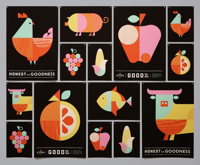
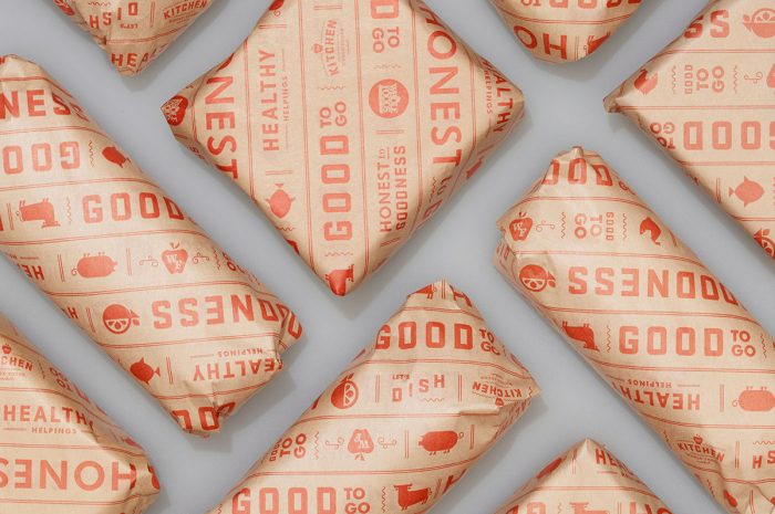
The Kitchen is the prepared foods division of Whole Foods Market. I’m sure anyone who’s been in a Whole Foods knows exactly what this is. For those who haven’t, it’s basically a grab-and-go offering that WFM has beside their in house restaurant-style experience. The identity and marketing design pieces create a unique look for the offering that sets it apart from the typical Whole Foods look. Despite the departure, the look adds to the overarching brand. The highly geographic approach mixes fresh, natural colors and strong geometric shapes to create a beautiful representation of the origins of the foods, and the creativity of the kitchen. It tells a story without relying on a lazy approach of basic, style-style photography. This creates an essence that conveys the art and “design” behind the food and how it starts with natural beginnings then transforms into delicious results.
Designed by Moniker SF & Rubber Design
