As designers and industry people, we love our coffee. Although we all have our own nuanced palettes, we can all agree that even shitty coffee is sometimes needed to get the job done. Blanchard’s is anything but shitty coffee, and the new brand identity for the coffee company is on another level, too.
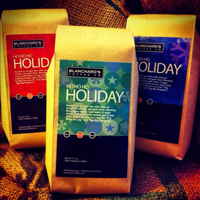
The rebrand was a complete overhaul of the original direction (show below). The previous look was a nice starting point, but didn’t differentiate the brand and it surely didn’t look fresh. Set in copperplate in a simple bounding box, the old brand was forgettable.
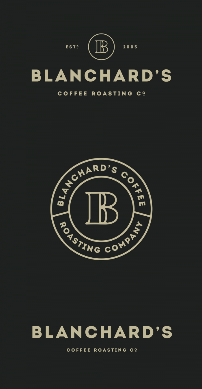
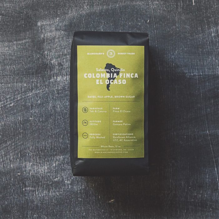
Blanchard’s new brand identity maintains simplicity, but comes across more refined and strong. That’s not to say it’s cold and modern. Instead it has a contemporary feel that’s more representative the brand today and where it wants to be in the future. A strong B letterform/insignia spearheads the identity. It’s lines are beautifully executed. Supporting the brand mark is the brand typography. A softened modern, geometric type family creates the warm strength necessary to set the right visual tone.
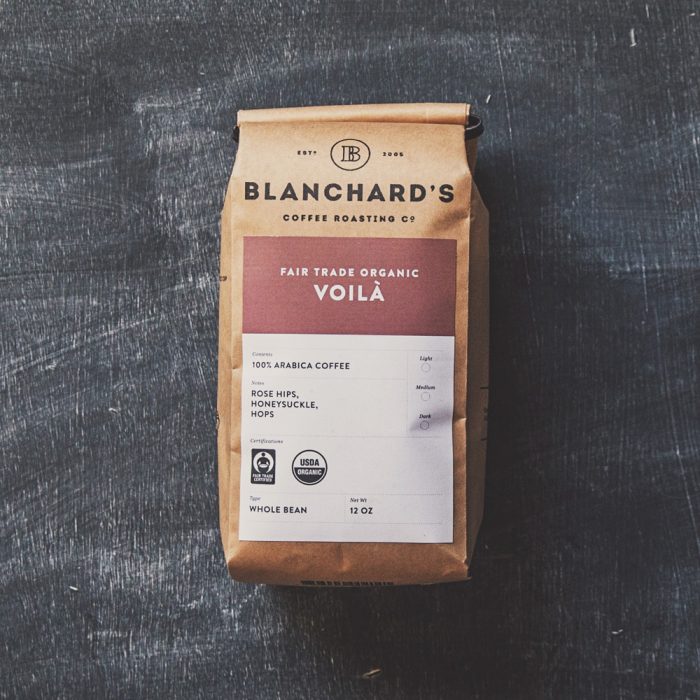
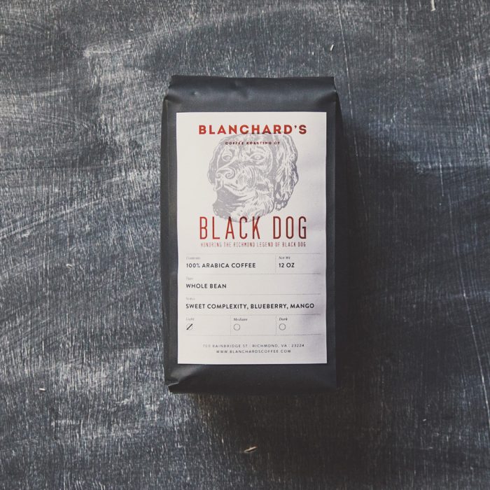
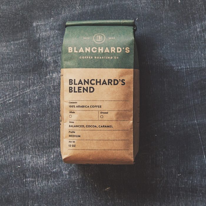
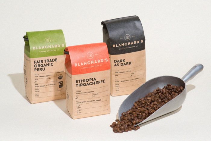
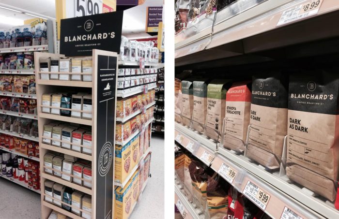
The rebrand takes its stride with the packaging. The packaging makes good use of budget by leveraging tipped on labels with a pre-printed bag. This allows Blanchard’s to do a large run of bags at a reduced cost per piece, while allowing for less expensive means of delineating each roast. Additionally, this method gives Blanchard’s the ability to do limited roasts, and allows them to explore without having to commit to large minimums to package the product. Finally, it creates a uniformed look across the roasts tying the brand identity together through a beautifully coordinated packaging suite.
Design & branding: Skirven & Croft
Website: Roaring Pines
Photography: Kate Magee
Previous Brand Identity & Packaging
Rebranded Look
