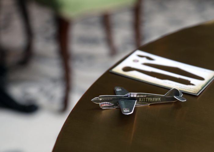
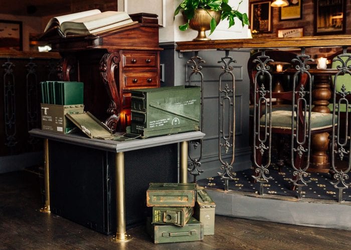
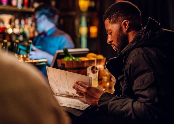
Contrary to what you may be thinking, this cocktail bar is not in celebration of man’s discovery of flight. Although it uses many aeronautic mnemonic devices in the design, Kittyhawk is a celebration of the French & American liberation of Paris in WWII. The name is derived from a WWII iconic aircraft the “Kittyhawk,” aka Curtiss P-40 Warhawk.
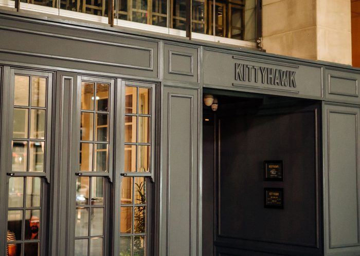
Kittyhawk is a cocktail bar located in the heart of Sydney, Australia. Designer Gemma Warriner take this inspiration and flys with the brand’s identity starting with her aircraft inspired typography for the cocktail bar’s logo type. She explains her direction perfectly:
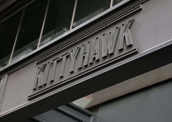
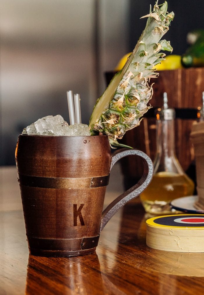
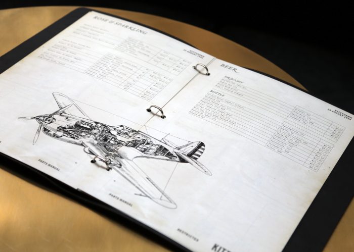
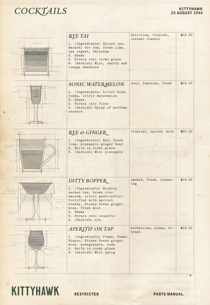
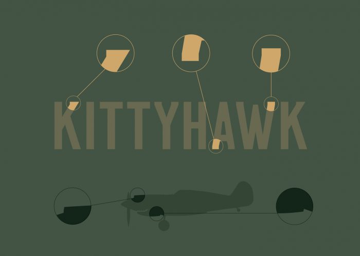
The Kittyhawk wordmark, a uniquely crafted typeface, reflects the mechanical components of the warcraft itself. The supporting brand elements and collateral are an output of archival WWII research; a visual exposition of airplane manuals and solider diaries that takes guests to the post-war Paris of the 1940s.
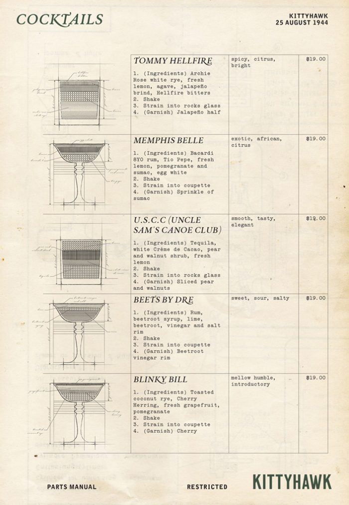
From this foundation, Warriner implements a beautiful visual language that pulls influence from classic schematic and drafted blueprint imagery. From isometric to cross sectioned diagrams, and beautiful grids, the brand takes the patron back in time tapping a nostaglic, historic emotion. This marries perfectly to the name, the vision, the experience and the brand.
Design: Gemma Warriner
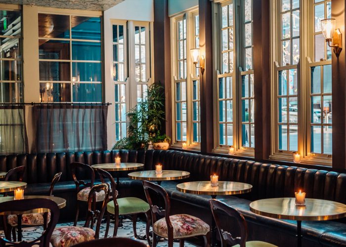
Photography: MY Media Sydney
Cocktail Illustrations: Jordan Hughes
