Warwick Station cafe restaurant branding

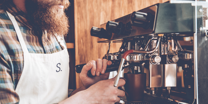
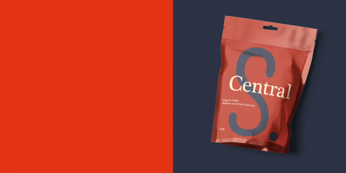
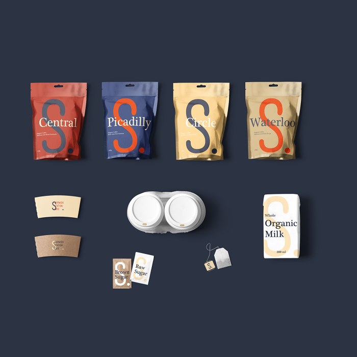
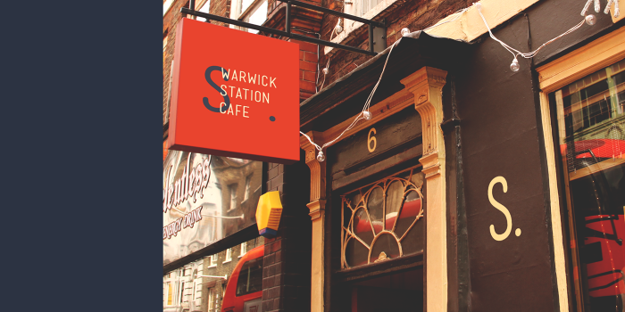
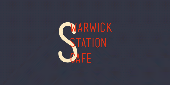
Located on Warwick Avenue in London, this coffee shop’s passion is found in serving the best organic coffees. Respect for the craft of coffee is an age-old trade which aligns perfectly with the historic location. “We were inspired by the company’s enthusiasm for making the trip on the iconic Tube be tastier. The symbol of the letter “S” resembles the path of cars drawing the underground of the city,” states the studio’s website. And they realize that inspiration wonderfully.

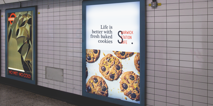
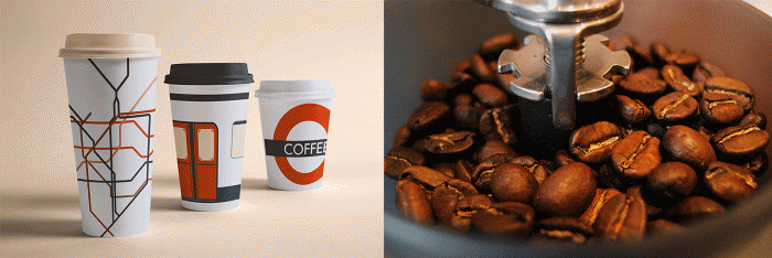
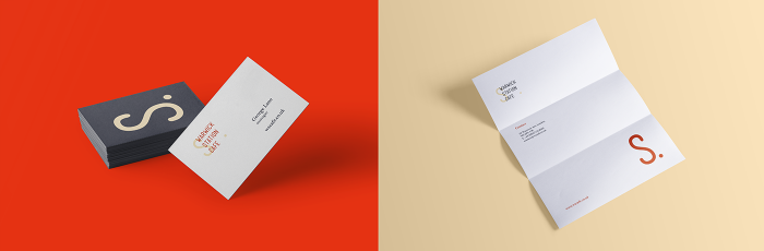
The identity is a perfect marriage of classic and modern seen in through typography selection and composition.  The grid serves as an excellent guide which creates a disciplined look and feel. London Underground mnemonic devices help seal the tie to the inspiring landmark. Those coffee cups are especially awesome.

Designed by Studio Vanila

e291f041191299.579be9c5ba79b

22ee4841191299.579be8b024f1f

cea1c441191299.579be4817ed1a

0672f141191299.579be13e11ee7

1934ab41191299.579be13e11989

9cdcf641191299.579be50315a69


f822e841191299.579be13db7747

aa977f41191299.579be13db72d7

01642e41191299.579bf7c08b5b4

The Forktales Podcast™: Interviews with restaurant industry leaders and visionaries

Restaurant and advertising industry headlines and thinking

Reviews of restaurant experiences from around the globe 

Reviews of our favorite design, business, & restaurant books

Our favorite typography and fonts

Inspiration in your inbox

Get the latest inspiration in your inbox every Monday morning, for FREE!

"*" indicates required fields

This field is for validation purposes and should be left unchanged.

Delicious Bits in your Inbox!

Get the latest and greatest content delivered to your inbox for free!

"*" indicates required fields

This field is for validation purposes and should be left unchanged.