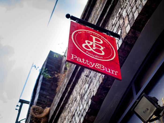
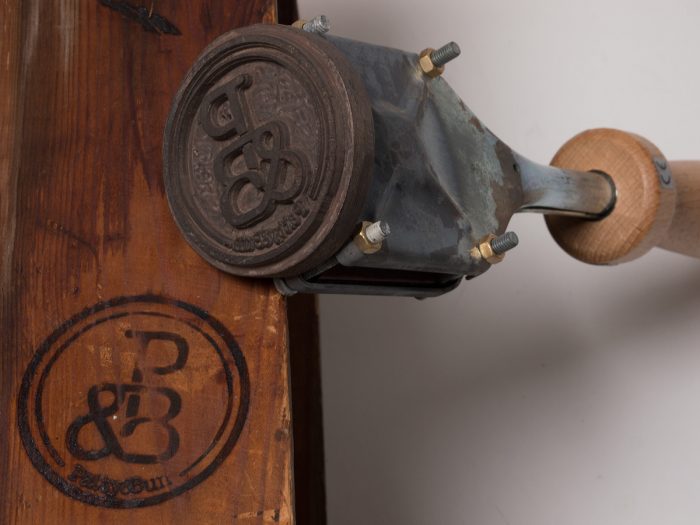
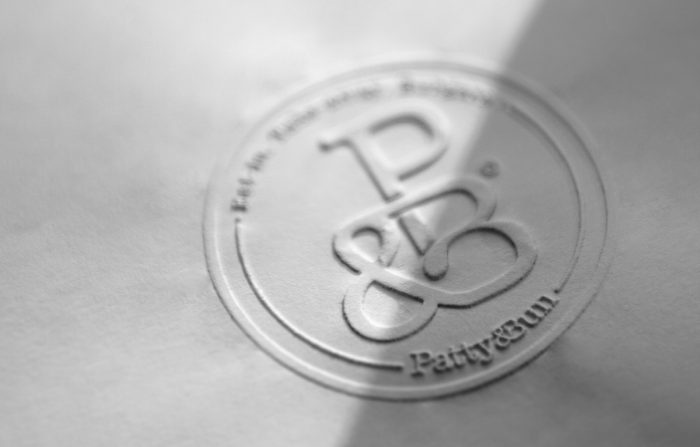
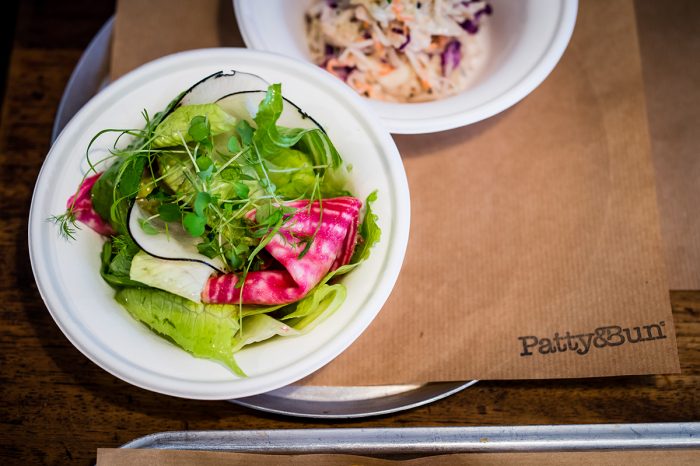
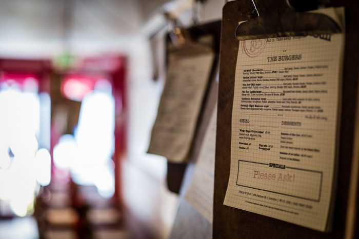
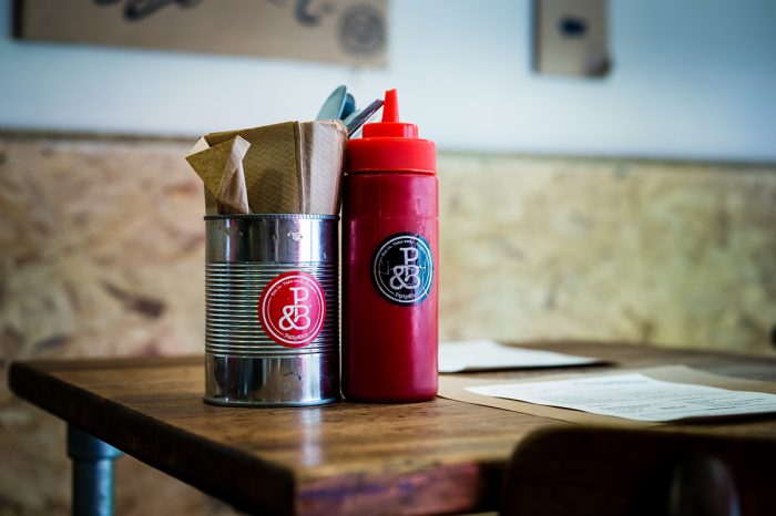
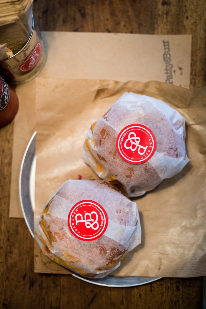
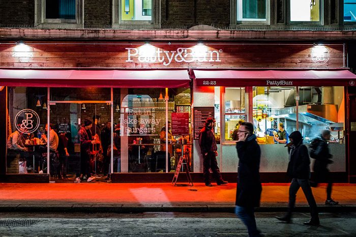
Rand Studio’s identity for Patty & Bun, a better burger concept in London, is as direct and beautiful as the food and name itself. The brand is centered on a lettermark of the P, &, and B letterforms all interlocking to create a fluid identity epicenter. The studio says they meant for this connection to “create a friendly and tasty looking brand symbol.” I think they nailed it.
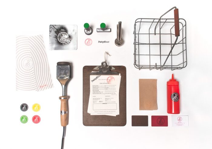
What jumps out as truly unique here is the red-washed wood on the signage that creates a stellar backdrop for the logo design. Additionally, the identity system is cost conscious without deteriorating the quality of the output. The low-cost elements actually add an aesthetic value that helps keep the brand authentic.
Some of the other touch points start to lean too heavy on the lettermark. There seems to be room for expanding the identity’s visual language to treat each touch point uniquely. Despite the missed opportunity, this is a stellar starting point for a growing restaurant brand.
Designed by Rand Studio

