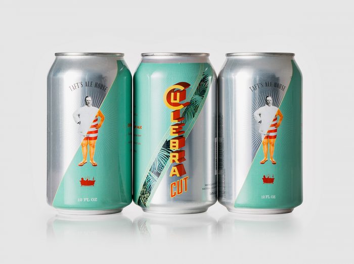
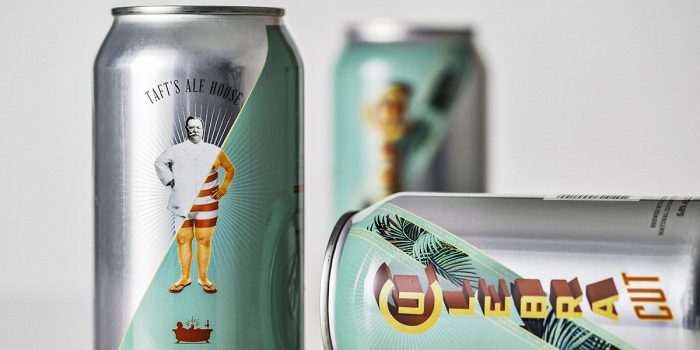
Taft’s Ale House – Culebra Cut craft beer branding

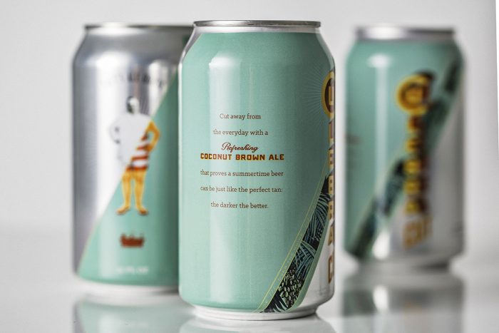
Really loving the semi-Vaudevillian/1920’s style about this craft beer brand identity and packaging. The typography is clearly pulling influence from 1950’s Cuba, the brand is a taste of classic Caribbean visually and in the taste of the product: Coconut Brown Ale. The color palette and design help this jump off the shelves and stand on its own.

Designed by 1 Trick Pony
culebra-cut-beer-2

culebra-cut-beer-1

culebra-cut-beer

The Forktales Podcast™: Interviews with restaurant industry leaders and visionaries

Restaurant and advertising industry headlines and thinking

Reviews of restaurant experiences from around the globe 

Reviews of our favorite design, business, & restaurant books

Our favorite typography and fonts

Inspiration in your inbox

Get the latest inspiration in your inbox every Monday morning, for FREE!

"*" indicates required fields

This field is for validation purposes and should be left unchanged.

Delicious Bits in your Inbox!

Get the latest and greatest content delivered to your inbox for free!

"*" indicates required fields

This field is for validation purposes and should be left unchanged.