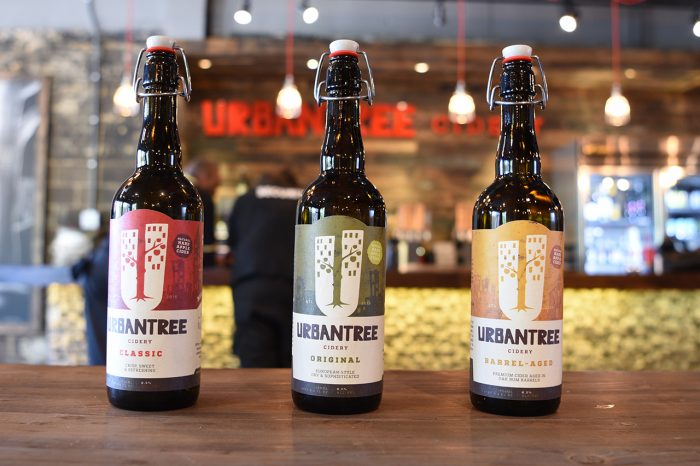
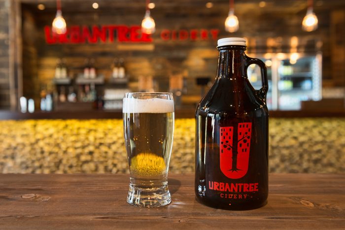
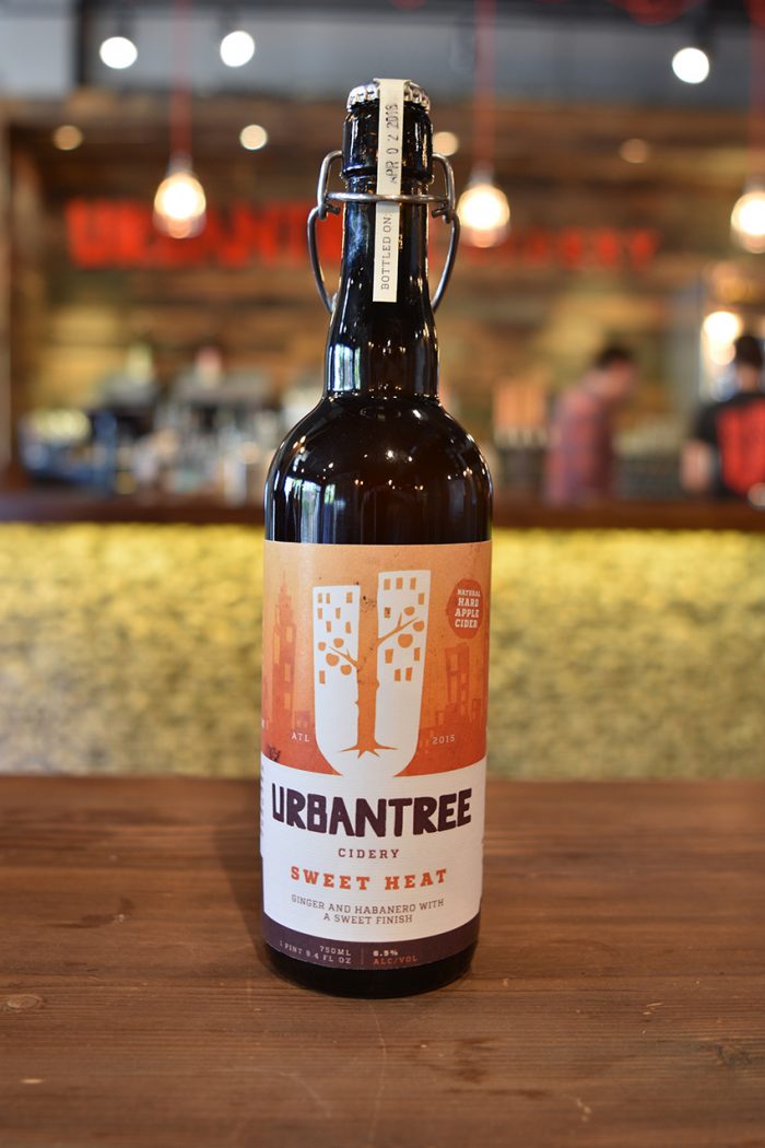
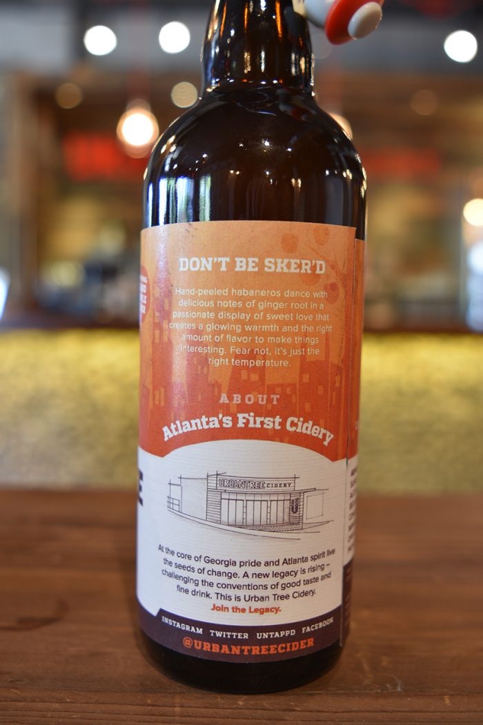
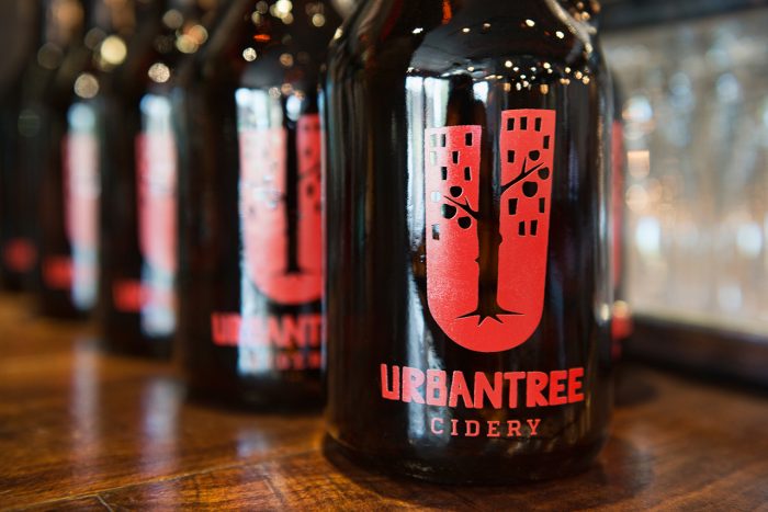
At first glance, a deeply colored bottle of Urban Tree Cidery brew looks as though it could have come from an old vintages wares shop – an ephemeral object – perhaps a bottle that was once produced by the hands of a traditional brewer himself, and at a time in history when cider was still being discovered and celebrated.
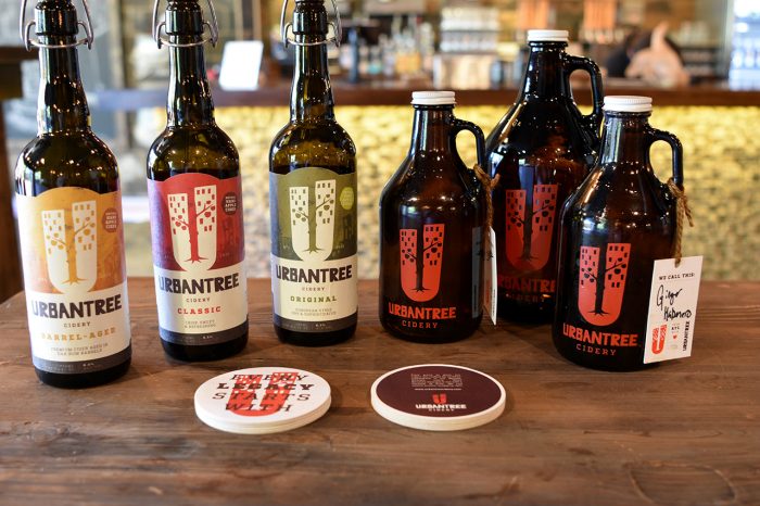
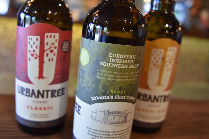
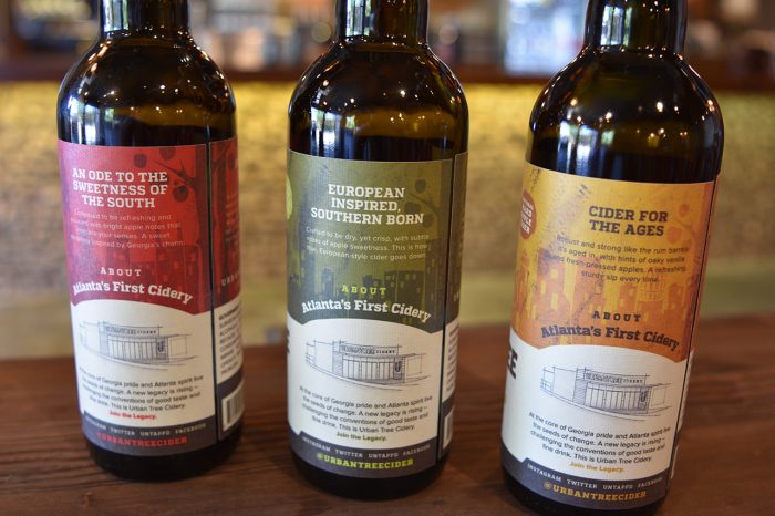
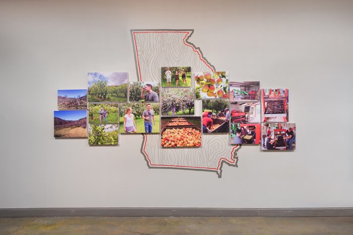
The visual execution of this project finds a beautiful intersect between type and illustration. A sense of place and origin of produce is established through a playful, hand generated scene of the Atlanta landscape – a visual tone that initiates an automatic connection between producer and consumer. The ‘U’ that holds this graphic and supports the brand could almost go unnoticed, yet continues to resonate as soon as the product is out of sight.
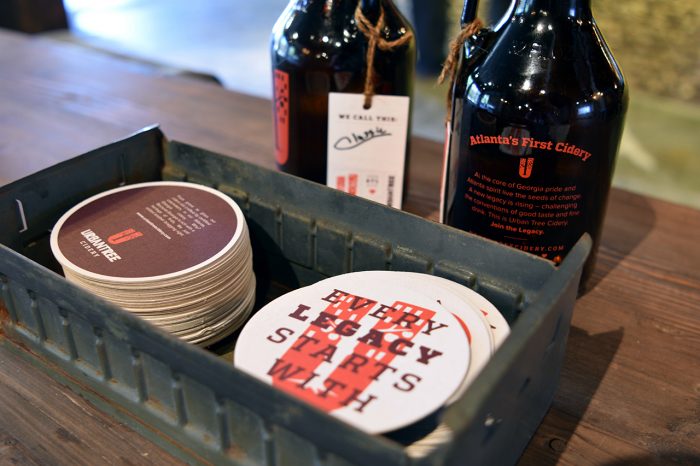
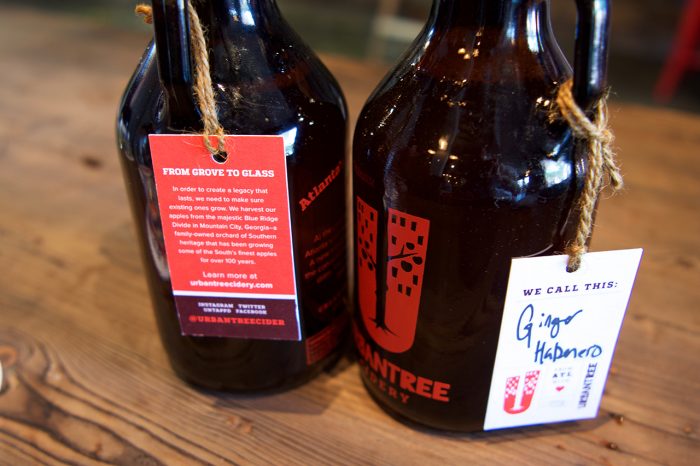
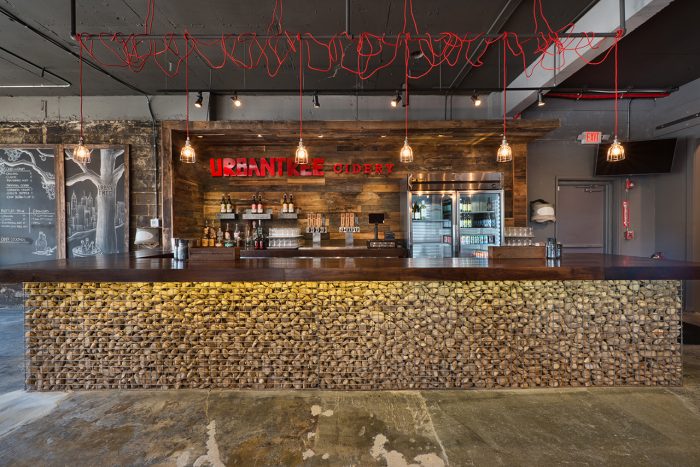
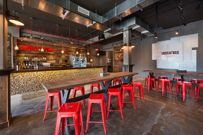
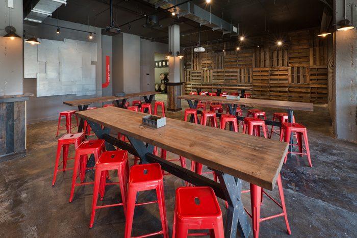
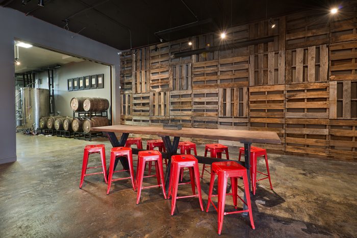
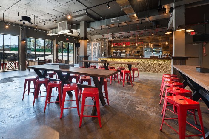
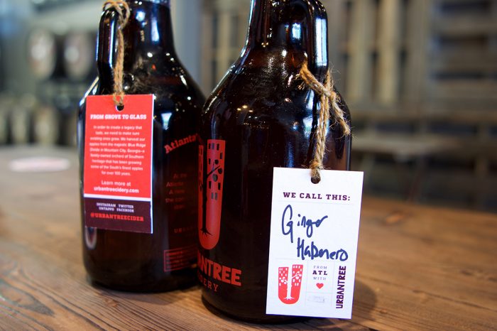
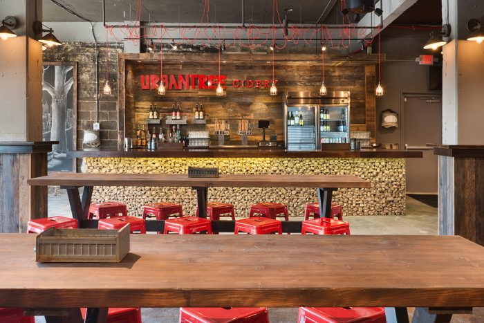
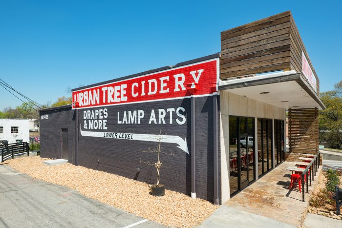
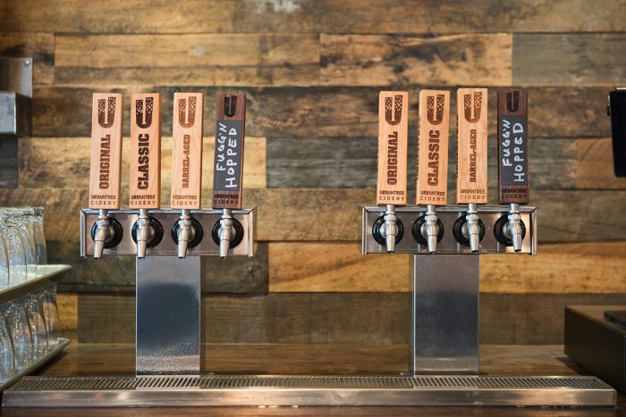
Extending beyond a logo, this identity finds itself creatively and consistently applied to a range of collateral including coasters, tags, tap heads and interiors. An excellent case study in successful and strong branding indeed.
Designed by Vigor – a restaurant and beverage branding and marketing firm
Interior design by Vigor, David Cook, and Cheryl Yul
###
Special thanks to Gemma Warriner for taking the time to review our work for Urban Tree Cidery. In an effort to keep things unbiased, I ask other designers in the field to review our work from a fresh eye. I urge them to pull no punches and be honest.
