Root & Crown cider & vodka branding

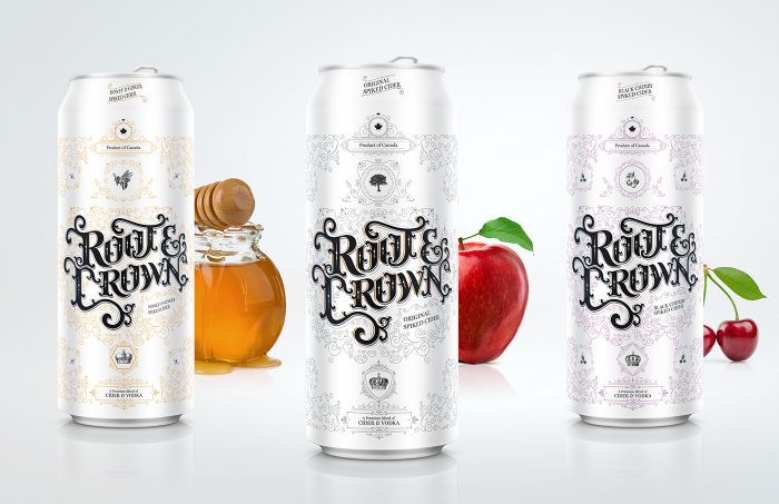
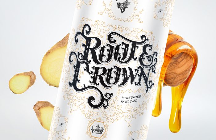
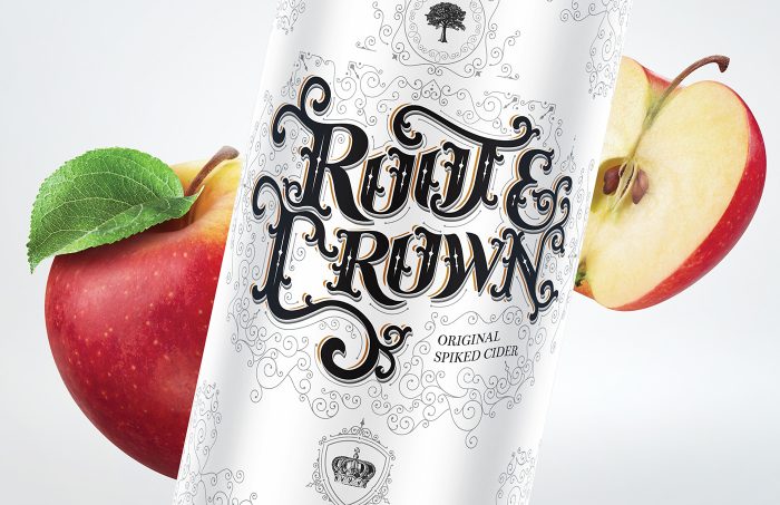
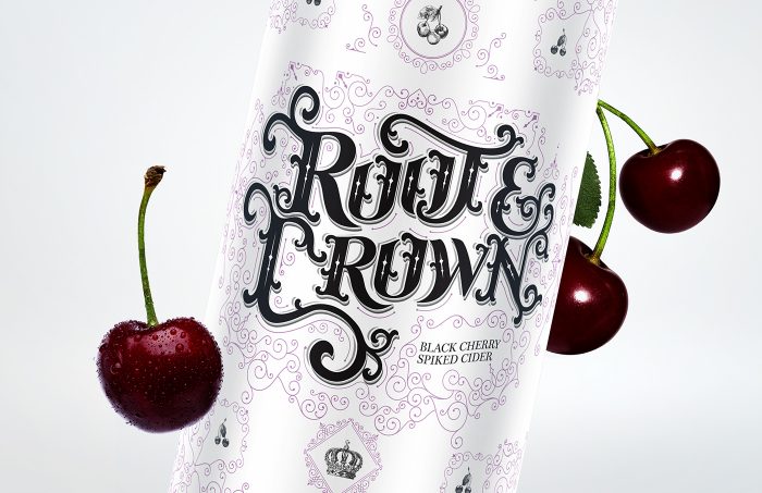
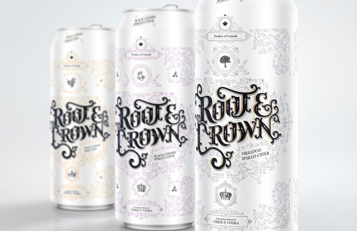
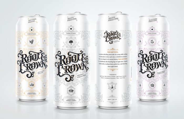
The typography design work for Root & Crown is just absolutely amazing. The intricacies of the filigree marry perfectly to the classic style type in what feels like a dance. And after having a few of these drinks, you may be wanting to dance. Leveraging color as an indicator is an excellent way to maintain ribboning across the flagship line while making it easy to find the flavor of choice. It’s not clear if this was chosen and put into production, or simply a design exercise. Either way, the design work is stellar and worth sharing.

Designed by Marquis Love

1c214928009285-5636e34f1befd

0ca0ce28009285-5636e34f0da0e

43a1f928009285-5636e34f006ab

de95a028009285-5636e34eea174

2aed1928009285-5636e34ed7828 8eb05b28009285-5636e34edfae4-1


The Forktales Podcast™: Interviews with restaurant industry leaders and visionaries

Restaurant and advertising industry headlines and thinking

Reviews of restaurant experiences from around the globe 

Reviews of our favorite design, business, & restaurant books

Our favorite typography and fonts

Inspiration in your inbox

Get the latest inspiration in your inbox every Monday morning, for FREE!

"*" indicates required fields

This field is for validation purposes and should be left unchanged.

Delicious Bits in your Inbox!

Get the latest and greatest content delivered to your inbox for free!

"*" indicates required fields

This field is for validation purposes and should be left unchanged.