Leo’s Oyster Bar restaurant branding

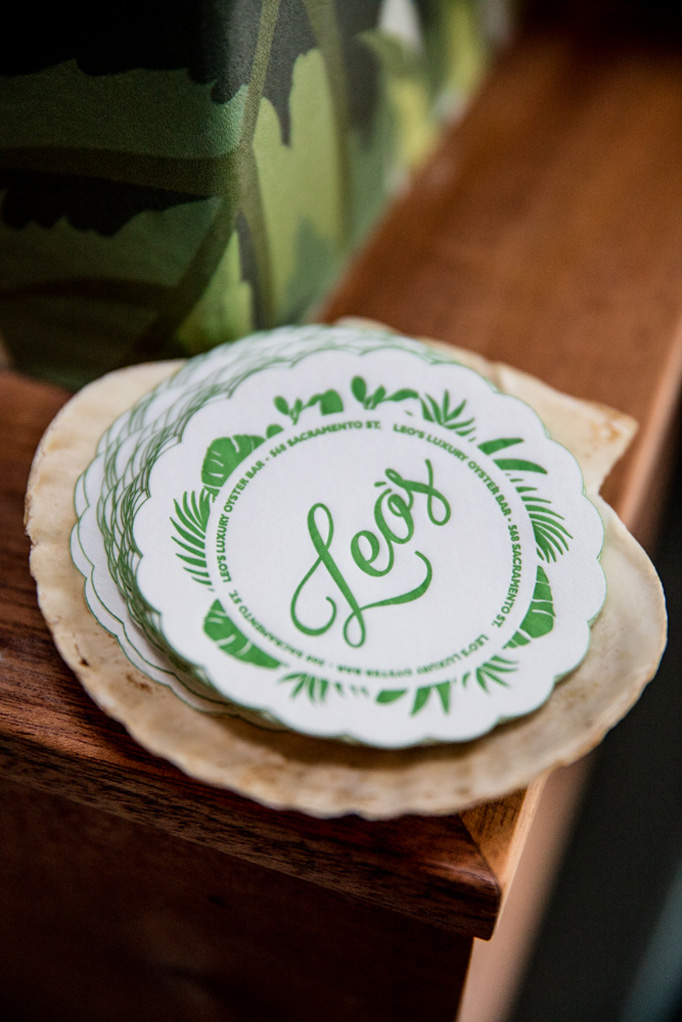
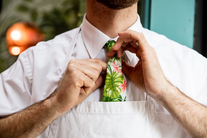
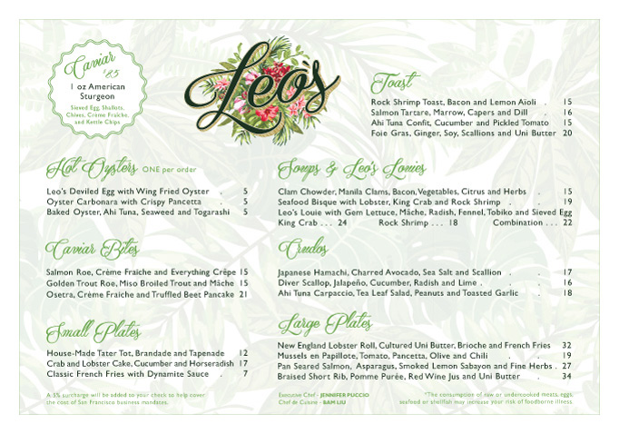
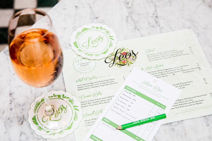
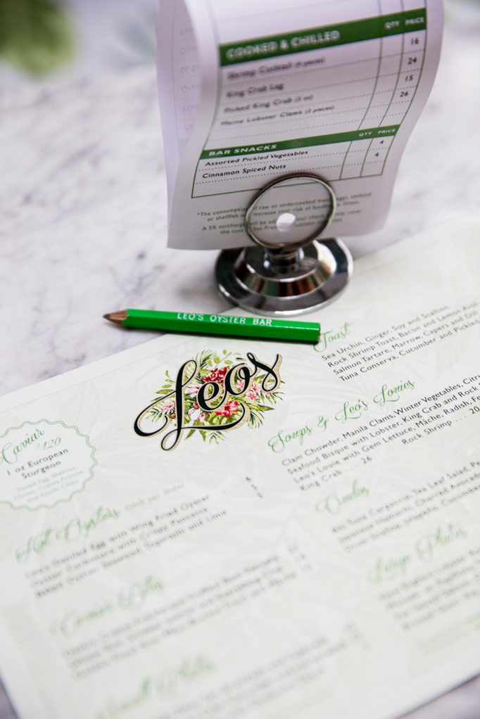
Leo’s is an oyster bar located in San Francisco created by A Big Night Restaurant Group. The brand identity and concept development was also created by the group, rather than an agency or studio partner which makes the look even more impressive. Leo’s look brings forth nostalgic elements found in old fashioned wall paper patterns, and mixes them with simple, modern typography. This crafts an upscale identity and vibe, while maintaining an approachability often lost in modernism. The vintage appeal is delivered excellently without being cliche, or boring. The greens mix well with the golds and pops of rose colors – a tough feat as these colors usually fall into a Christmas-y feel.

Designed in house by A Big Night Out Restaurant Group

leos_diner_photo_05 leos_diner_photo_04 leos_diner_photo_03 leos_diner_photo_02 leos_diner_photo_01

The Forktales Podcast™: Interviews with restaurant industry leaders and visionaries

Restaurant and advertising industry headlines and thinking

Reviews of restaurant experiences from around the globe 

Reviews of our favorite design, business, & restaurant books

Our favorite typography and fonts

Inspiration in your inbox

Get the latest inspiration in your inbox every Monday morning, for FREE!

"*" indicates required fields

This field is for validation purposes and should be left unchanged.

Delicious Bits in your Inbox!

Get the latest and greatest content delivered to your inbox for free!

"*" indicates required fields

This field is for validation purposes and should be left unchanged.