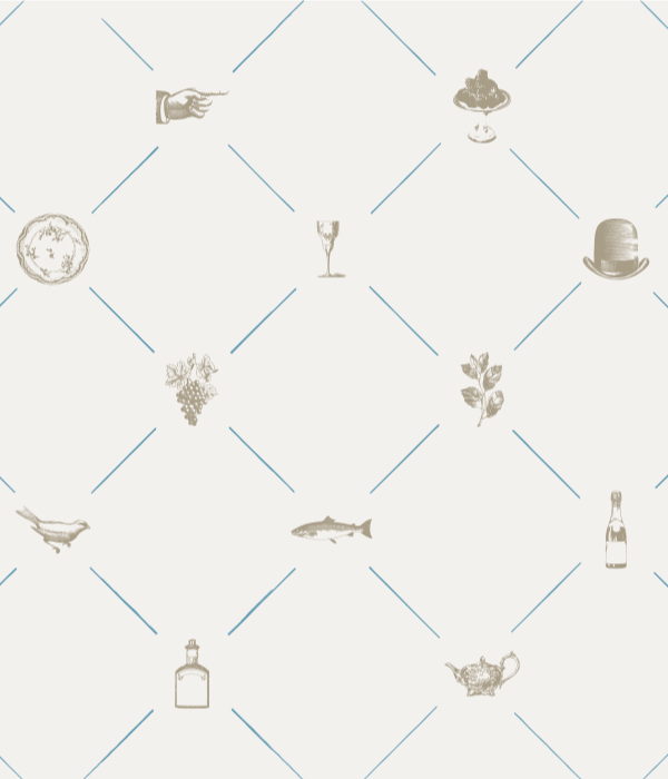
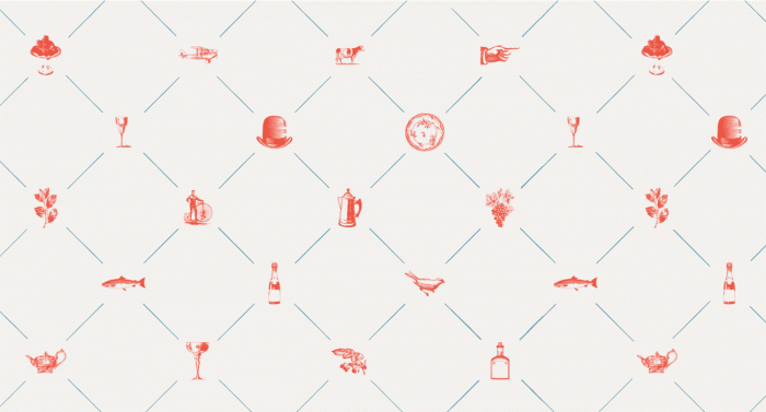
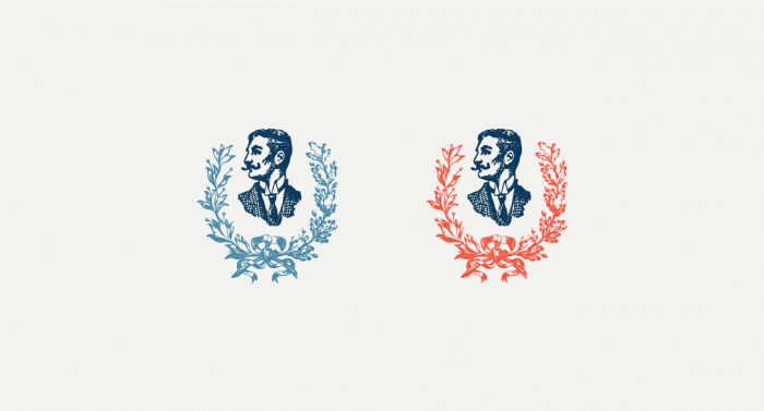
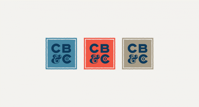
Courtney Eliseo’s new venture is off to a fantastic start. For those that don’t know, she was the creative behind Seamless Creative and DesignWorkLife – a blog that most of us were so sad to see go. But fear not, she’s alive and kicking and this project found on the new site just had to be shared. Her new venture is called En Route, and she uses that name as a battlecry for how she approaches her work. You’ll see once you visit the site. For this project, the typography is what really grabbed me. Working with a name like CB & Company leaves little to go on with regard to graphic design, but the typography seemed to spark a wonderful set of logotypes and monograms. With a touch of playful nostalgia, En Route takes this New York kosher deli’s look to a modern, crafted feel.
Designed by En Route
