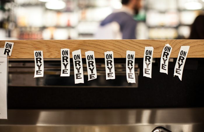
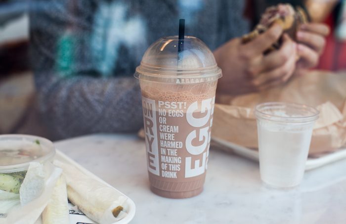
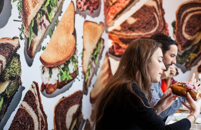
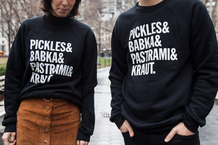
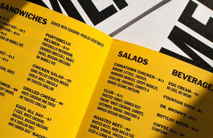
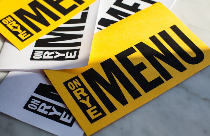
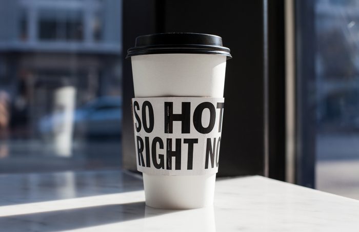
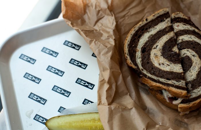
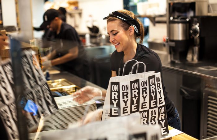
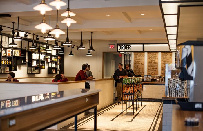
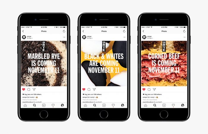
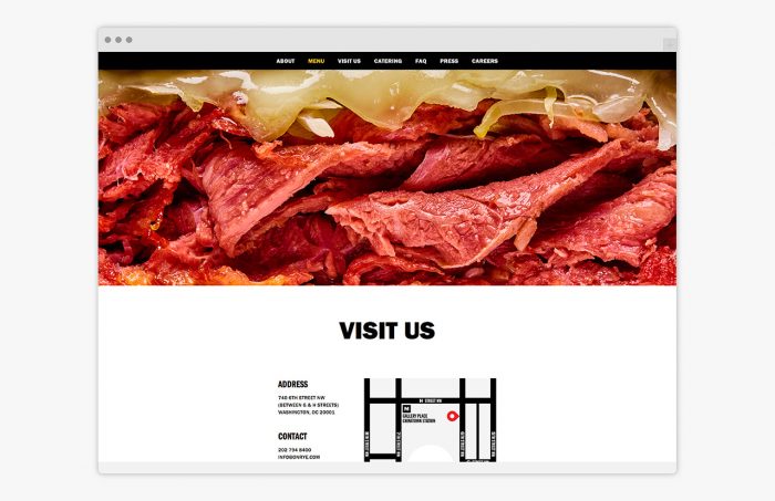
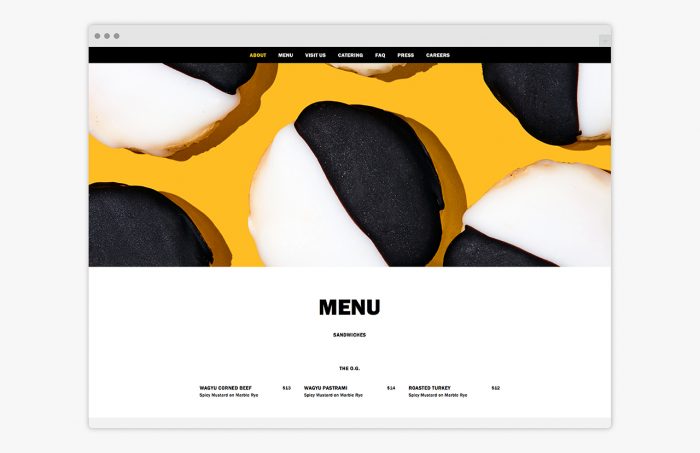
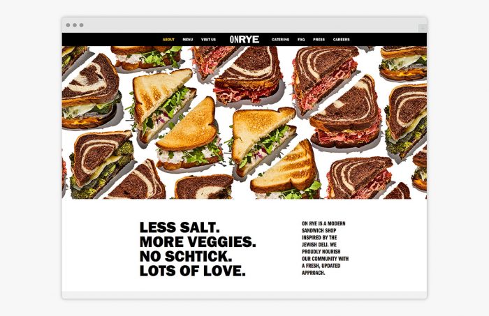
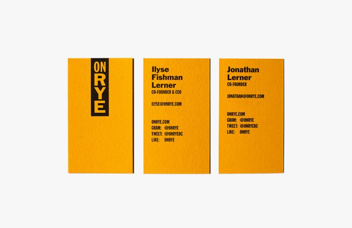
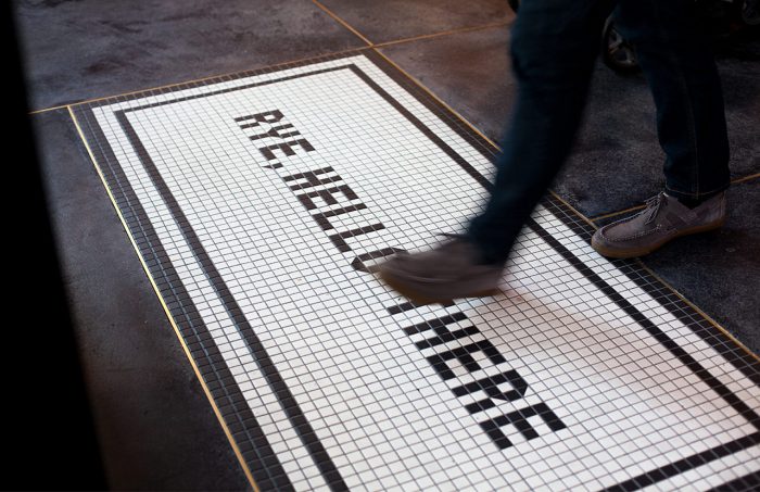
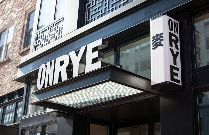
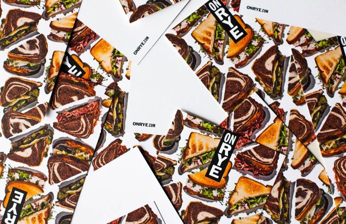
I waited a little bit to post this because there weren’t quite enough photos to share. It seems as thought the Pentagram team took a little trip and loaded up on some stellar imagery that gives a bigger view of the work completed for On Rye, a new fast casual sandwich concept located in DC.
The brand is a mix of minimalist typography and minimalist photography. They marry wonderfully allowing each element to sing across the brand’s multiple touch points. The no-nonsense approach to the design, a bit of a Michael Beirut signature, is a welcomed break from the pseudo-crafted, lo-fi design aesthetic that’s seemed to float to the forefront of restaurant design and branding these days.
Have a look through the full project and have a deeper read about the ins and outs here.
Designed by Michael Beirut’s team at Pentagram
