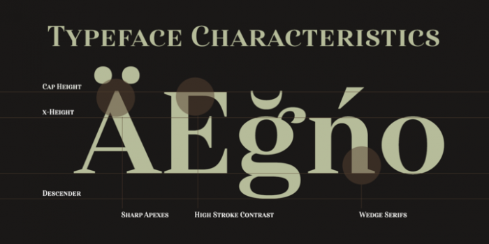
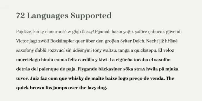
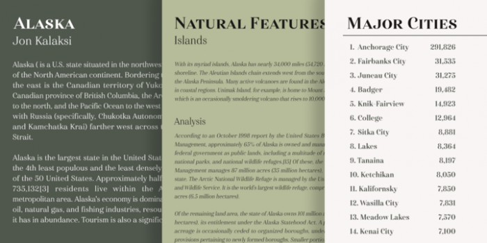
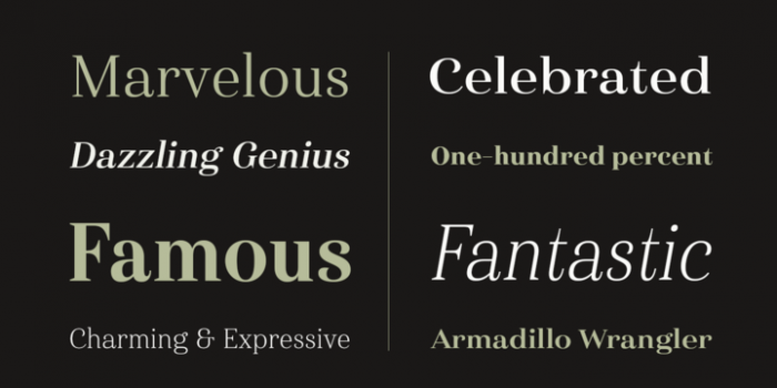
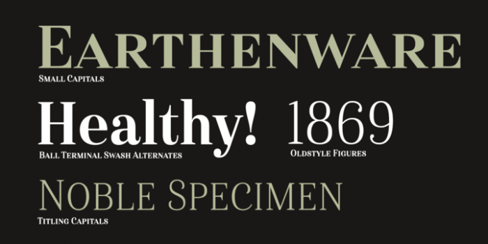
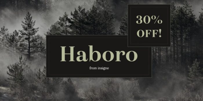
I’ve been really into serif typography styles lately. They’re so beautiful when executed properly. Haboro, a type family from Insigne Design, is one such family. As always, the nuances are what make the type so strong and unique. In this case it’s the slight whip on the C, S and lowercase g letterforms. Quite intriguing.
Designed by Insigne Design
Available at MyFonts
