Campo restaurant branding

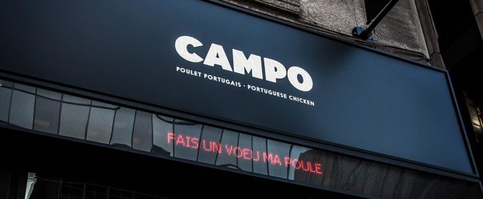
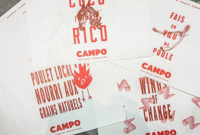
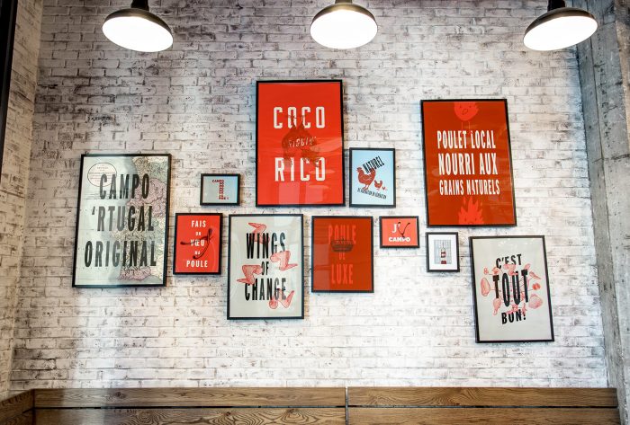
This brand identity is fantastically robust which is exemplary of a well thought out and executed restaurant brand. Each touch point serves as another brick in an overarching story. They add to the full brand vibe piece by piece with elements of personality and unexpected wit.

What really sets this brand apart is the meshing of clean typography with gritty illustrations. It creates a unique visual disruption that’s intriguing. The main illustration is the fire chicken. However, it could be a fire who’s quite surprisedly unhappy. Just depends on whether you see a beak or a mouth. Pretty stellar either way.

Designed by Polygraphe

The Forktales Podcast™: Interviews with restaurant industry leaders and visionaries

Restaurant and advertising industry headlines and thinking

Reviews of restaurant experiences from around the globe 

Reviews of our favorite design, business, & restaurant books

Our favorite typography and fonts

Inspiration in your inbox

Get the latest inspiration in your inbox every Monday morning, for FREE!

"*" indicates required fields

This field is for validation purposes and should be left unchanged.

Delicious Bits in your Inbox!

Get the latest and greatest content delivered to your inbox for free!

"*" indicates required fields

This field is for validation purposes and should be left unchanged.