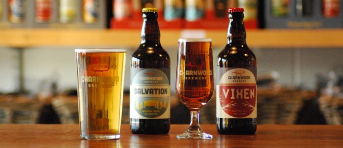
Spearheaded by a post 60’s style fox, the identity for Charnwood Brewing is a healthy mix of reserved and whimsy. Charnwood is a local brewery found in the UK’s Leicestershire and Nottingham areas. As a family-run brewery, the design team felt it right to have a fun, relaxed and quirky vibe throughout the identity. The fox, lovingly named “Clarence,” serves as the anchor for the identity as each craft beer style is allowed to have its own look and feel. This tactic can work quite well when you’re a small, niche brand as “ribboning” and shelf space aren’t necessarily a concern.
Overall we love the look here at GXG and thing the magic really exists with the fox mark. One note of criticism is the use of Pacifico script font. It’s just terrible… we should know, we used it for another brand awhile back. Haha!
Designed by a dozen eggs


![]()