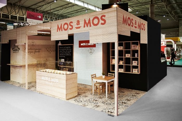
Mos a Mos food kiosk design

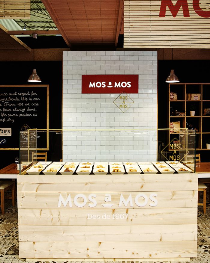
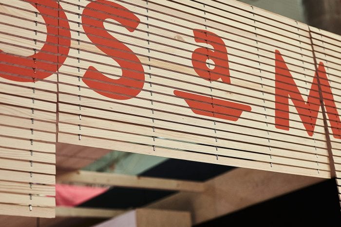
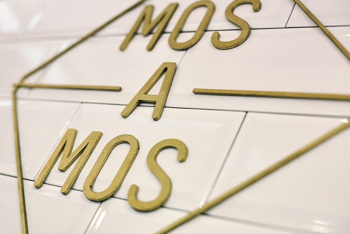
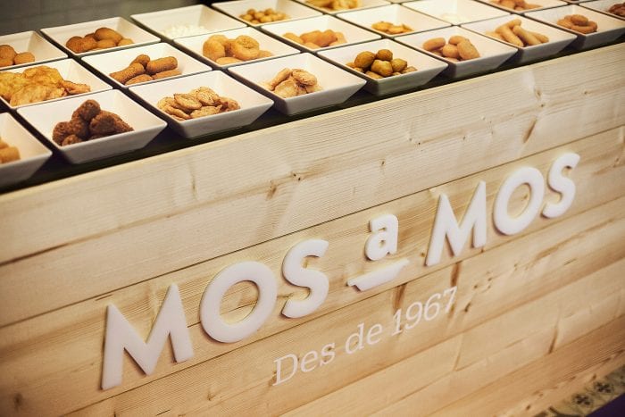
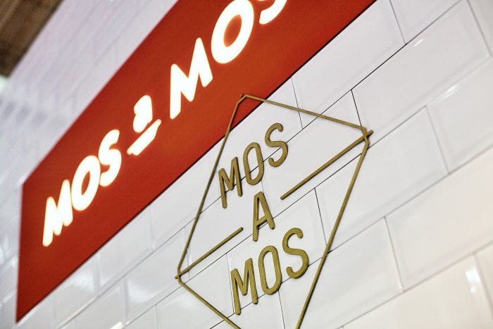
Designing for the kiosk model is tough. You don’t have as much space to inject brand moments. However, the Zoo Studio team executes an amazing experience that’s immersive and intriguing. The design for Mos A Mos, a frozen foods brand via Spain, pulls influence from classic design aesthetic and import industry cues. The heavy use of wood seems like a nod to the classic wooden shipping container, and the use of strong, simple typography really drives home the brand’s visual tone.

Designed by Zoo Studio in Barcelona, Spain


The Forktales Podcast™: Interviews with restaurant industry leaders and visionaries

Restaurant and advertising industry headlines and thinking

Reviews of restaurant experiences from around the globe 

Reviews of our favorite design, business, & restaurant books

Our favorite typography and fonts

Inspiration in your inbox

Get the latest inspiration in your inbox every Monday morning, for FREE!

"*" indicates required fields

This field is for validation purposes and should be left unchanged.

Delicious Bits in your Inbox!

Get the latest and greatest content delivered to your inbox for free!

"*" indicates required fields

This field is for validation purposes and should be left unchanged.