Tea is certainly a slowly building trend here in the States, but elsewhere in the world, it’s celebrated. This isn’t news, but the fact that so many folks correlate tea to British or Asian cultures pigeonholes perceptions and therefore design for tea-based brands.
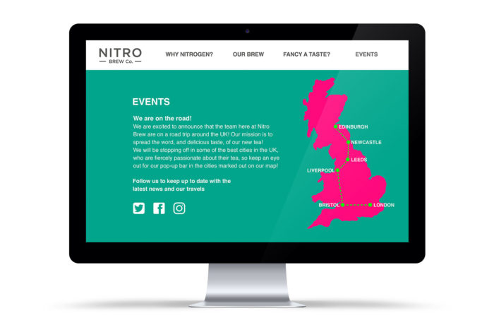
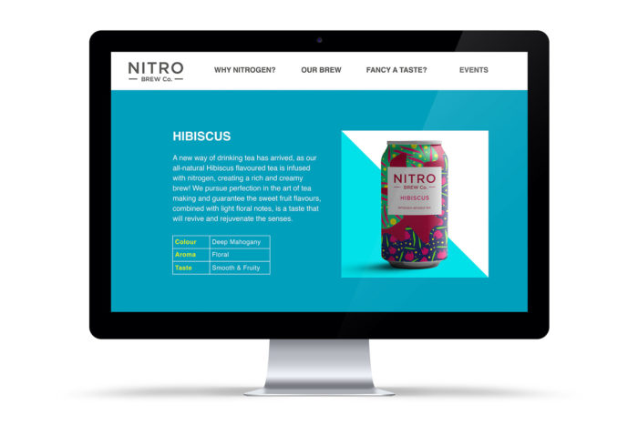
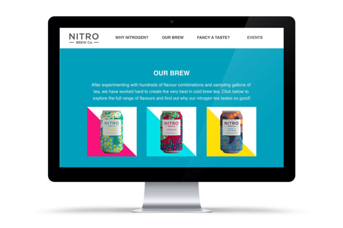
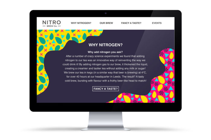
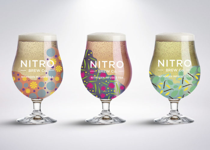
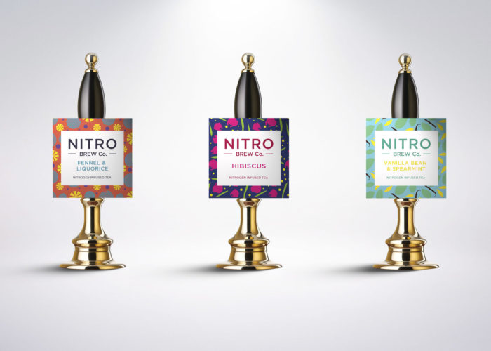
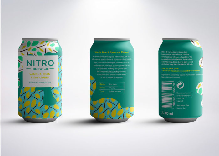
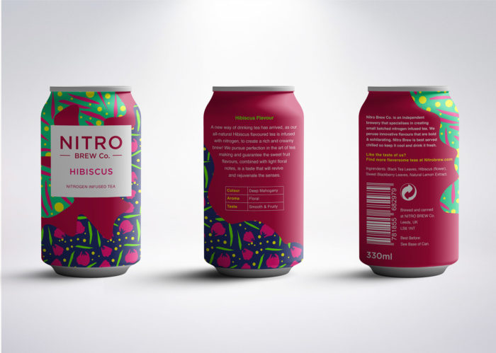
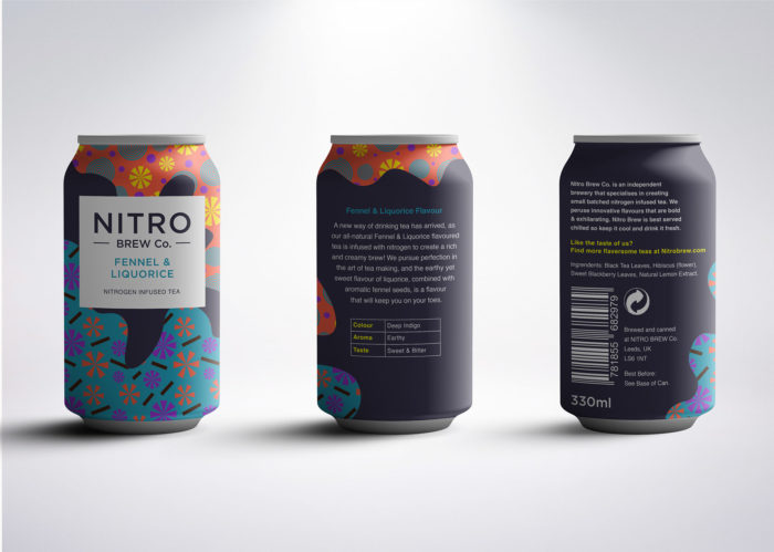
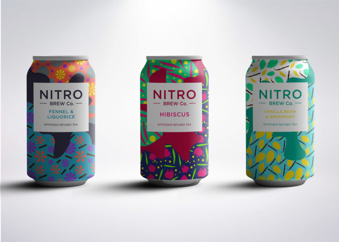
Rachel Buchanan decided to challenge the cliché’s with a fresh brand identity and packaging direction that celebrates the beauty of tea in modern, vibrant way. The fluorescent color palette and floral inspired patterns collide in fluid beauty. Bolstered with modern typography and a confident layout, the branding for Nitro creates a visual representation of the tea experience.
Designed by Rachel Buchanan in Leed, United Kingdom
