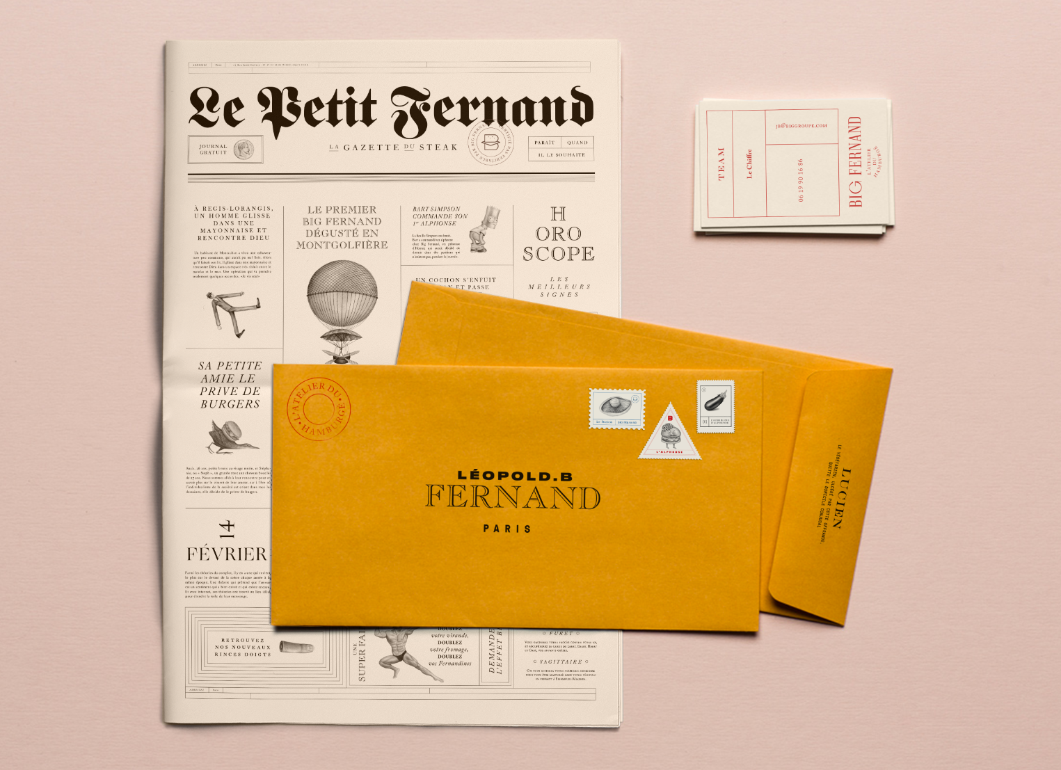
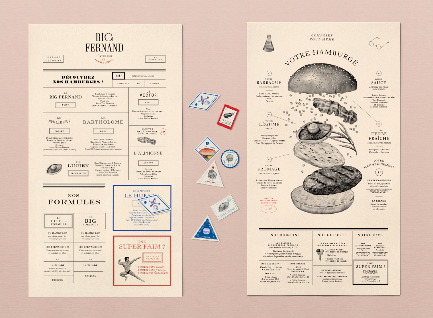
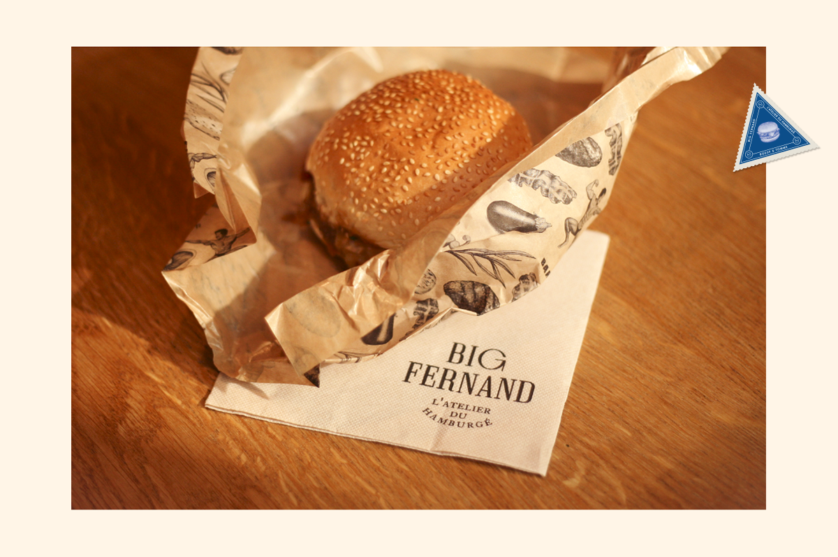
I think I’m on a burger branding kick. To me this brand was entirely unexpected when it comes to greasy ground beef between two buns. Its elegant and classic but it’s also kind of weird. Violain & Jérémy have great taste when it comes to illustration used in their work and the use of it in Big Fernand is so beautiful and unique and kind of makes you uncomfortable, in a good way. Theres a burger that resembles Lemongrab on Adventure Time, a couple butts, one of which belongs to Bart Simpson for some reason, and a pimple faced kid who looks like McLovin’ in Superbad. If I could read French I’m sure I could decipher why they chose to add two more eyes to an illustration of a cat, but for now I’m enjoying the naiveté of my minimal knowledge of French.
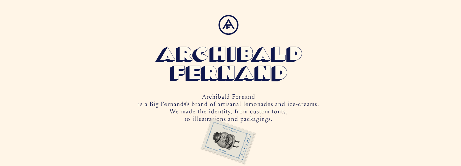
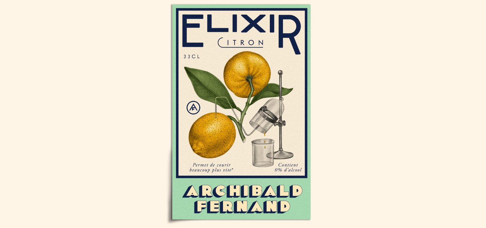
The menu features fresh and French beef, locally grown produce and of course only the best French cheeses. Their use of typography is sophisticated yet fun. And they also created a custom font called Archibald Fernand for their artisanal lemonades and ice creams. Violain & Jérémy is an illustration and graphic design studio located in Paris, France, specializing in; artistic direction, graphic identity, web design and editorial design to name a few. I will definitely keeping an eye on them, it looks like they’re going to continue to make marvelous work.

