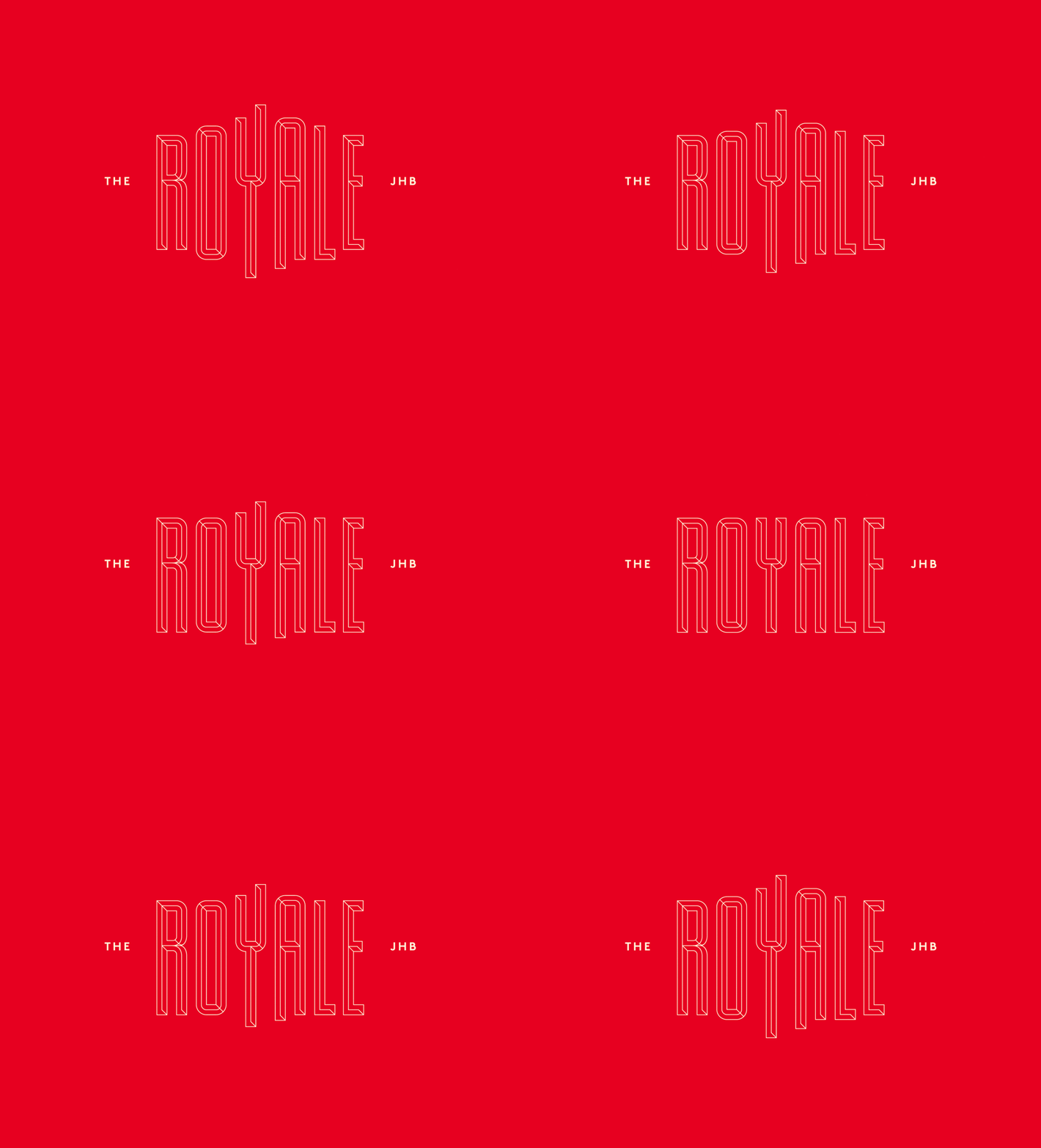
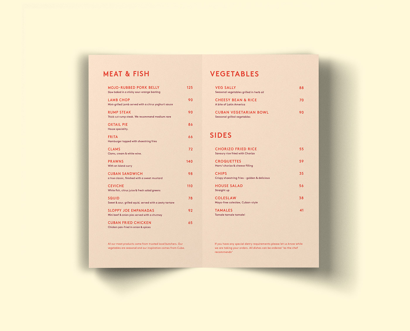
I’m not sure if you’ve noticed by now but I am a sucker for millennial pink. You can ask anyone in the Vigor office what my favorite color is and it’s obvious, it’s pink. With that said this branding has a very Grand Budapest Hotel meets Pulp Fiction feel to it. The red pops against the pastel blues, pinks, and yellows. They even have a pattern featuring the logo and their palm tree logo. I think they did a great job with this branding, it’s very well executed but I wonder how long this pastel trend is going to last. I personally love it but I know all things must come to an end at some point. I believe the logo is timeless but unfortunately, I don’t think the colors will last as long.
The Royale is a Cuban inspired restaurant & bar in Johannesburg, South Africa where the designer Nicholas Christowitz is originally from. The branding was inspired by the Royal Palm Hotel in Havana. The way the logo stretches in the middle is a great tweak to call out to the shape of the hotel.


