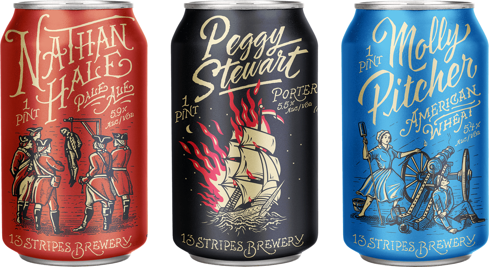
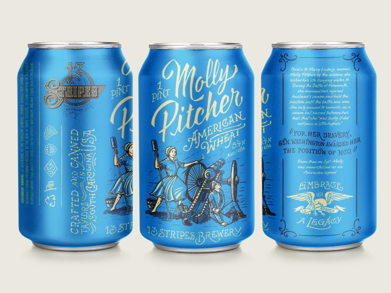
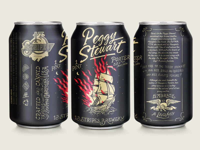
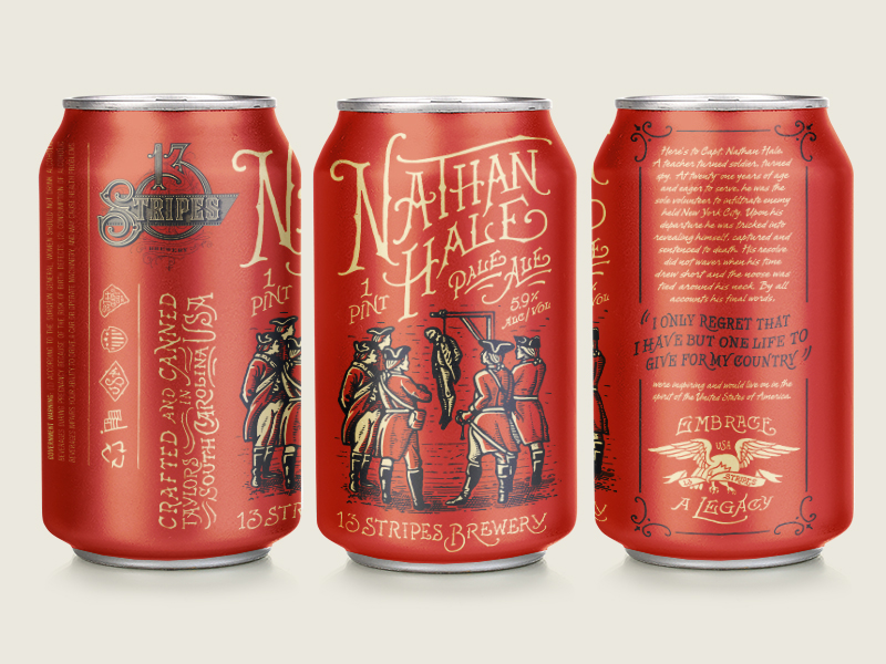
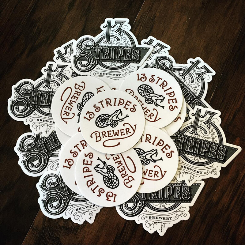
13 Stripes is a new, old world style brewery based out of Taylors, South Carolina. They believe in fostering a community that believes in the legacies that have been passed down for generations and draw their brand/brewing philosophy from the rebels of the original thirteen colonies of this great nation. Forefathers worked with them to establish an identity and only three can designs; I’m not sure if 13 Stripes is simply not canning other brewskis yet, or if they just started with three (if you know, holla at cha girl).
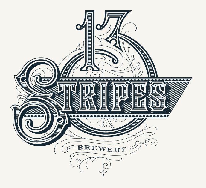
Like all the other work that Forefathers does, they knocked it out of the park with this one. The can designs are bright and distinct with their illustration style, and it seems to me that most, if not all, the typography on the entire can is handwritten, minus the usual legal copy of course. Each can features a non-fictional story from our countries inception, spotlighting characters that encapsulate the American spirit of rebellion and perseverance. I’m not a huge fan of the ornate intricate logo,; I think the simpler hand-drawn one on the front of the can and used on other pieces of collateral meshes better with the illustrations, personally.
Branding and packaging by Forefathers.